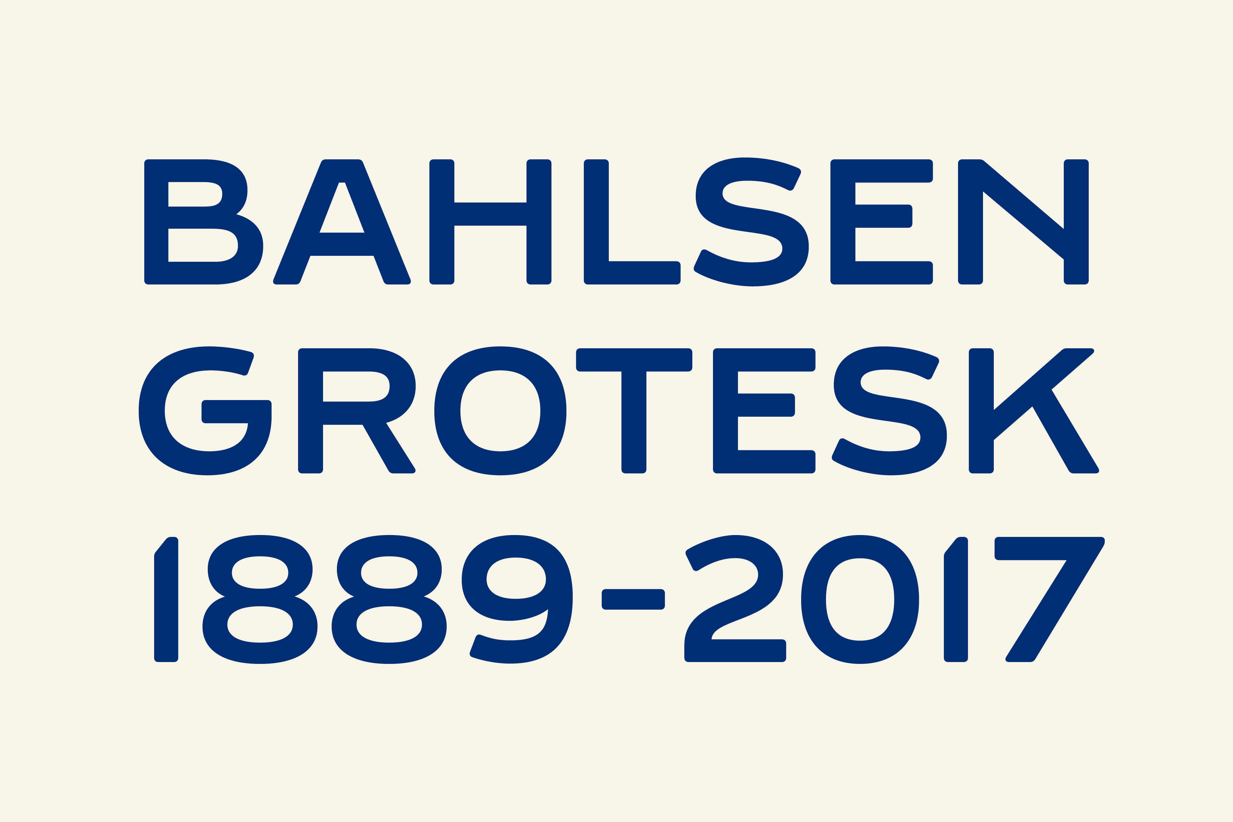
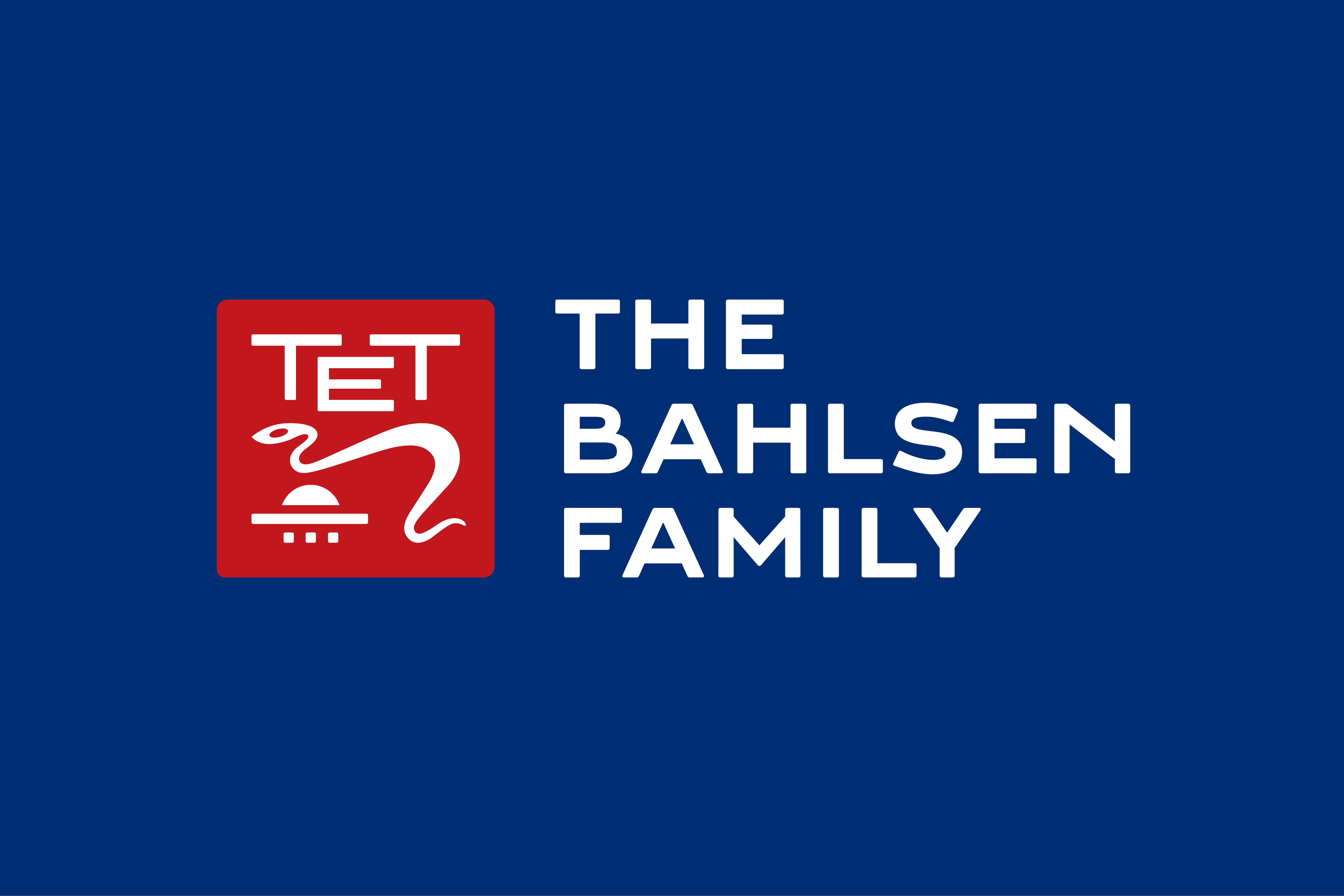
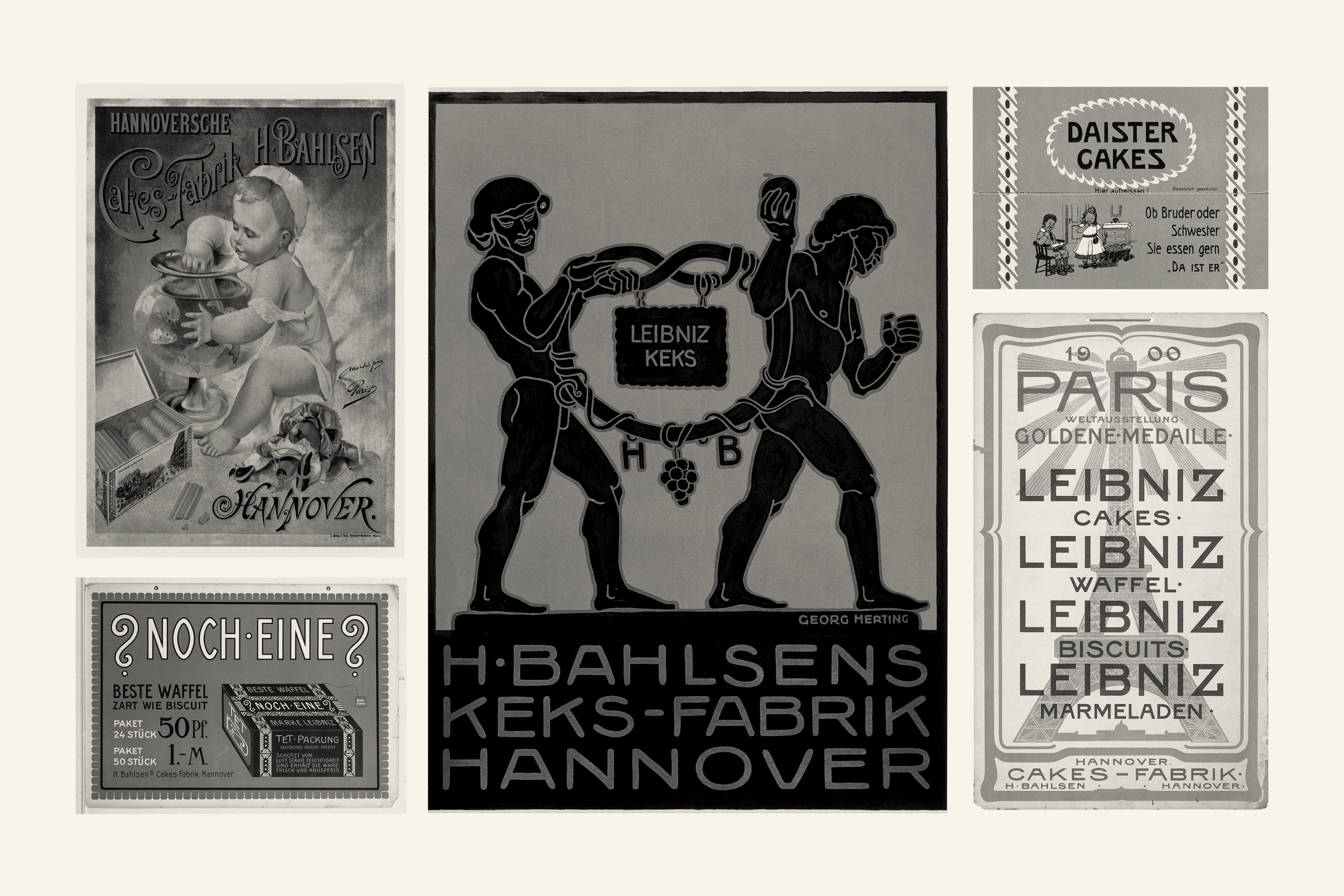
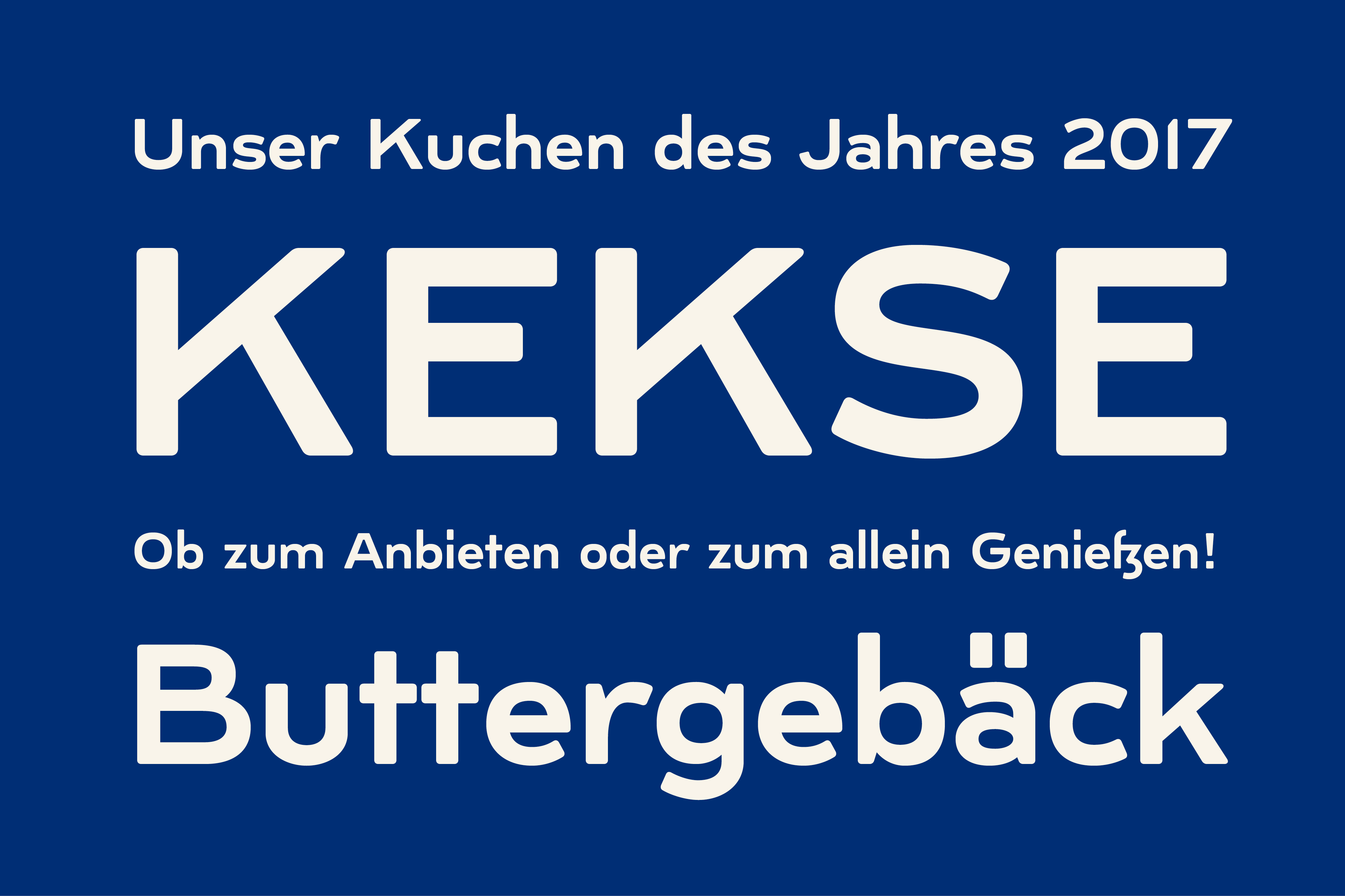
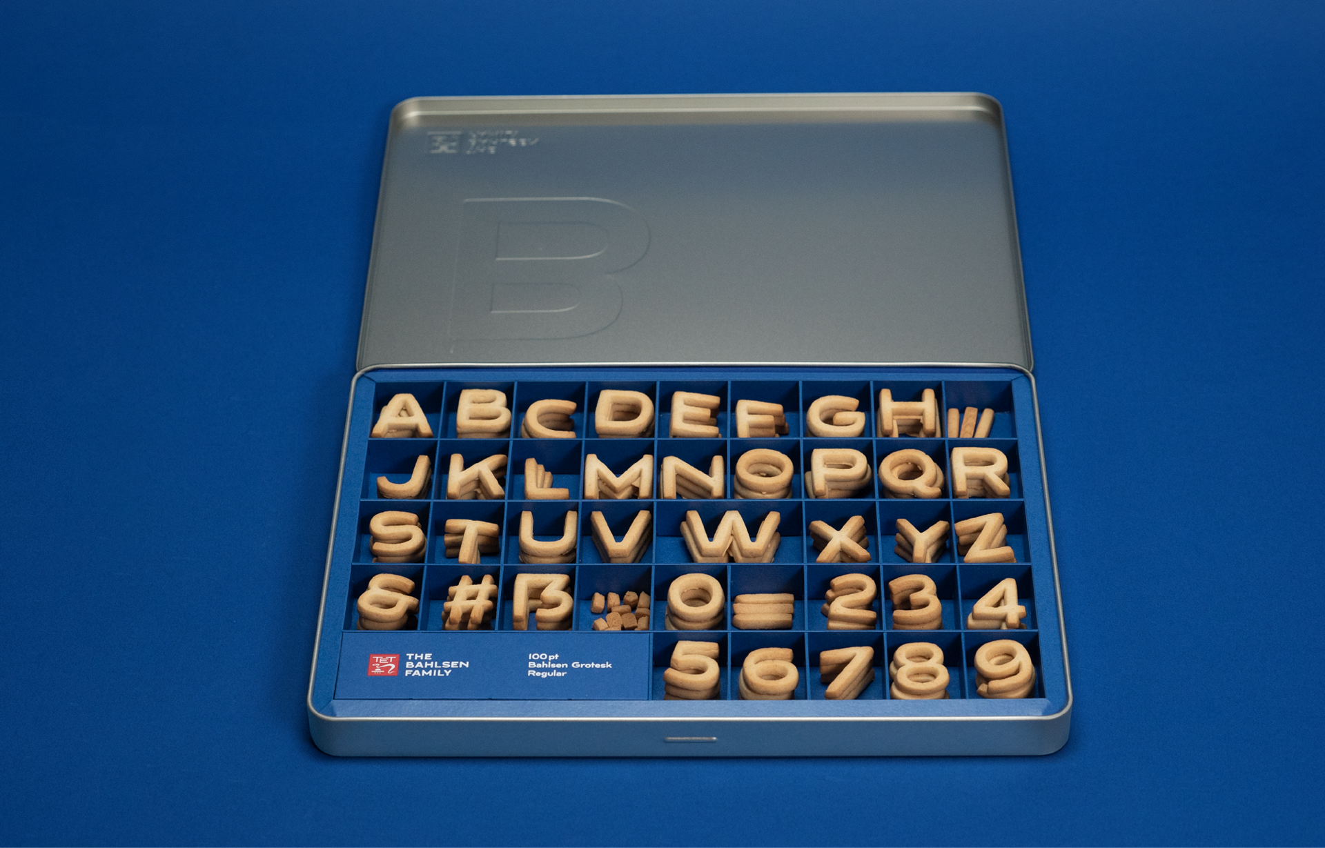
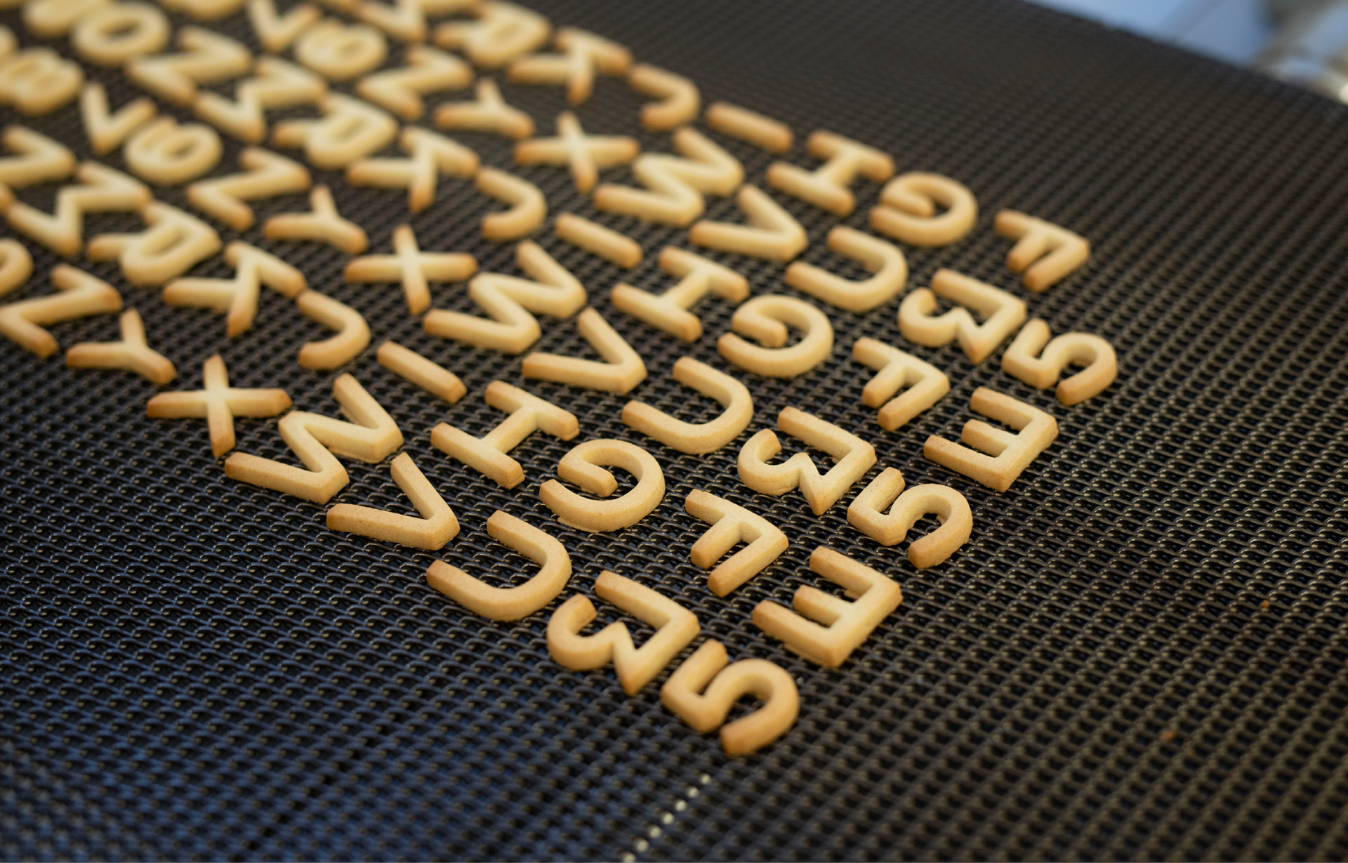
As part of the new Brand Identity for Bahlsen Family, design agency Mutabor commissioned a custom font to complement their work on the project. The visual concept is based on revitalising Bahlsens heritage by drawing inspiration from advertising posters tracing back to the brand’s roots in the early 20th century. The result is a typographic-driven solution making the custom font one of the main pillars of the branding.
Characteristics
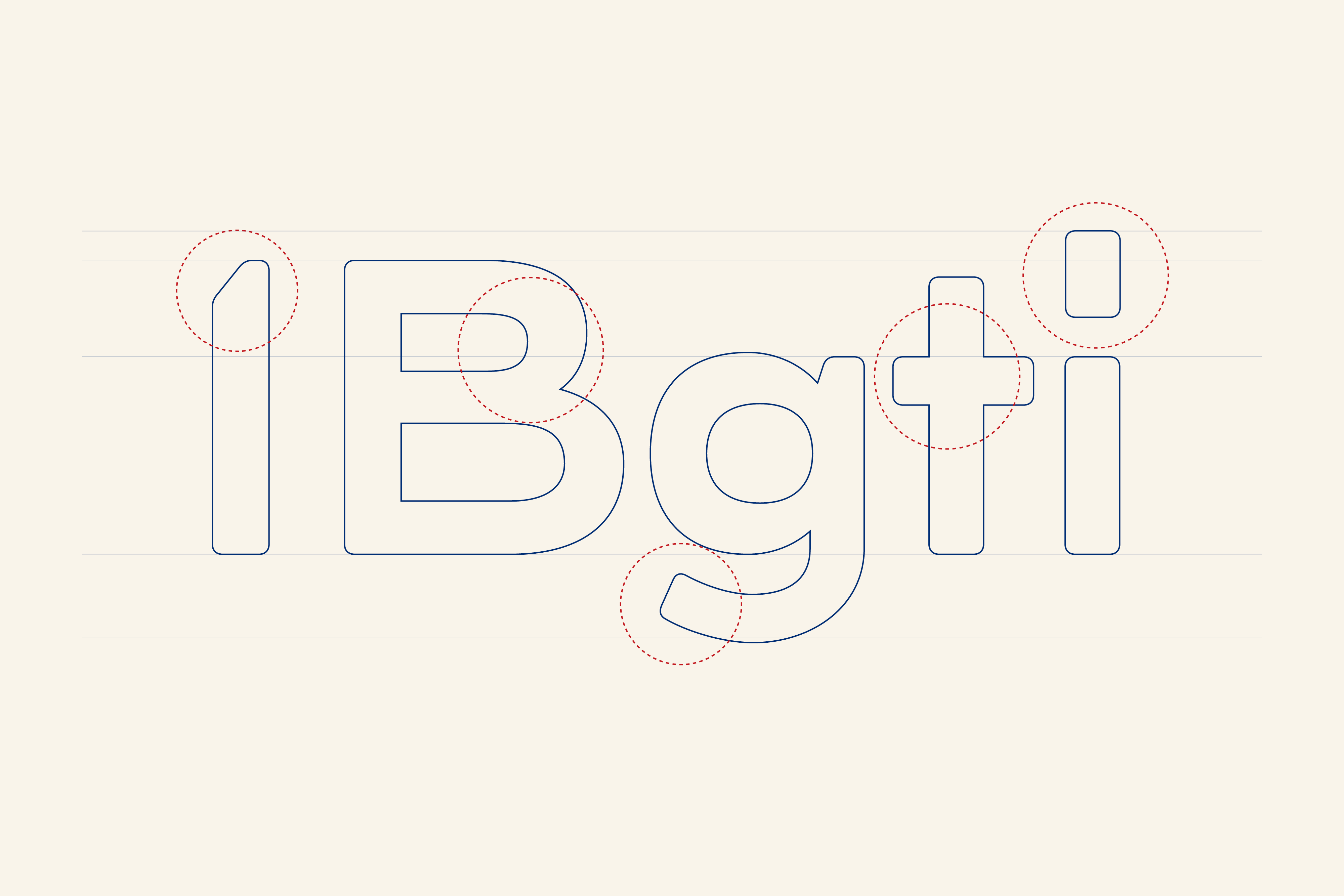
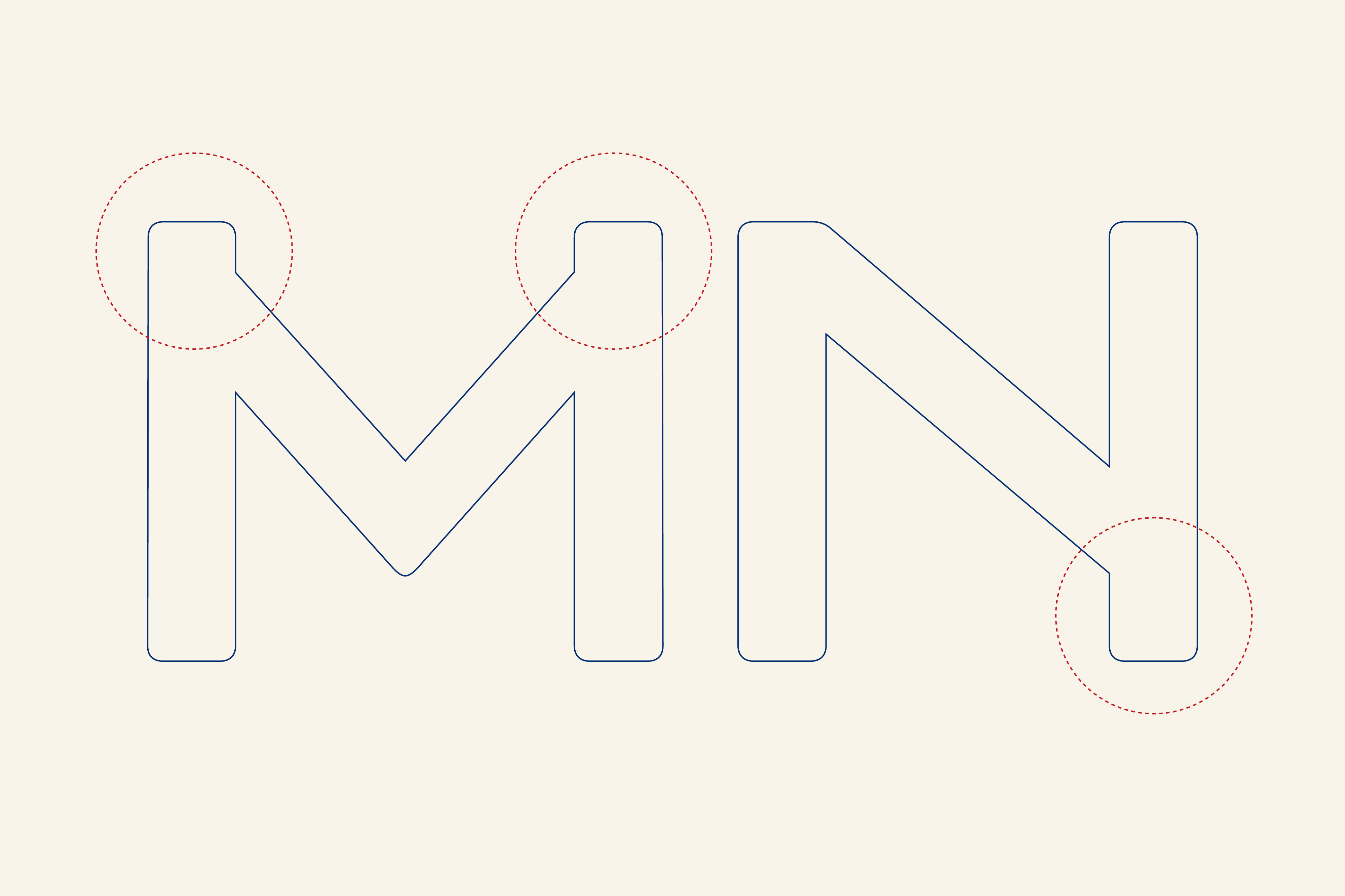
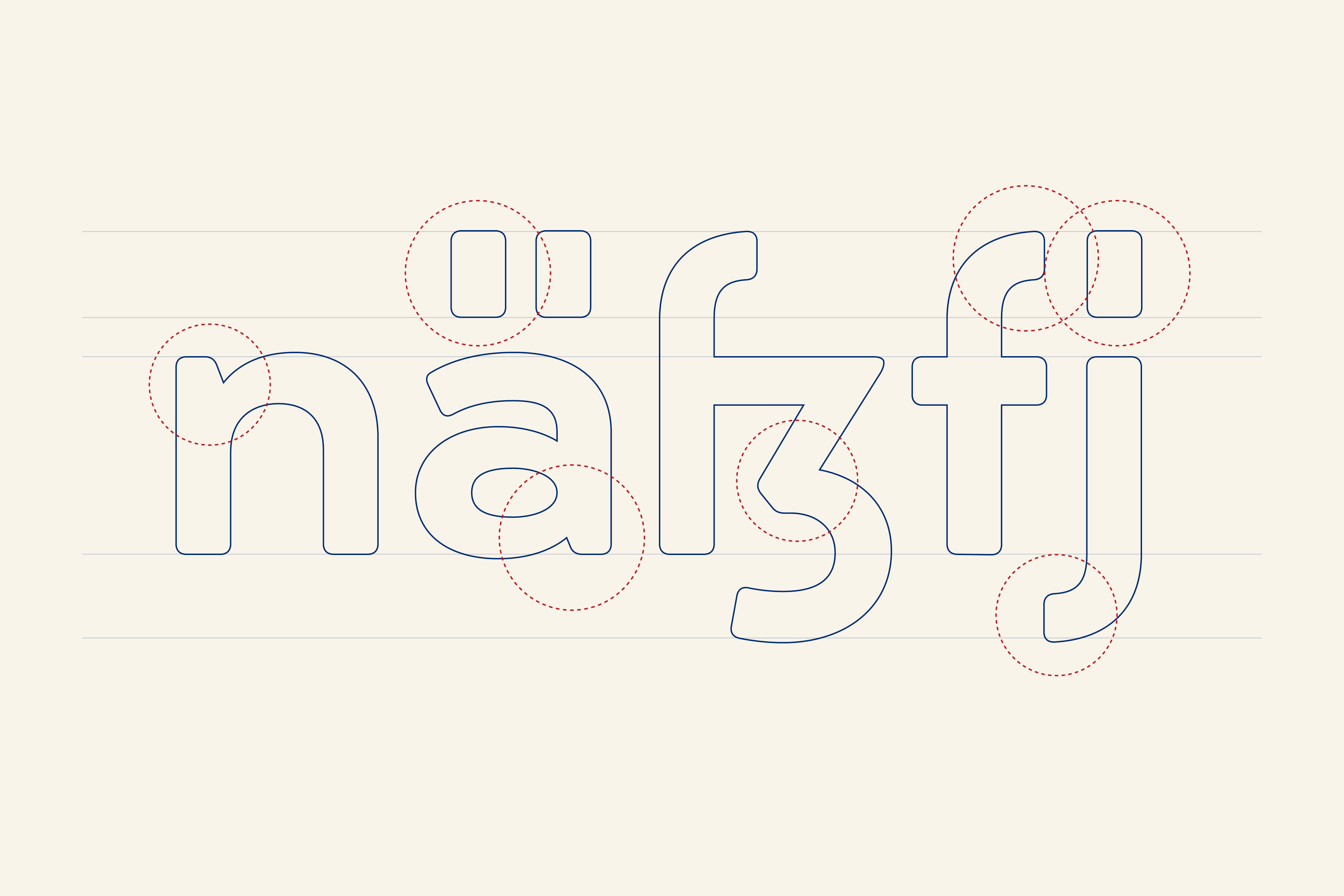
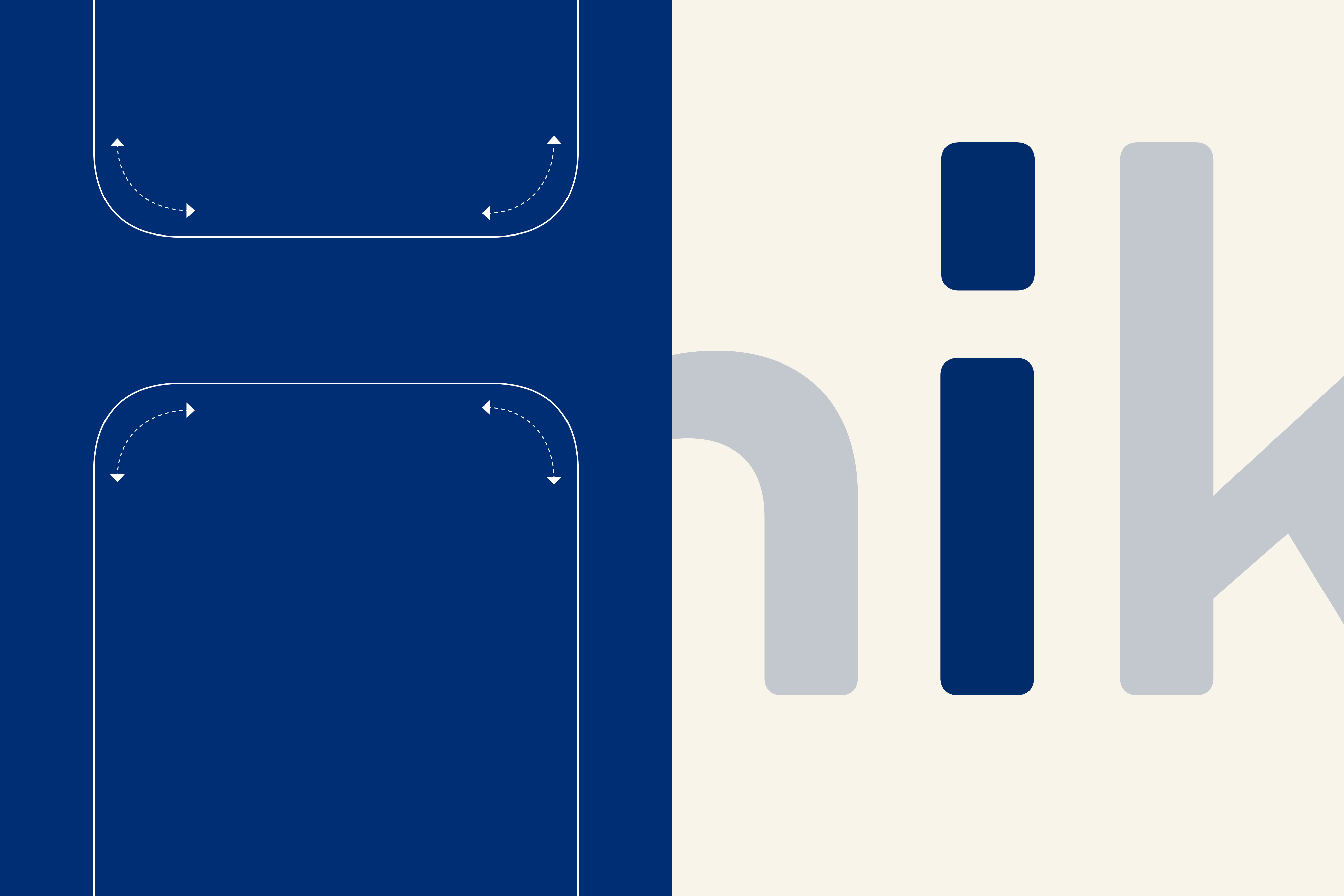
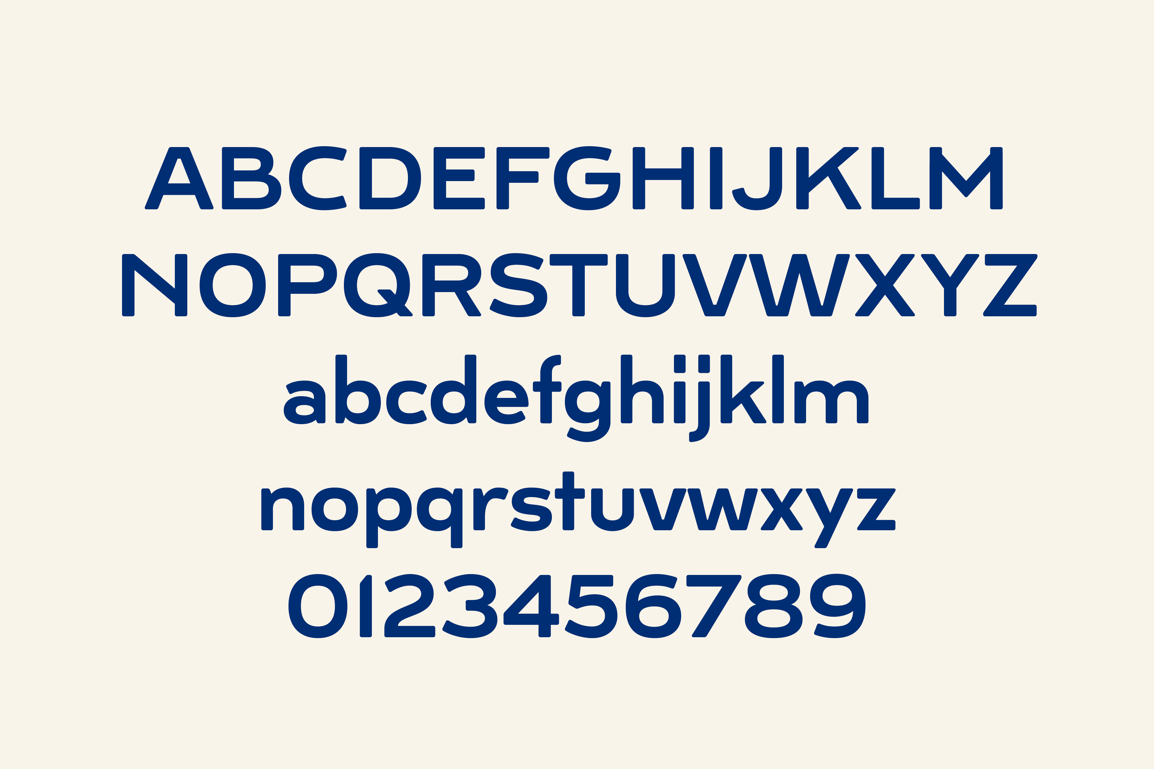
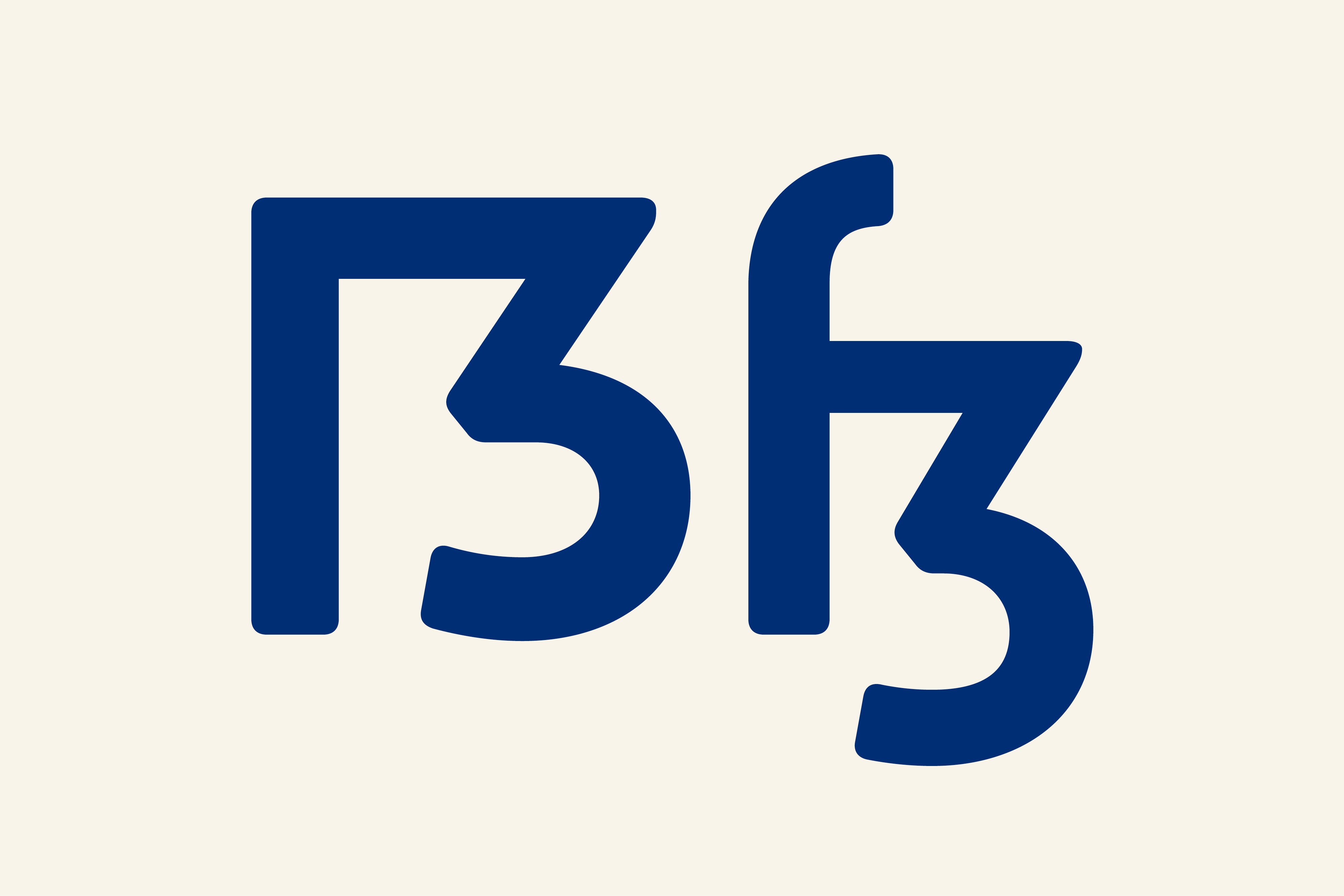
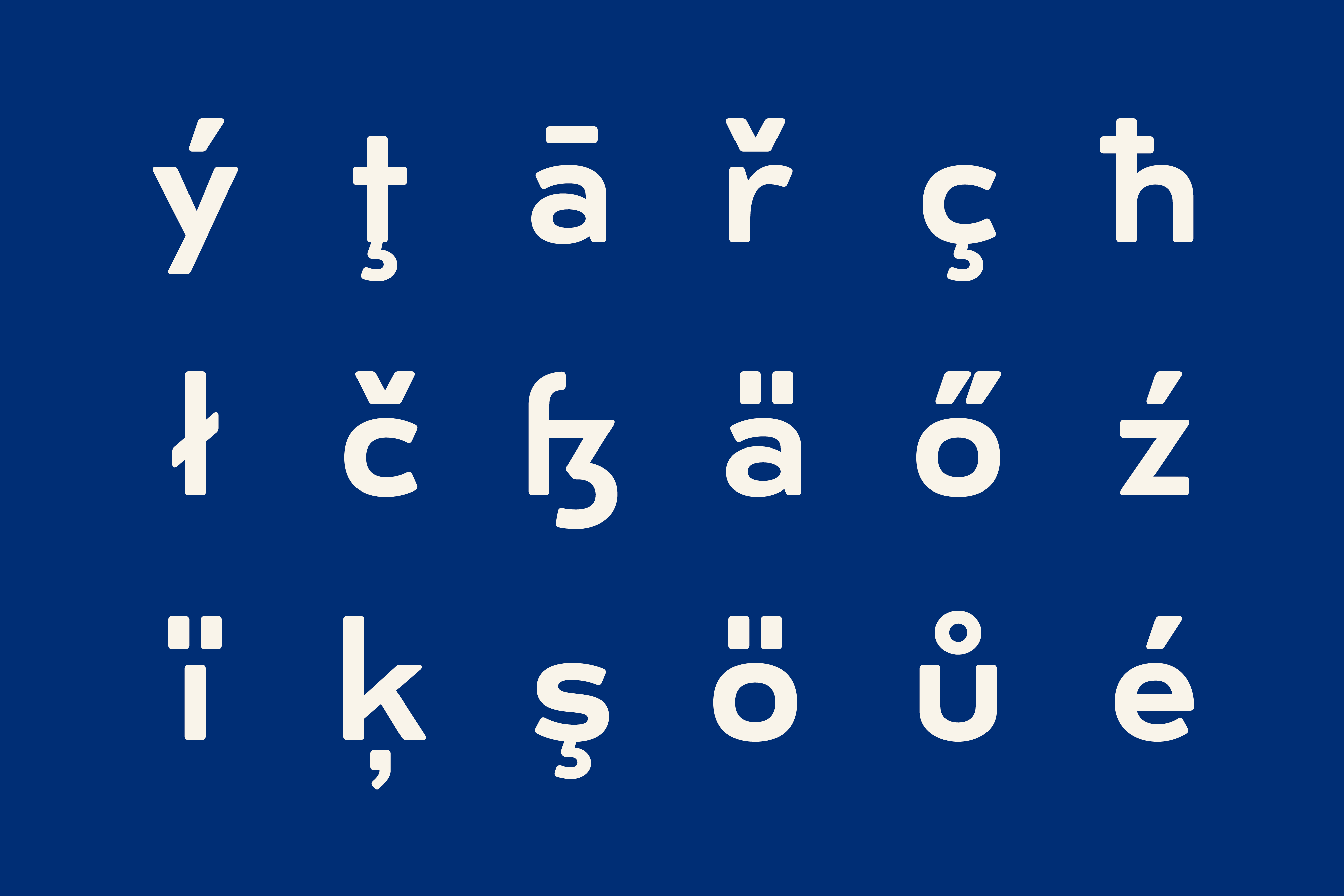
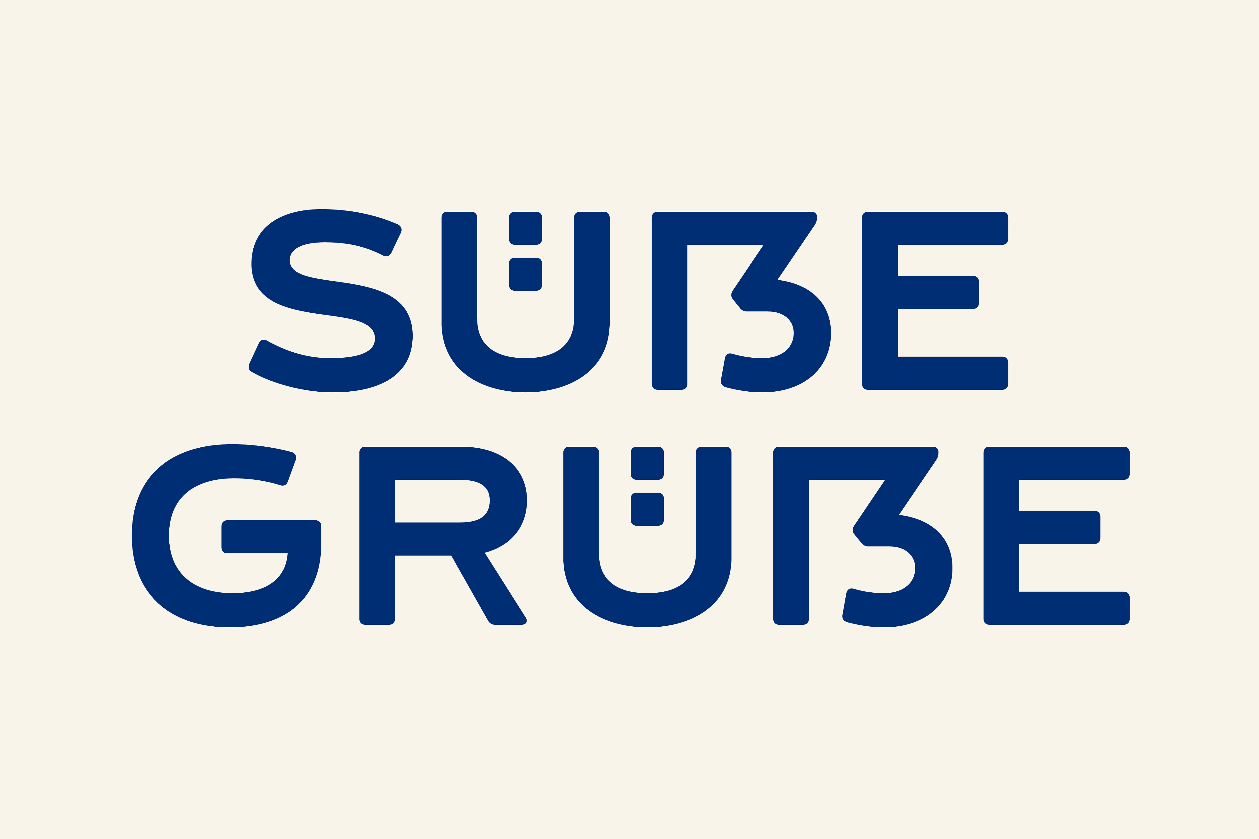
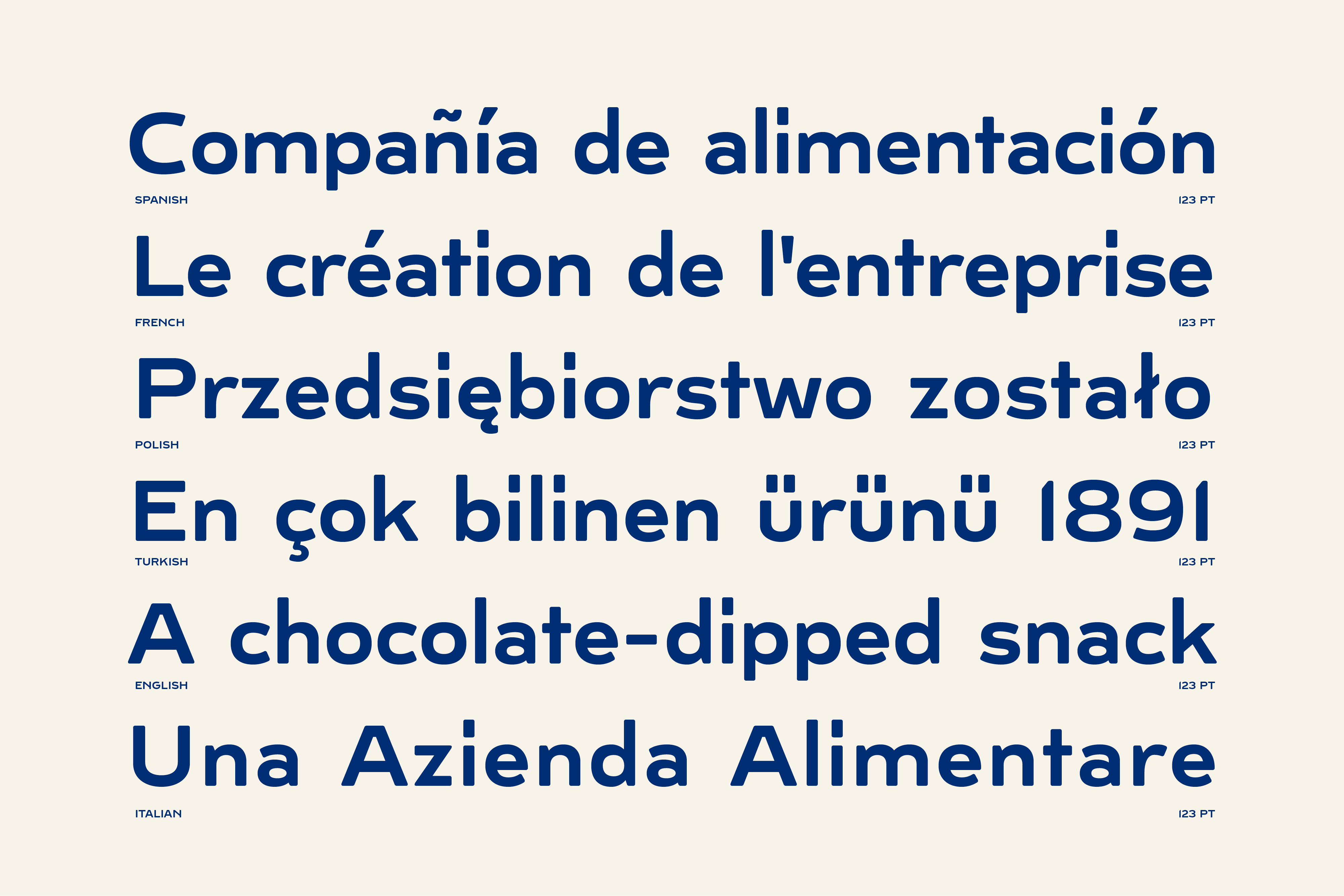
Drawing inspiration from old advertising posters from the early 20th century, Bahlsen Grotesk comes with wide proportions and features like open apertures, tapered connections on lower and uppercase Z and a low x-height. In order to create a warm appearance, corners were slightly rounded.
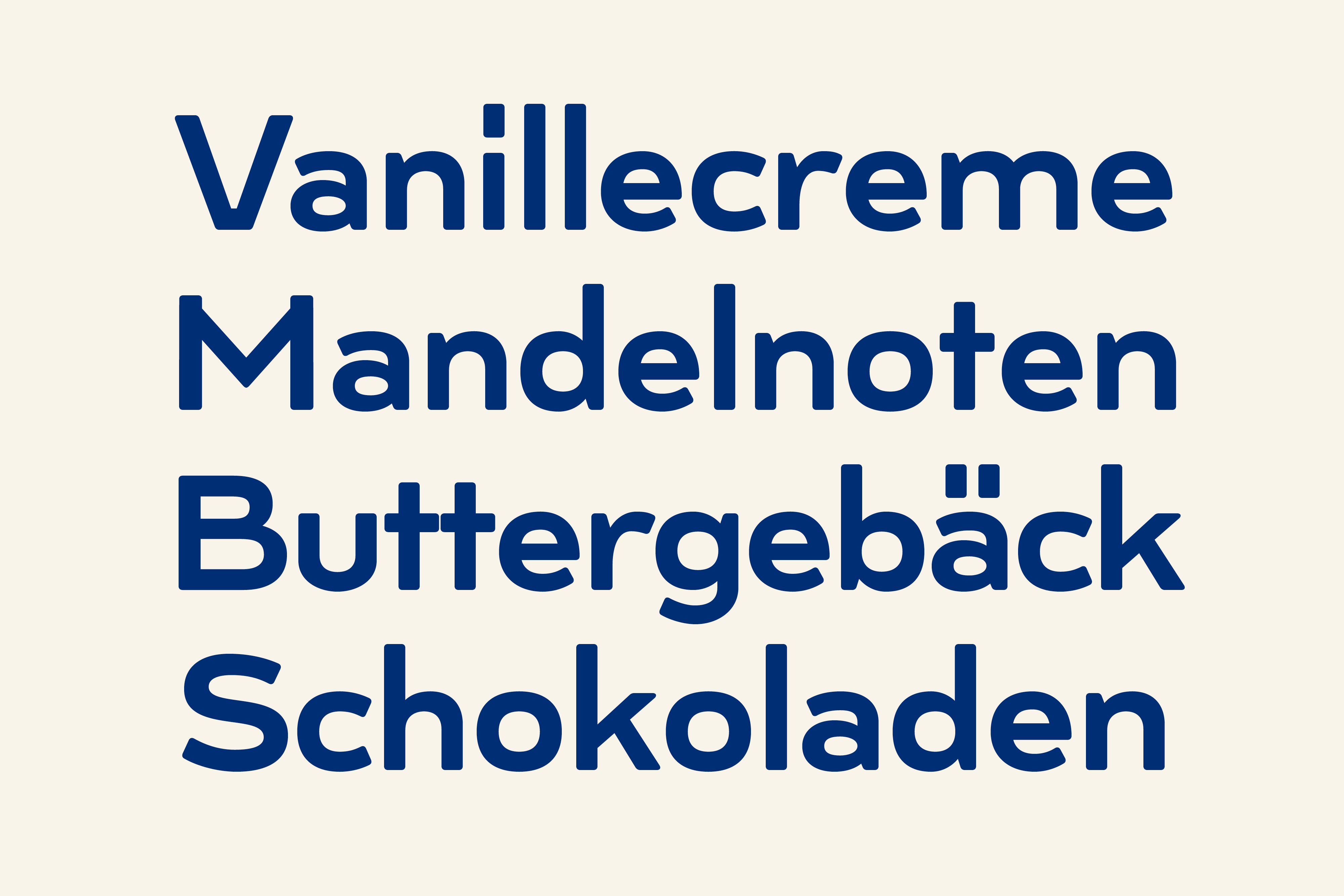
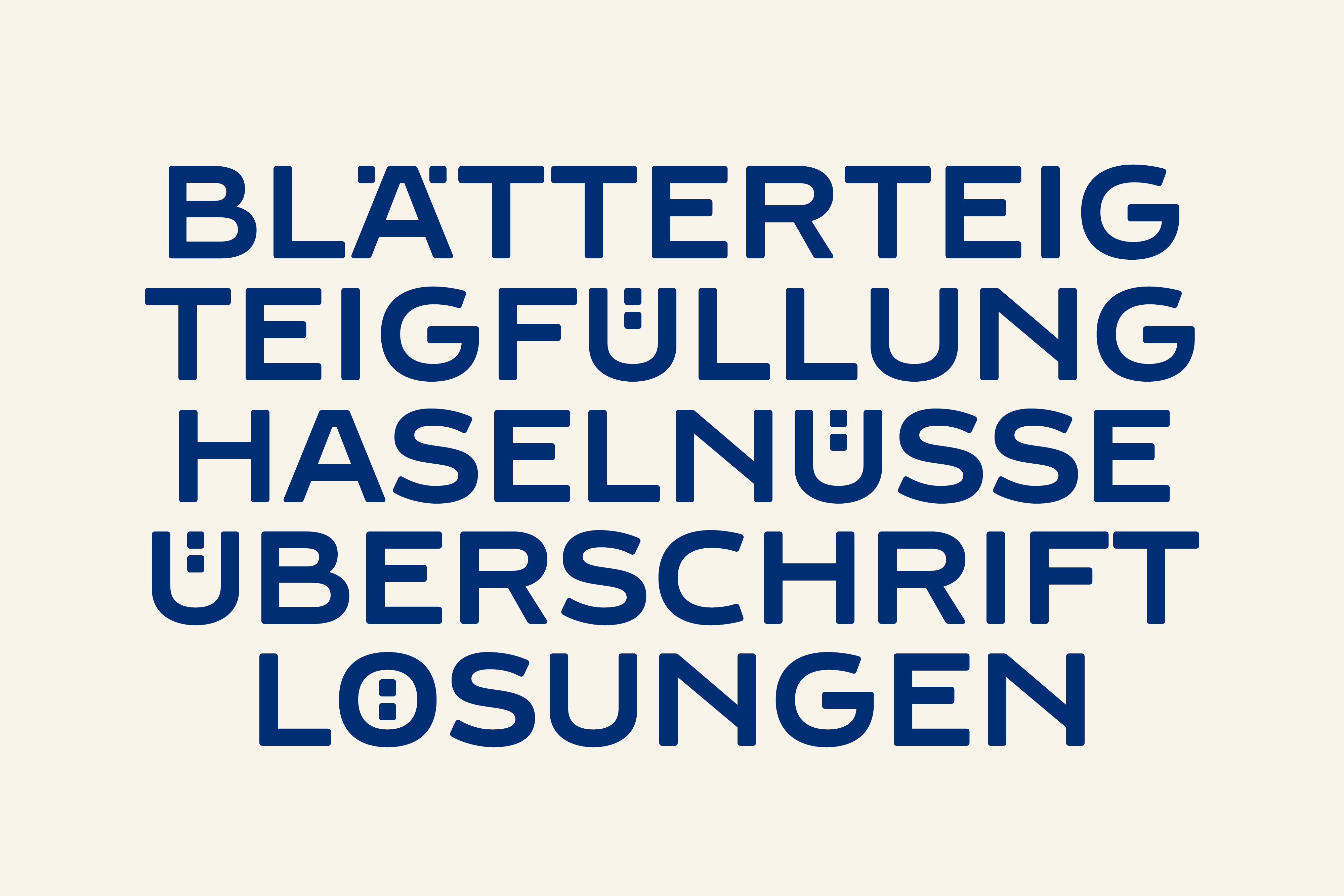
Headlines
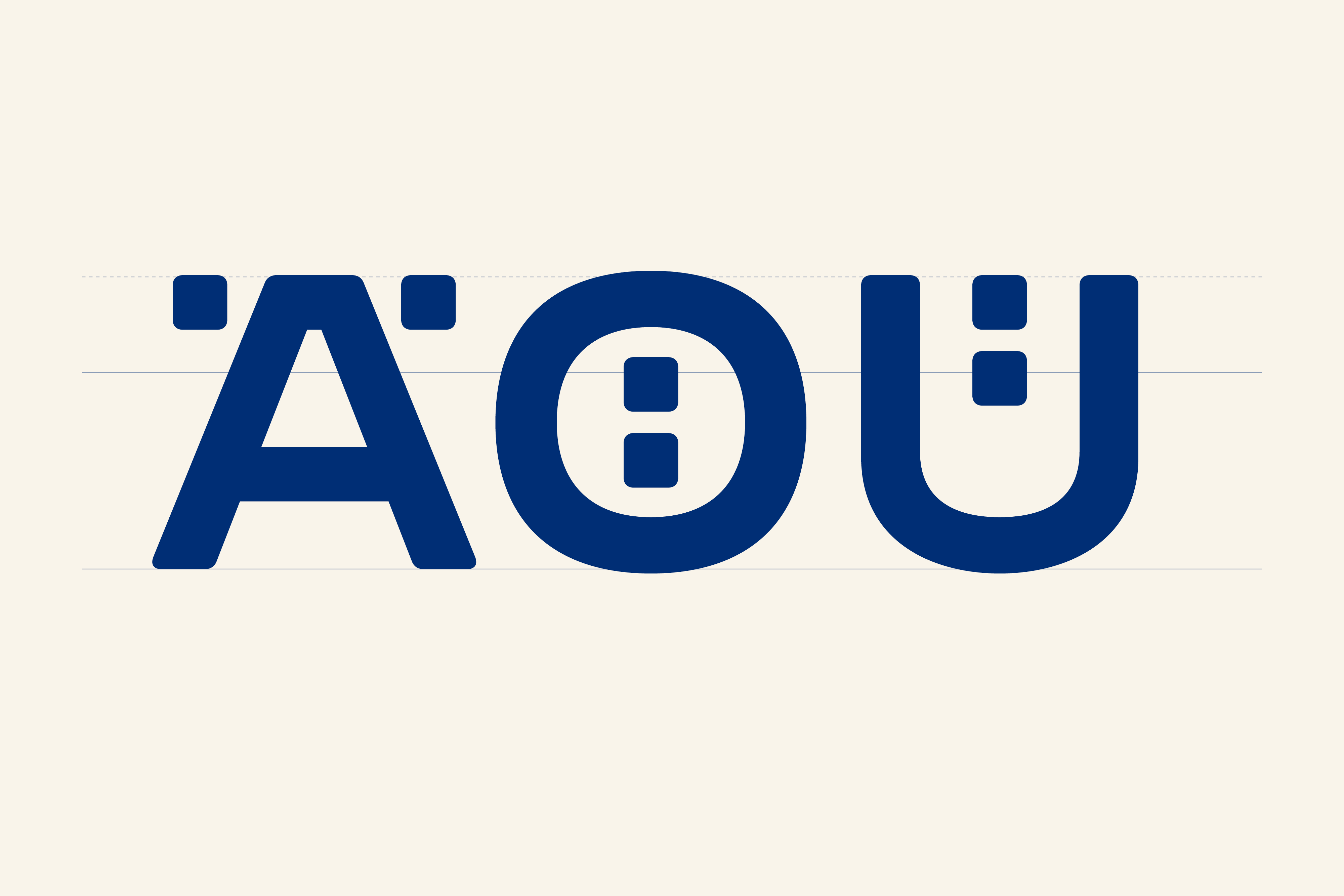
Diacritic marks on glyphs like Ä Ö or Ü were designed to work with a narrow line-height.
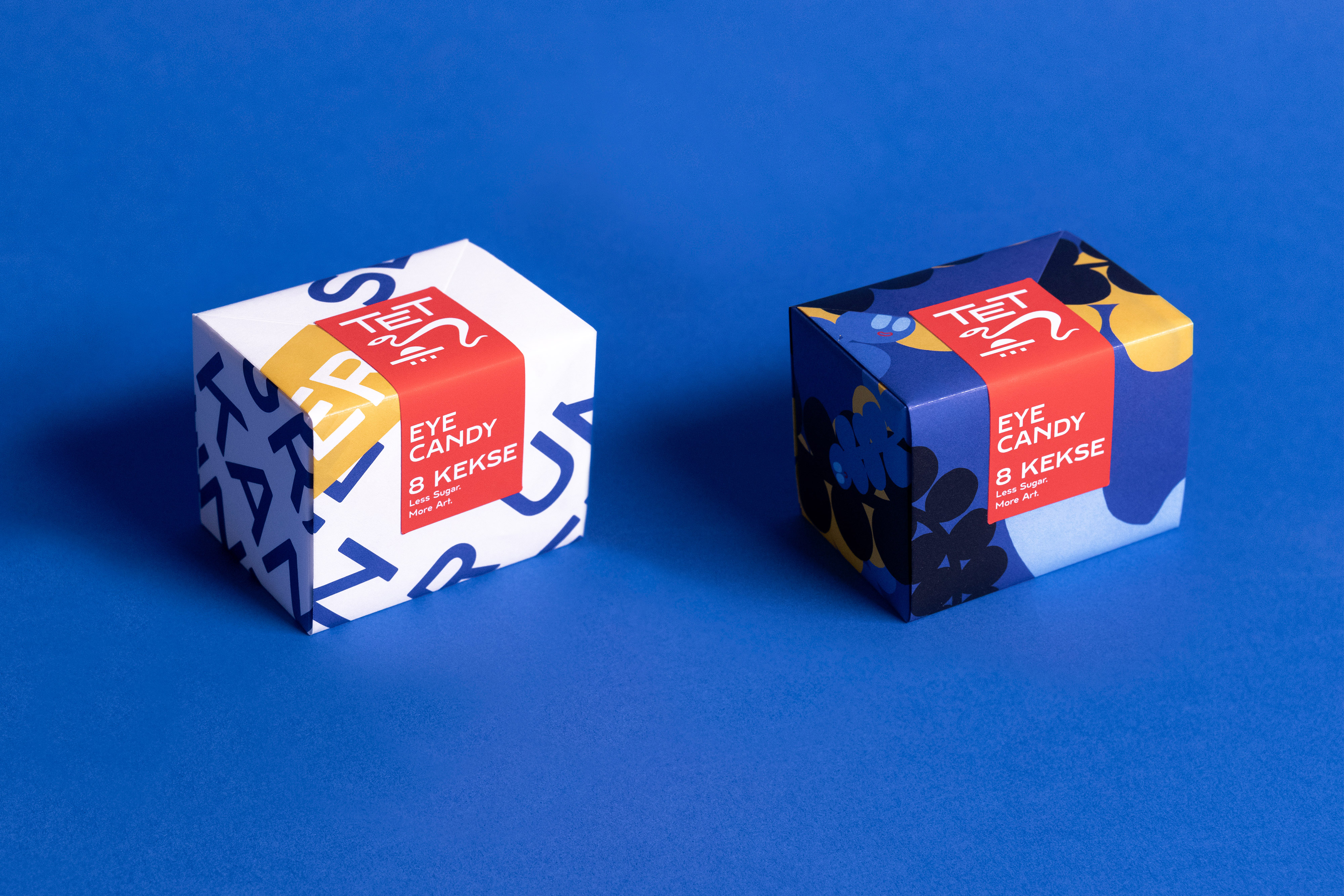
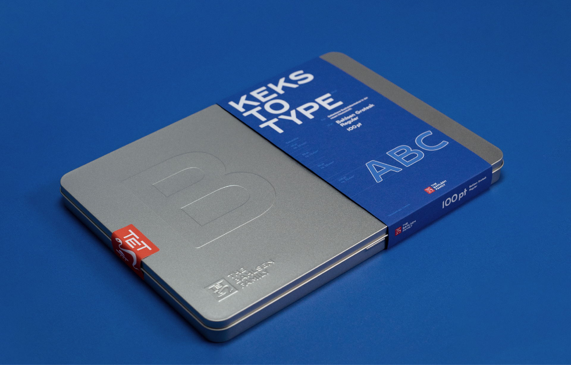
Special Edition
Ingredients: a resourceful master baker, the innovative experimental bakery at the head office in Hanover and a perfect recipe. The world’s first baked corporate typeface is fresh out of the oven – including customized packaging.
If you want to talk about a project or want to know more about what we can do, please send a mail to contact@renebieder.com.