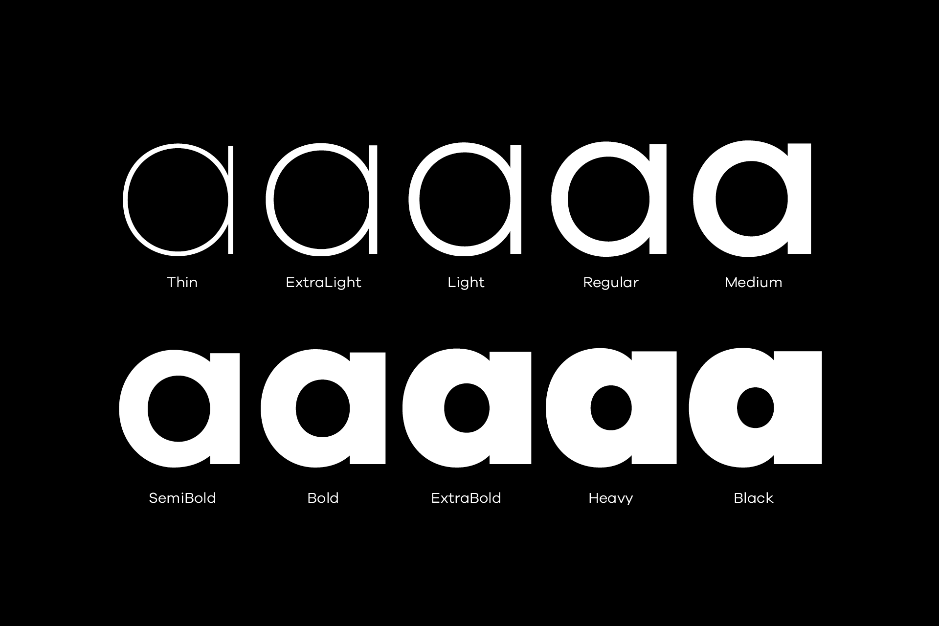
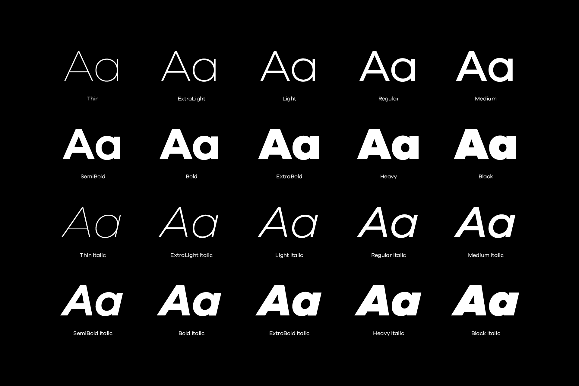
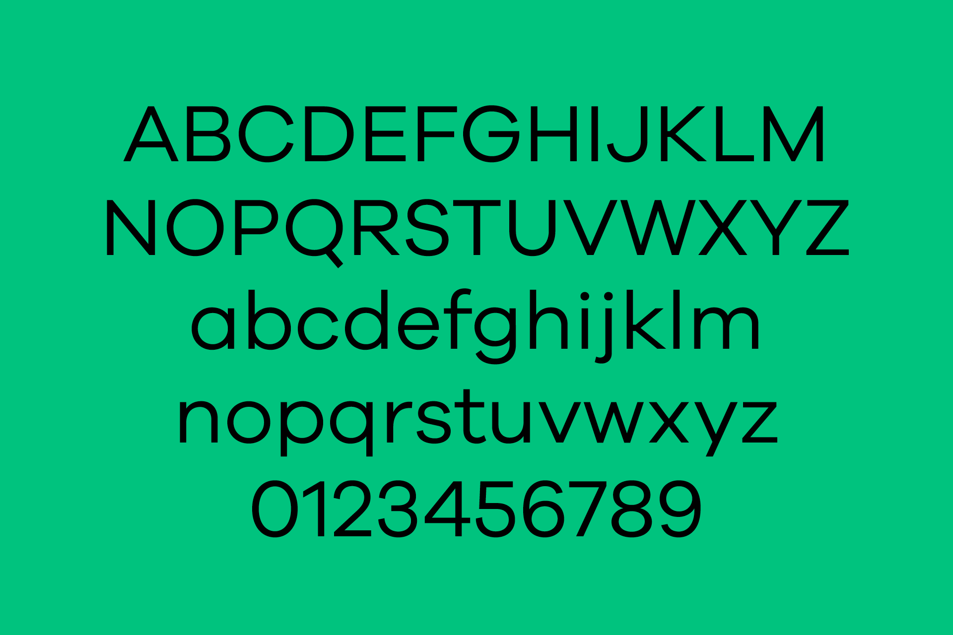
Galano is a geometric sans in the tradition of Futura, Avant Garde, Avenir and alike. It has a modern streak which is the result of a harmonization of width and height, especially visible in the lowercase letters, to support legibility. The family comes in 10 weights plus matching italics.
Buy Galano on Myfonts
Download the Testfonts
Characteristics
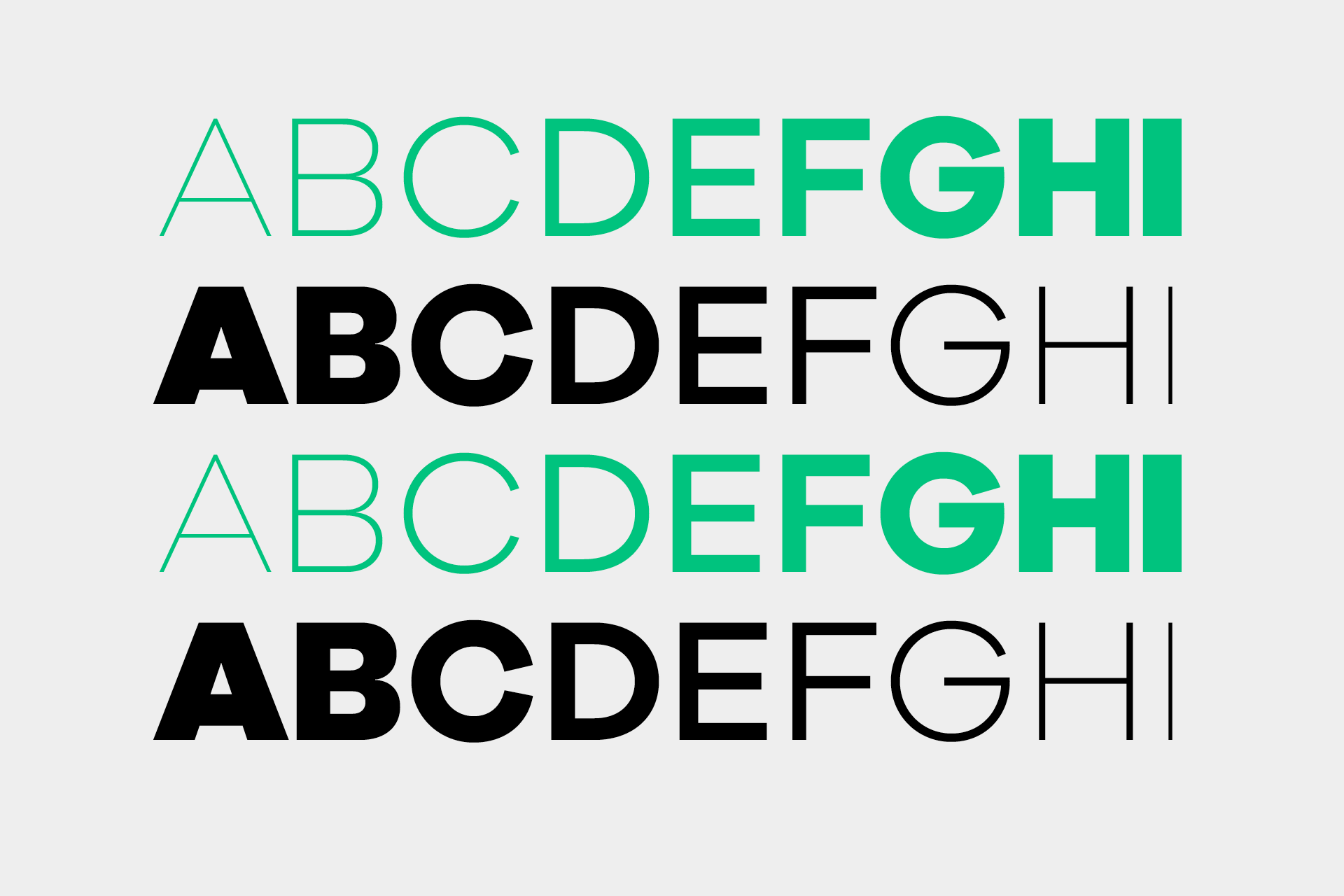
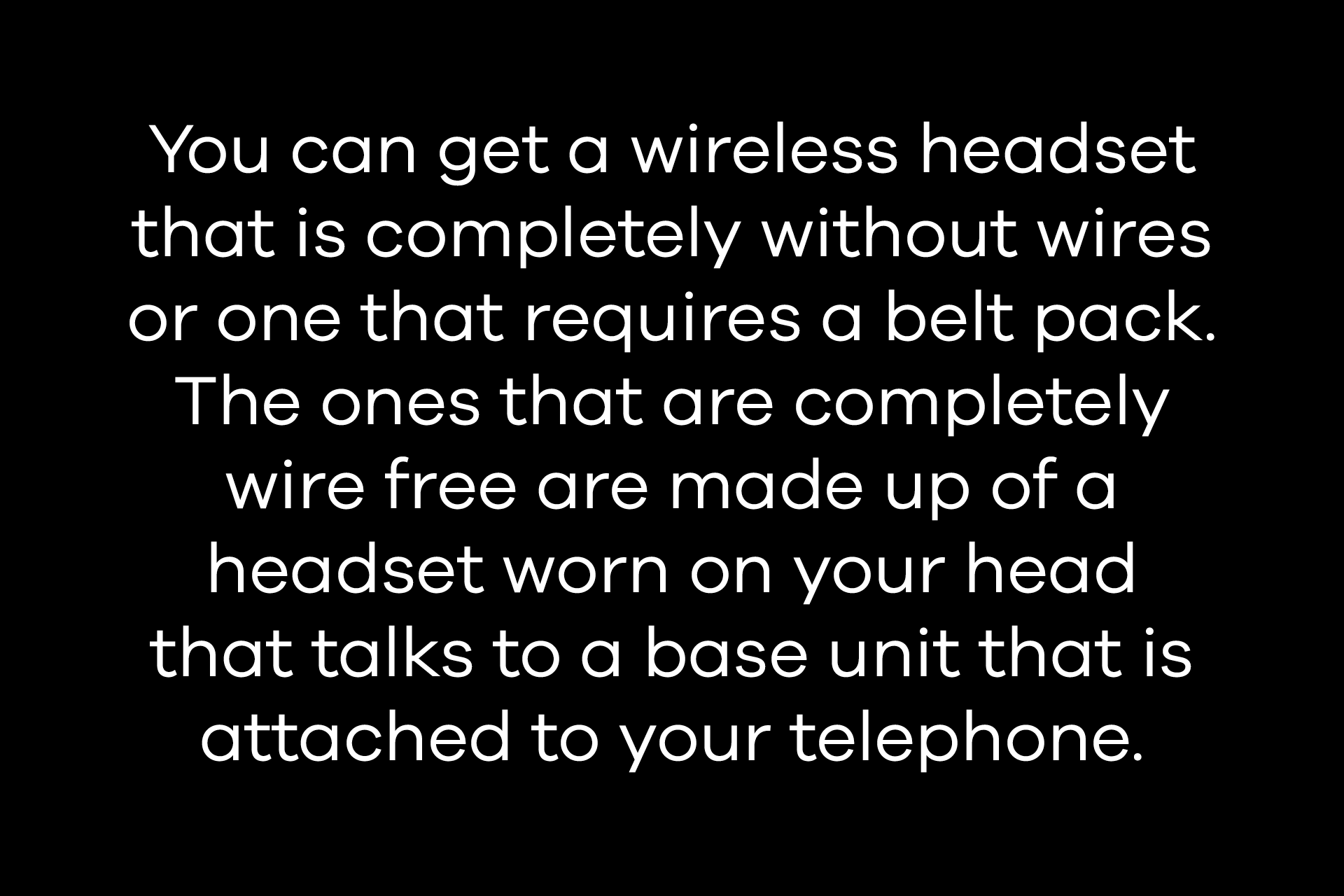
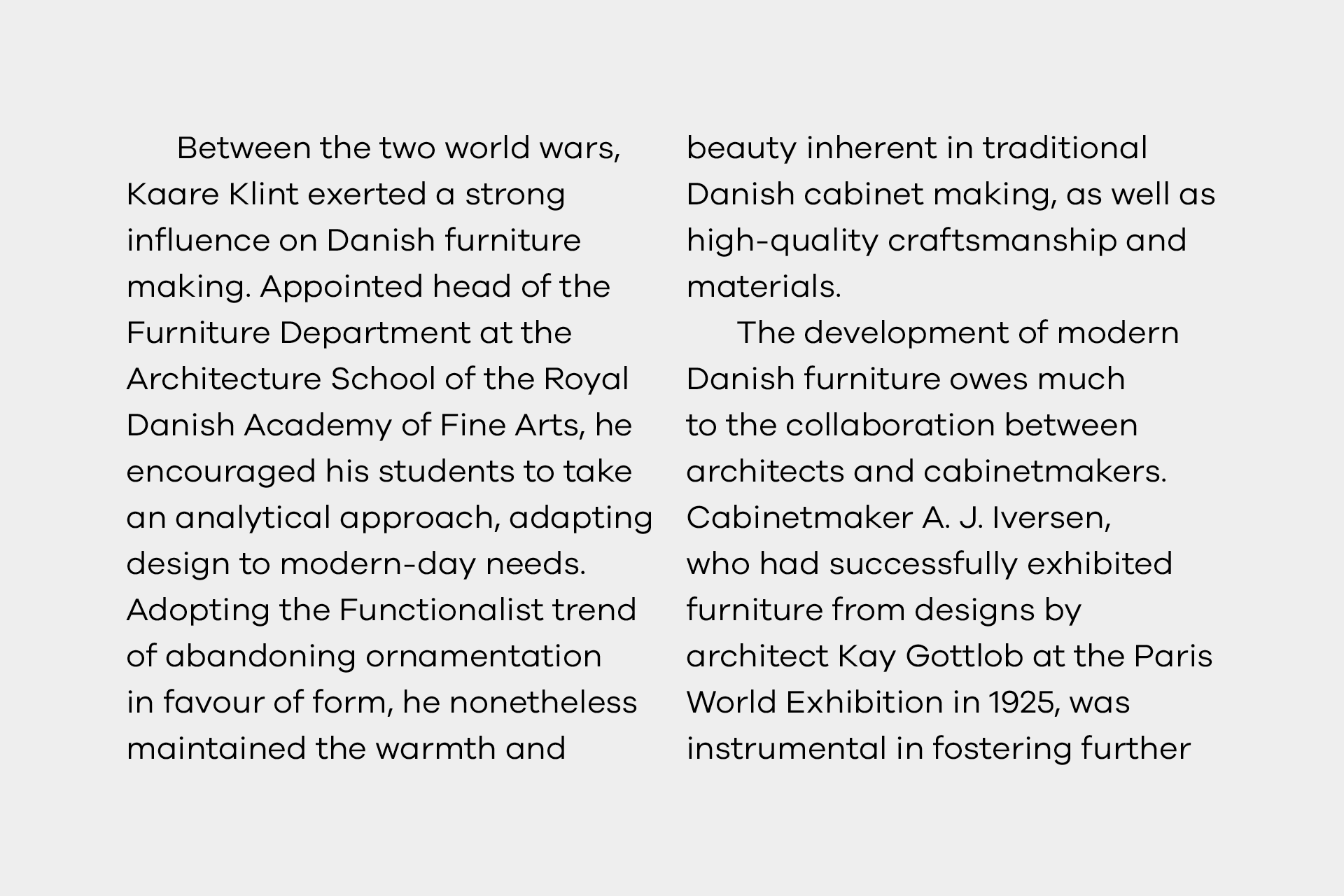
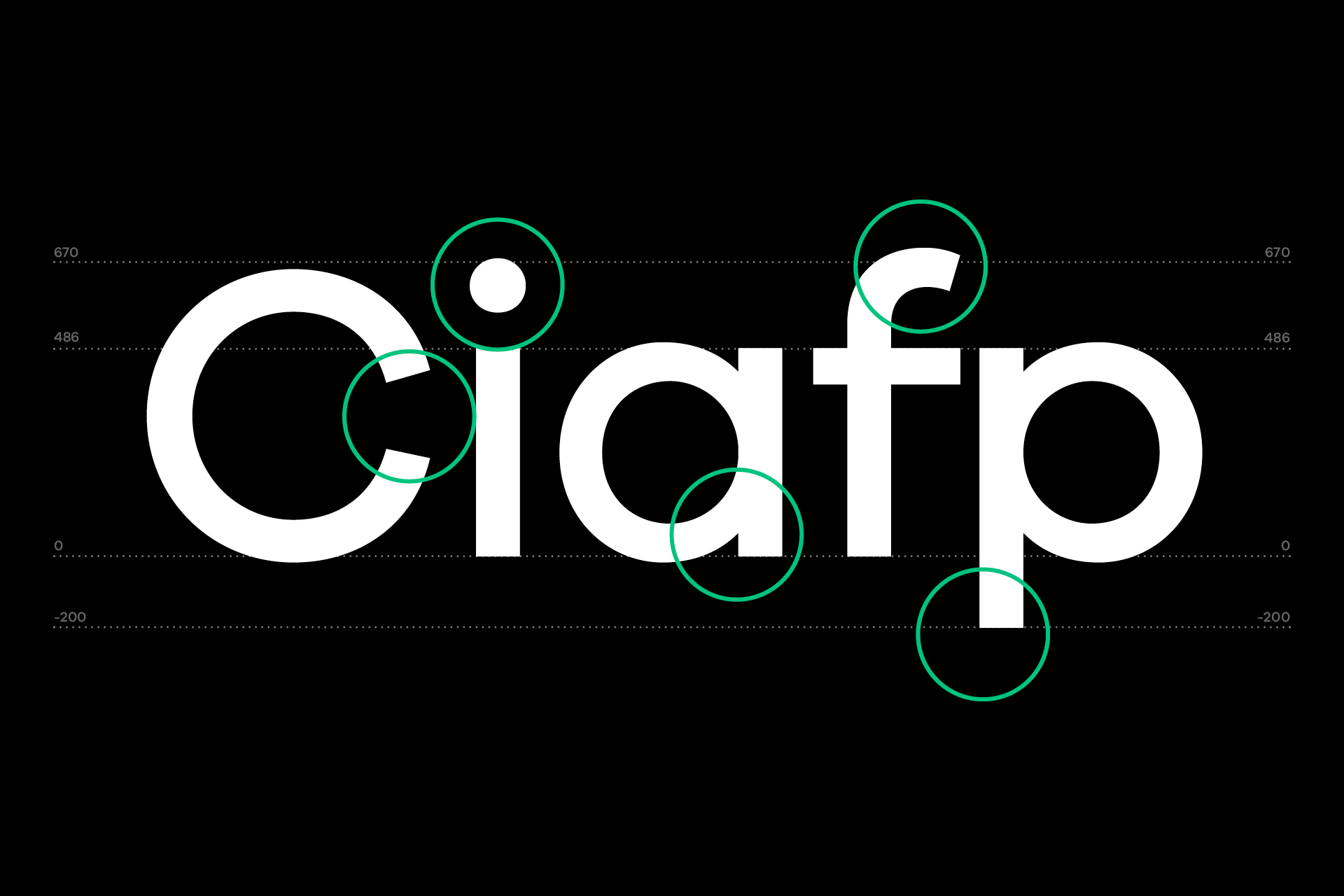
Galano features circular shapes and a large x-height, resulting in a highly legible font. The geometric appearance is combined with a compact look, which is the result of a short descender/ascender as well as closed apertures.
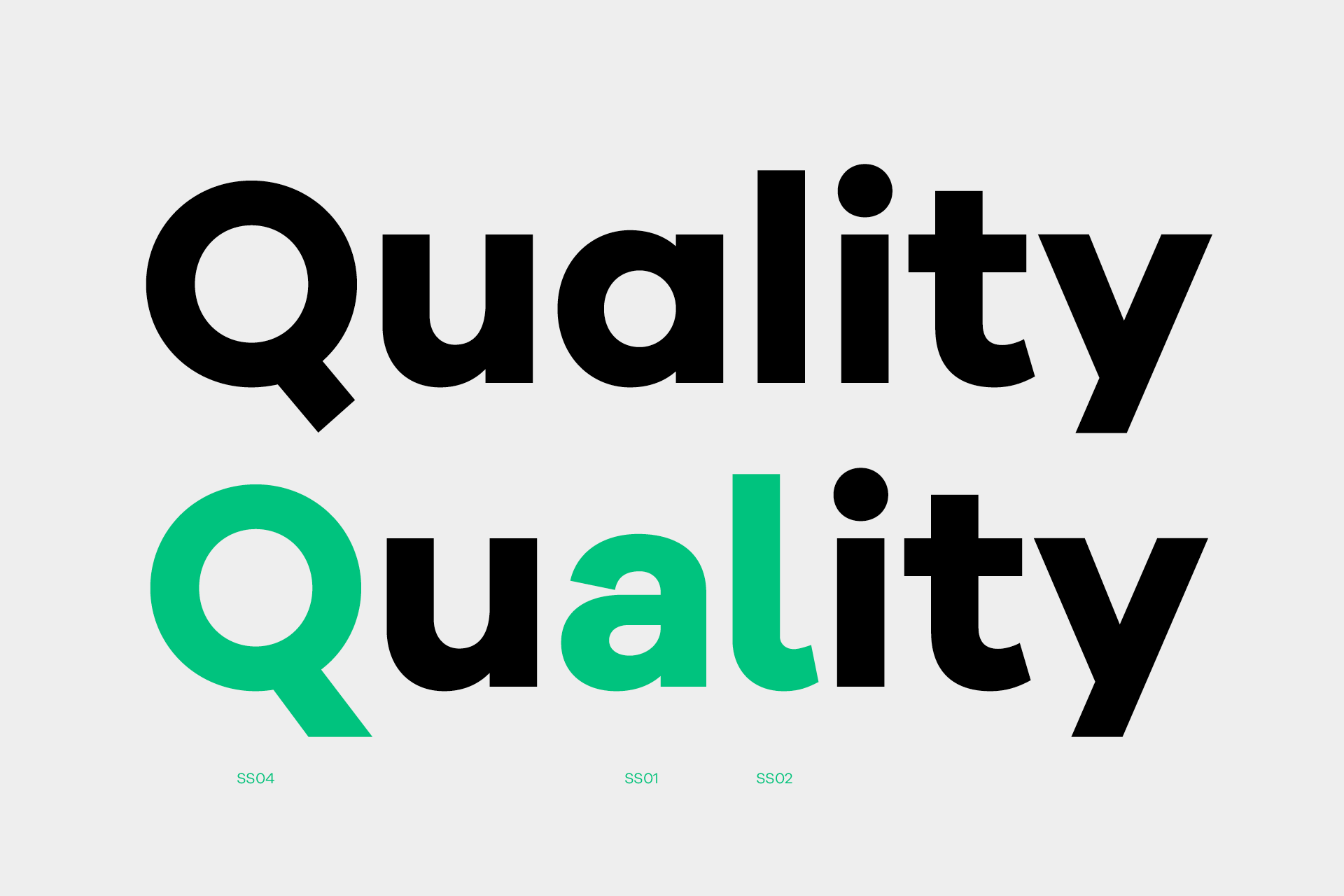
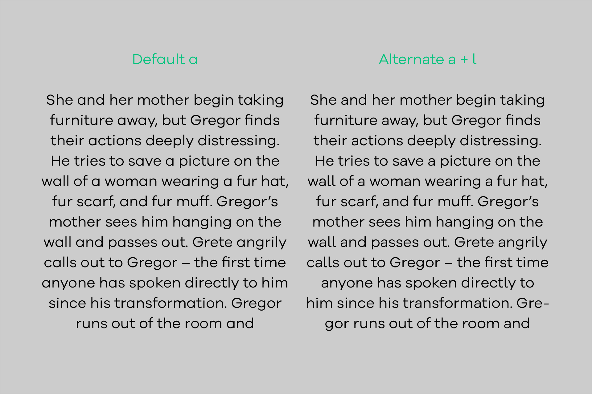
Alternates
During the design process, multiple variations of one character come and go. Only the ones that match my overarching concept best, make it into the final selection. But what if someone else decides differently? Or a specific task requires a different design? That’s what the alternate characters are here for! Choose from five different alternative characters the ones that match your design best.

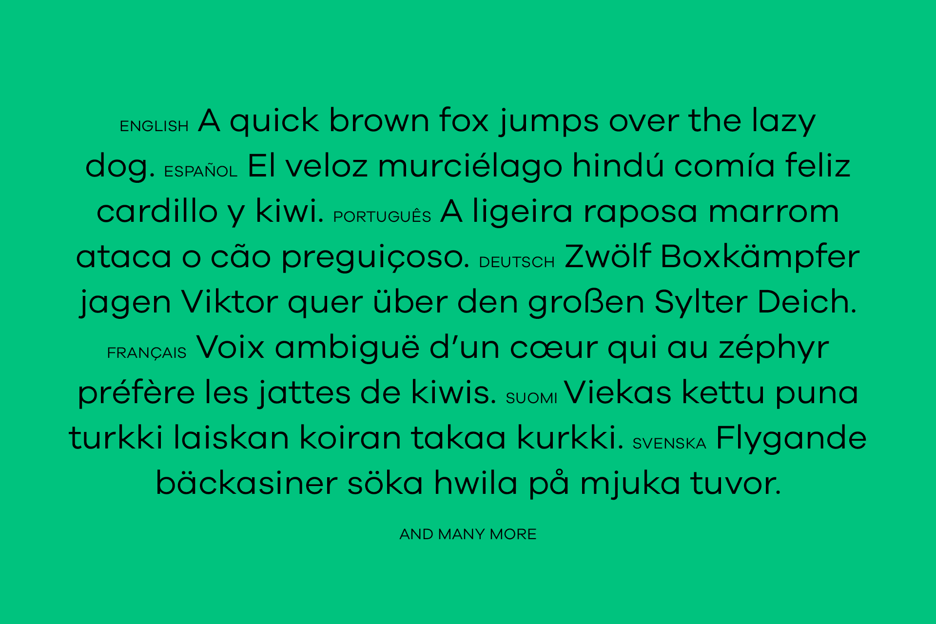
Languages
Bonjour, gracias, dank je wel. It’s all there. Plus more than 80 other languages.
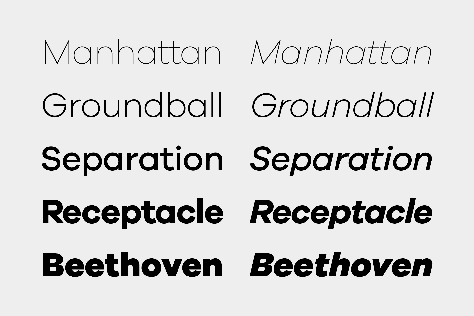
Weights
The Galano family comes in ten weights plus matching italics. Its mid-weights are optimized for usage in long paragraphs, while the bolder weights create a compact and confident look in headlines or short copy.