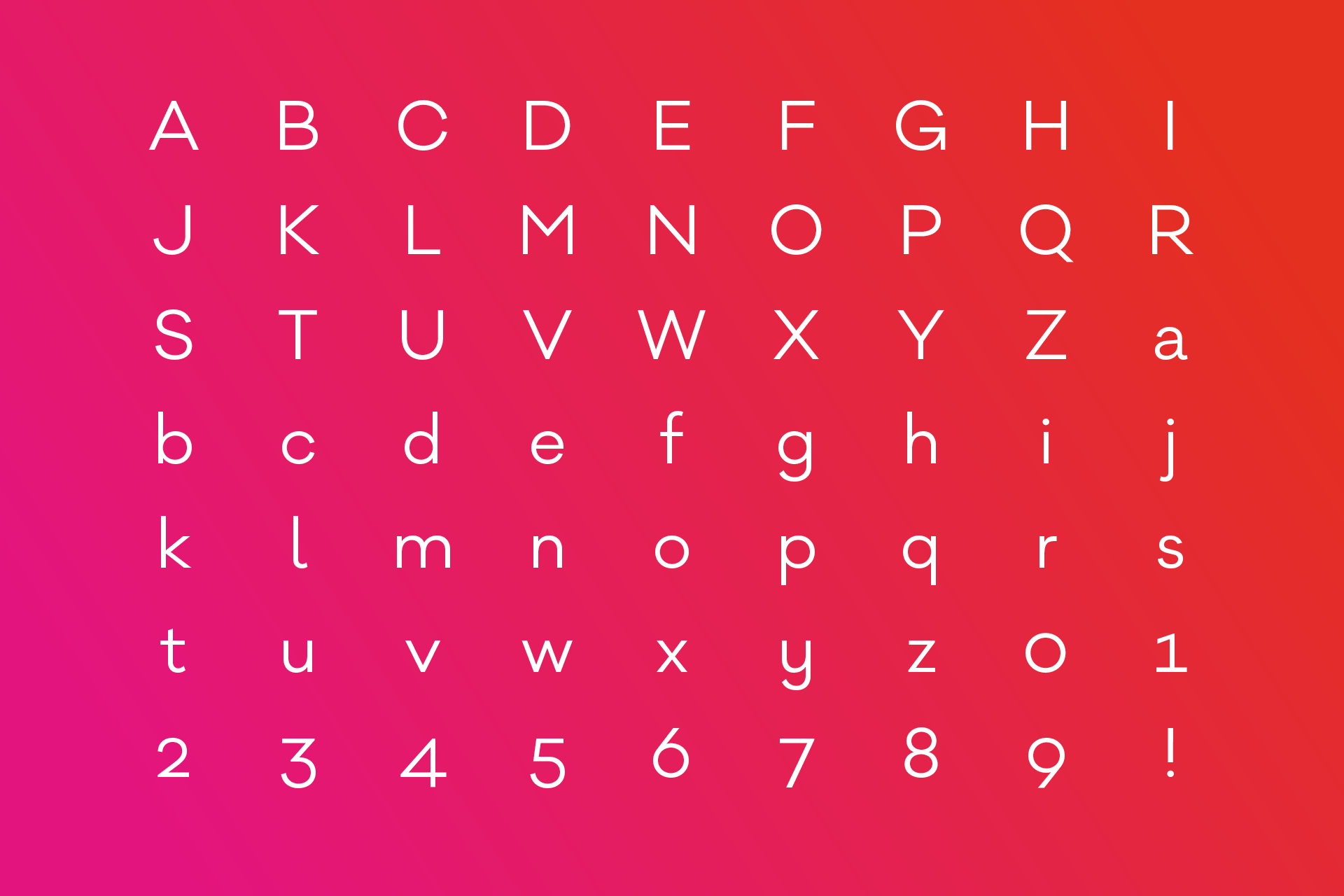
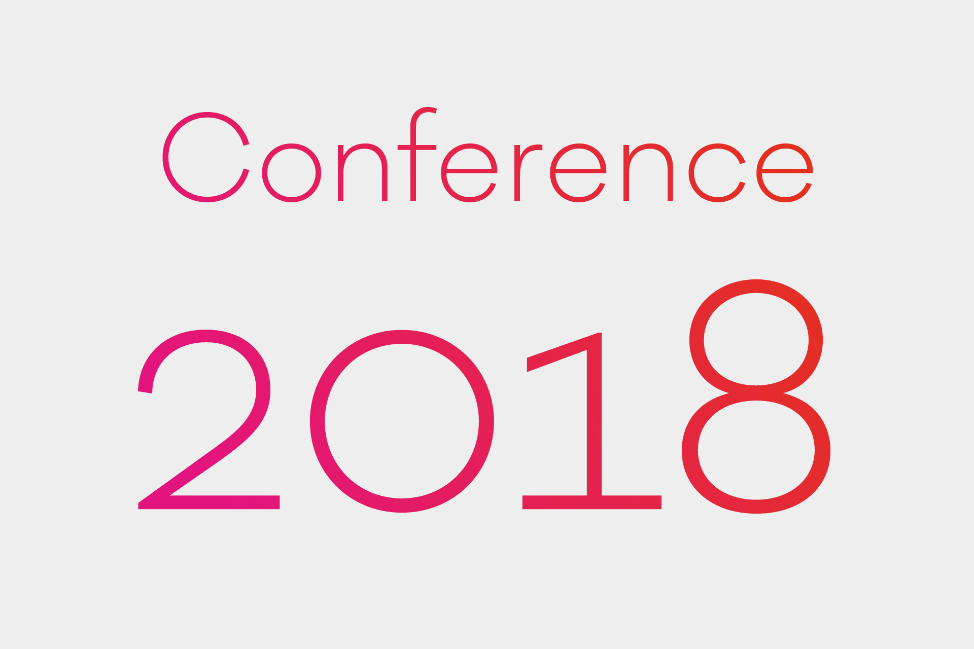
For the visual identity of the internationally renowned Design Conference “TYPO Berlin”, René Bieder was commissioned by studio adhoc, to design a custom version of the Galano family, working as the main font in all communication and on site branding of the 2018 edition of the Conference.
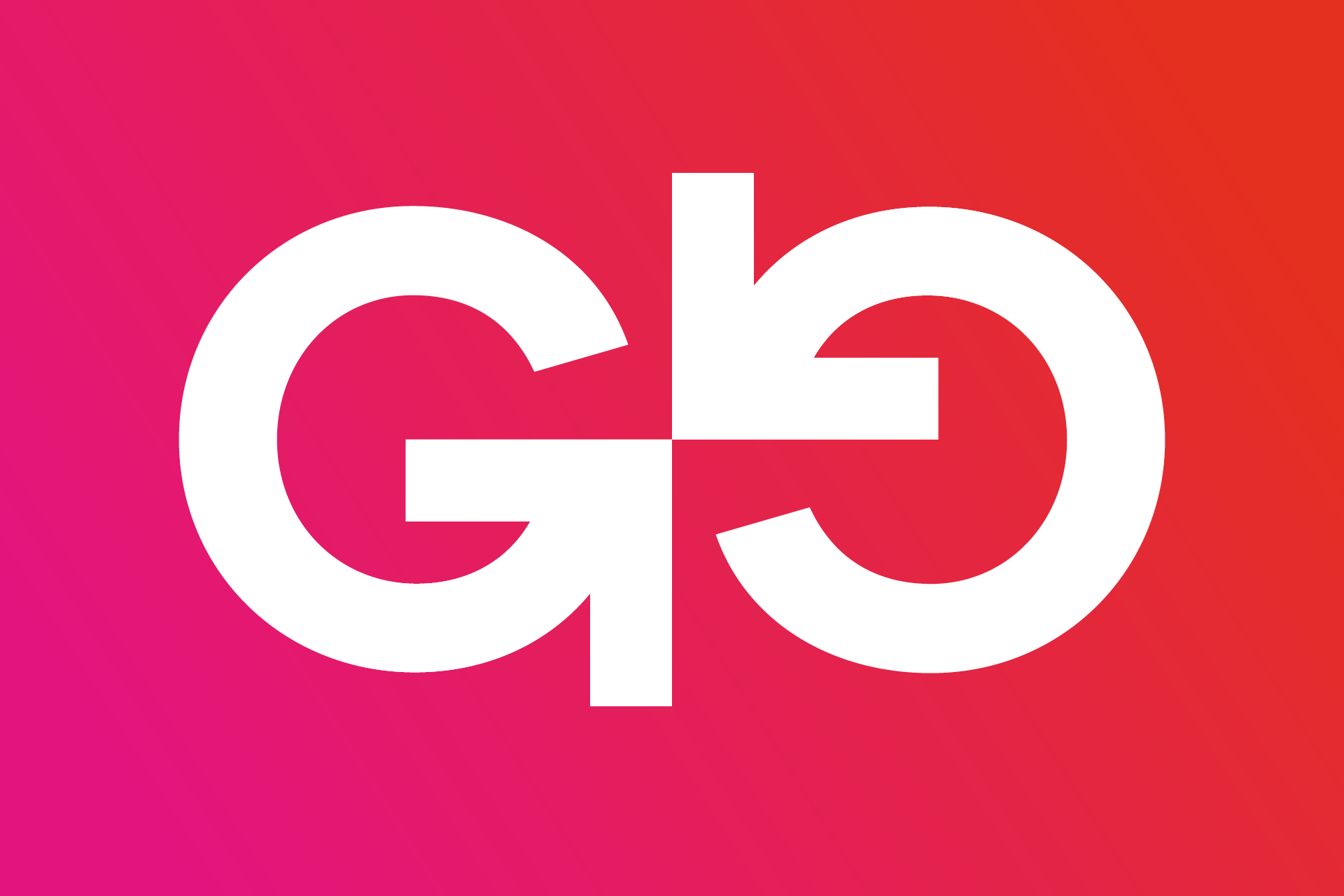
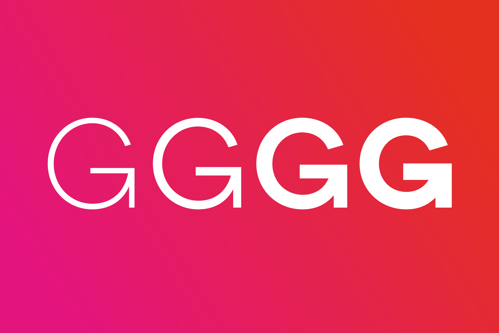
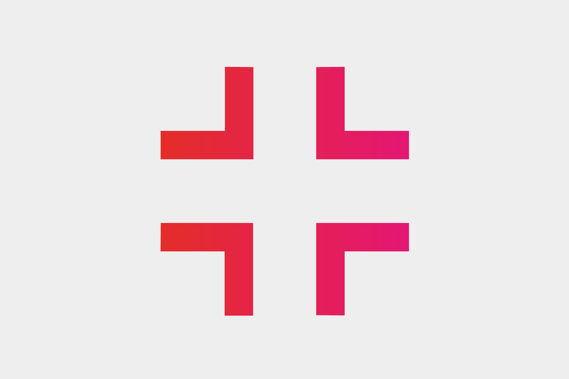
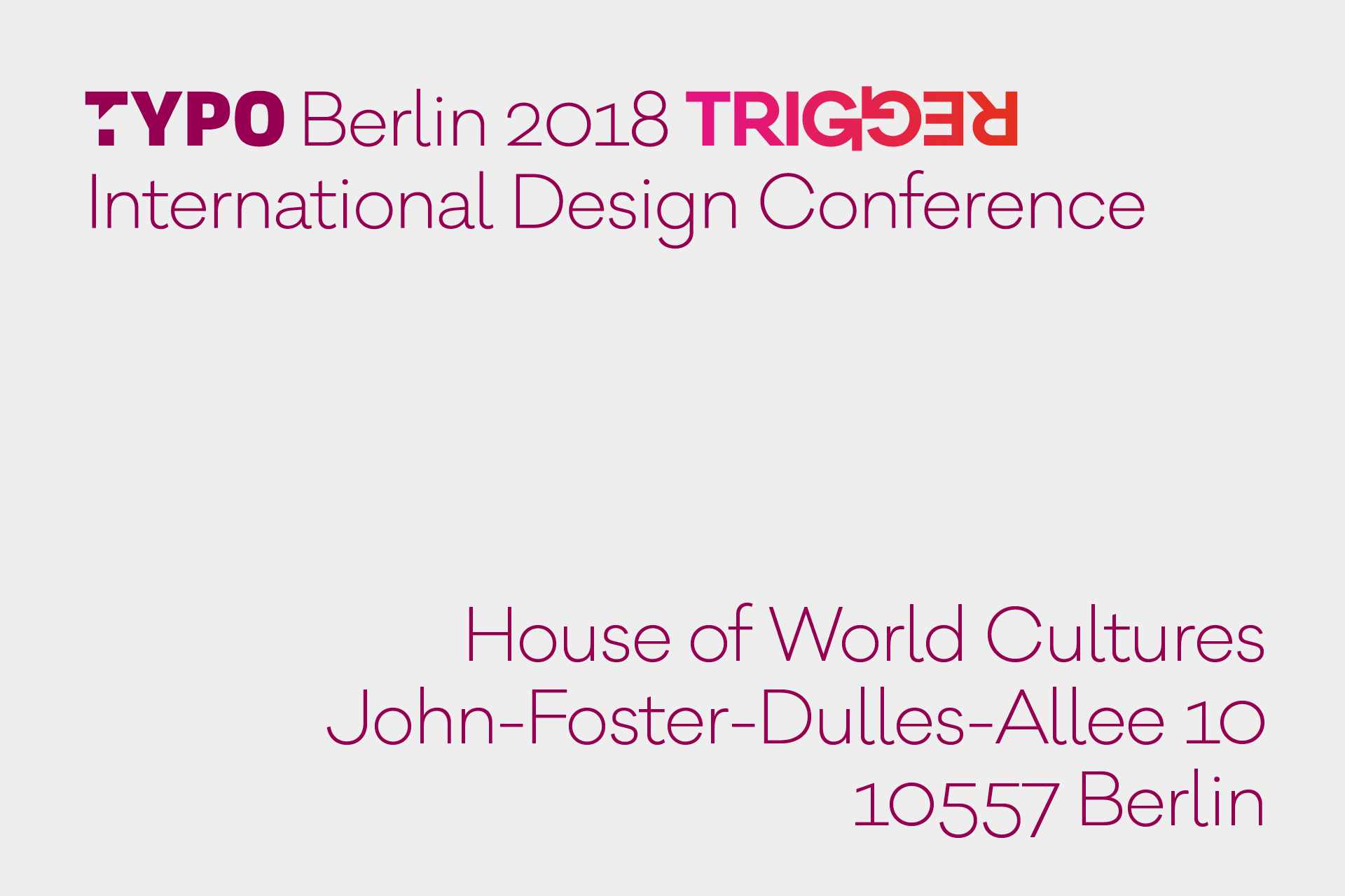
Studio adhoc came to us with a very clear brief, building around a mark composed by two uppercase G’s of the Galano Classic subfamily, resembling two pointing arrows.
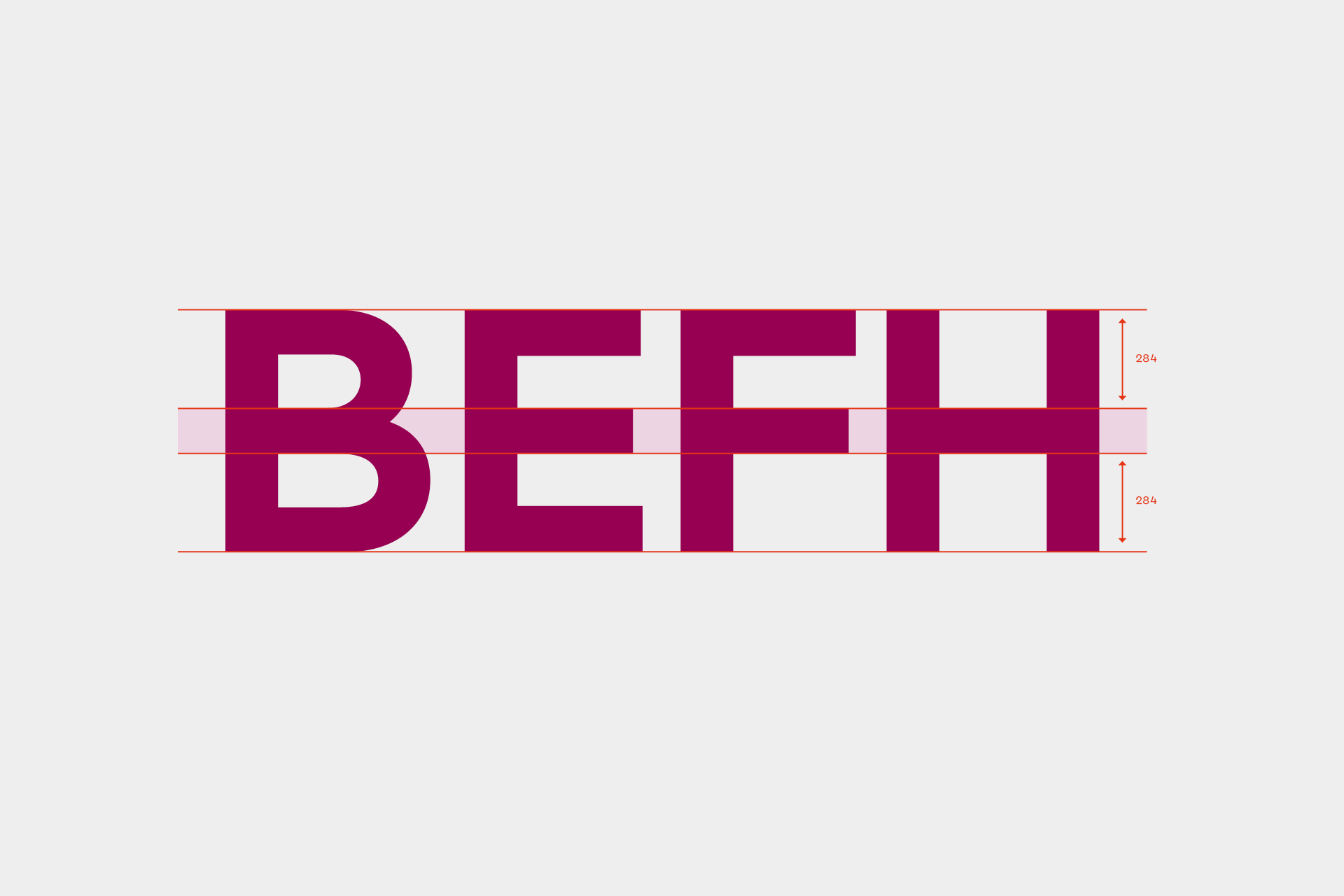
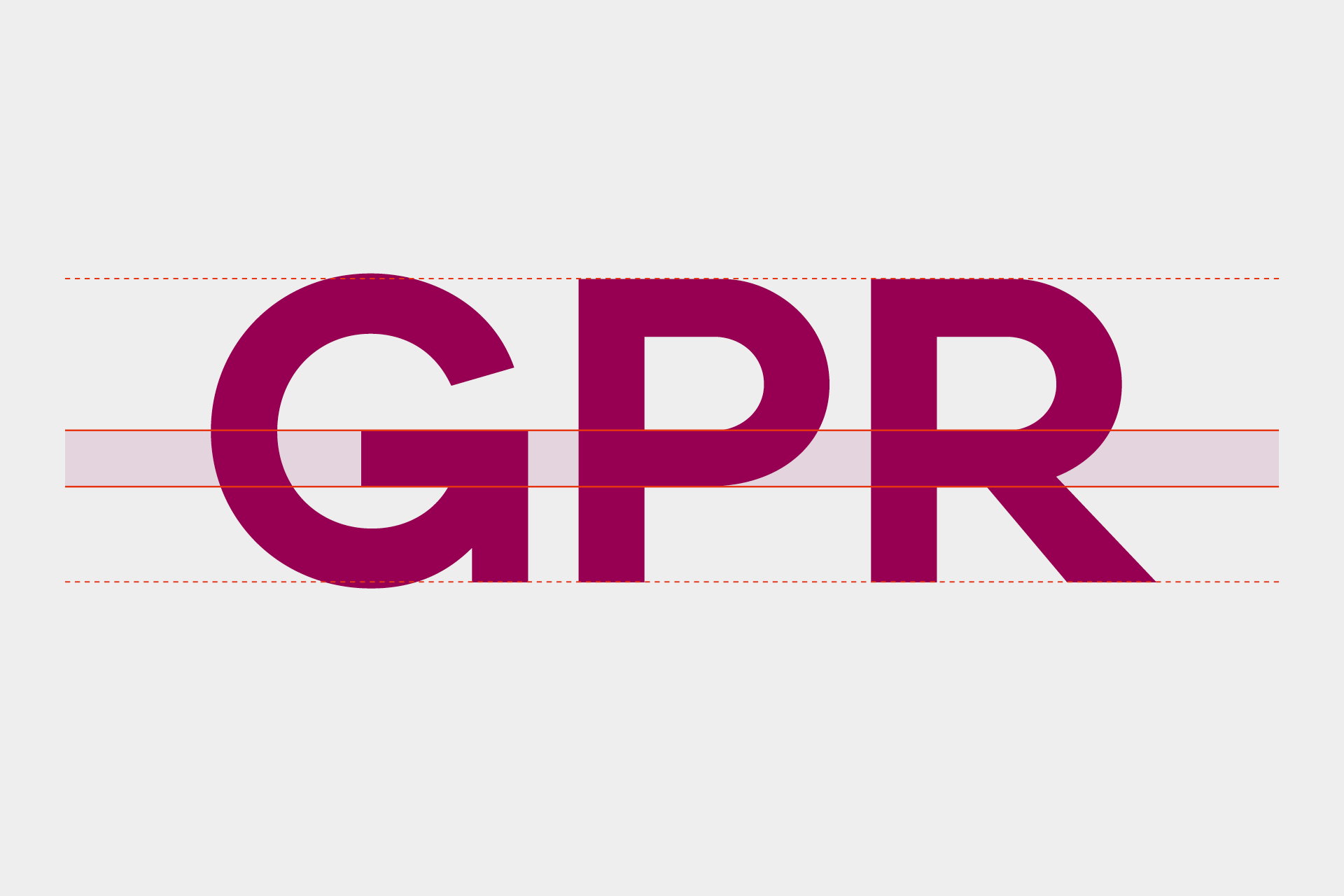
Further adjustments included a unification of crossbars on B E F H, as well as larger counter shapes on P and R, resulting in an overall logo-esque appearance.

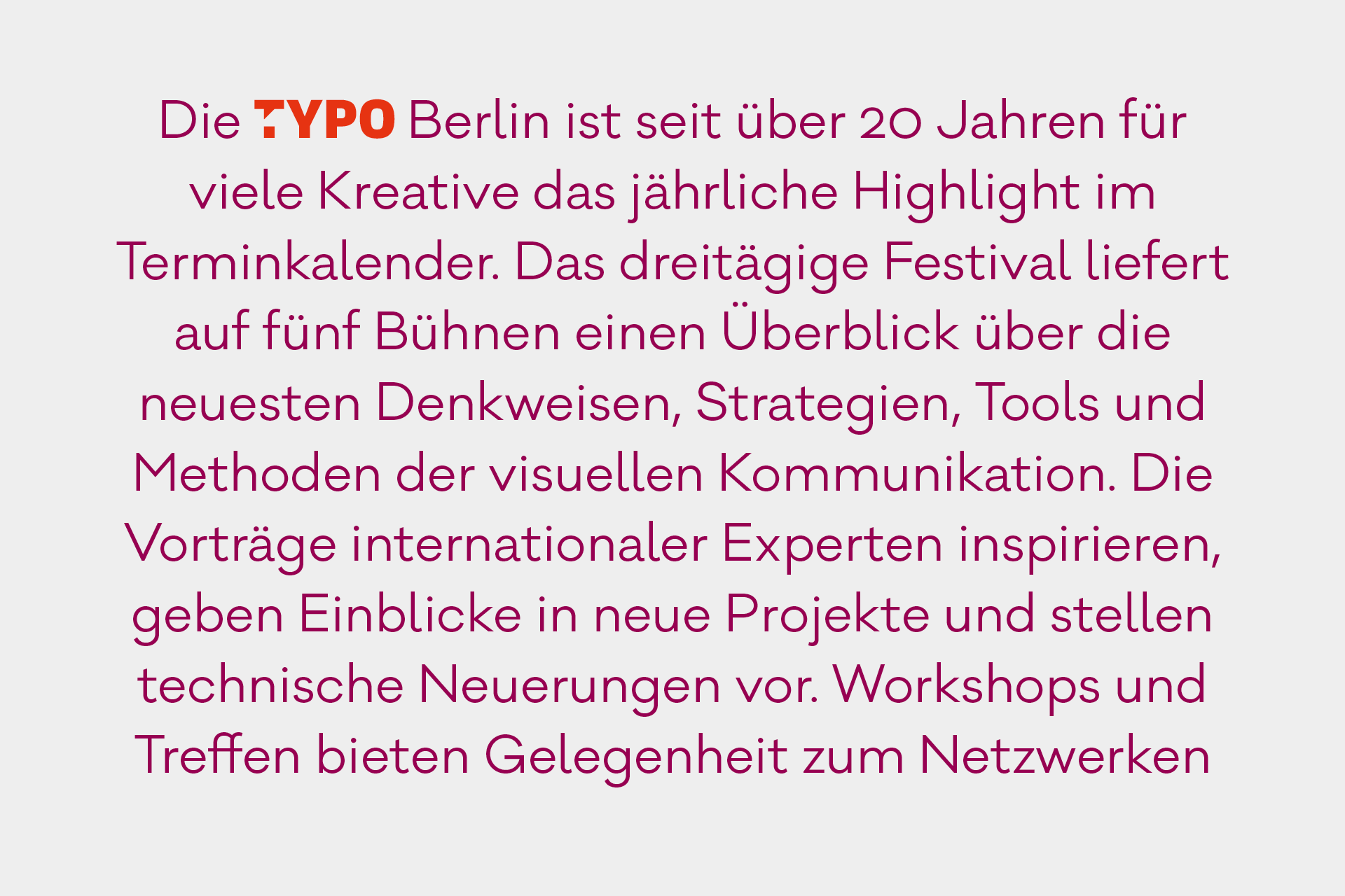
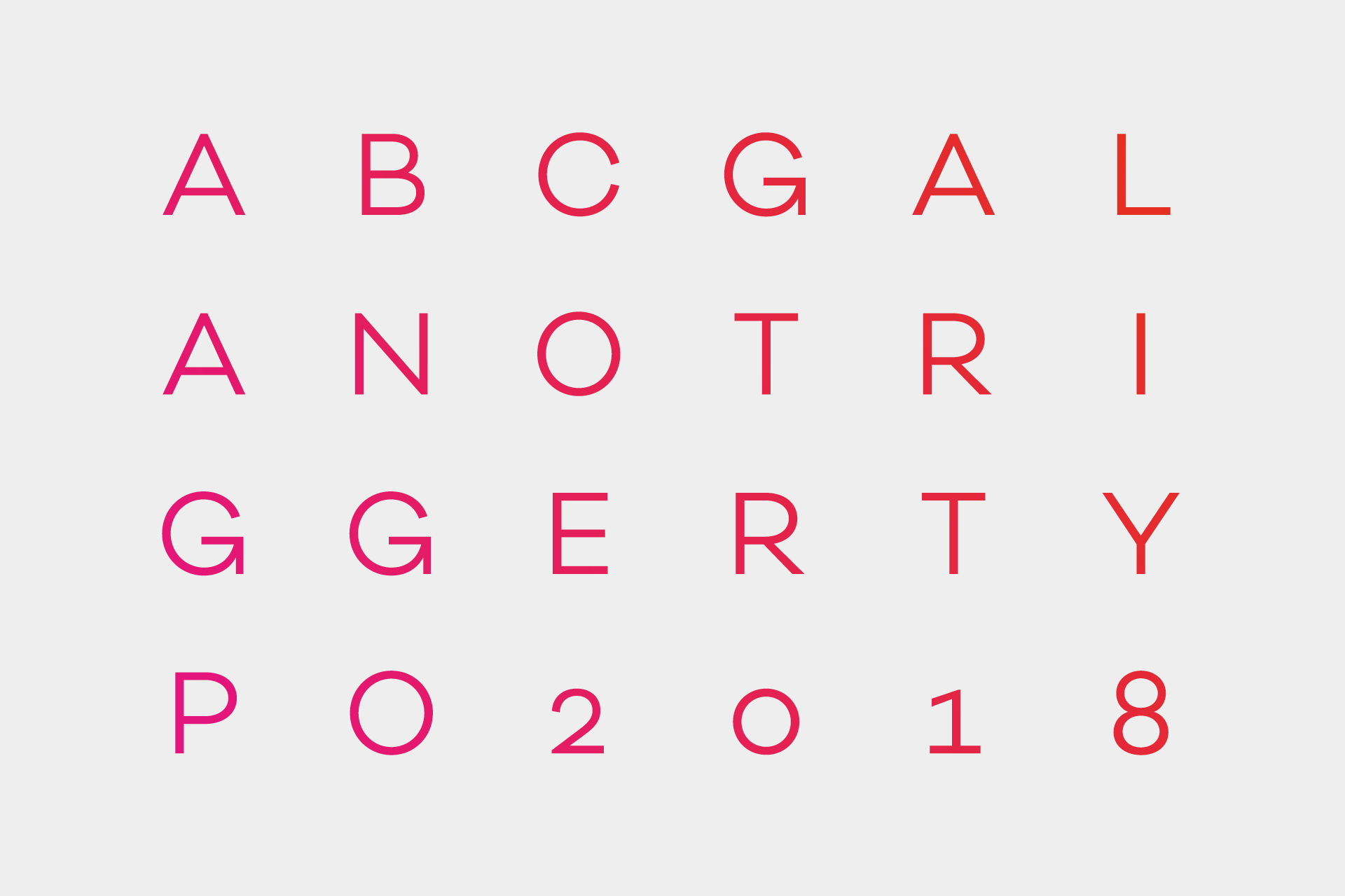
The family was delivered in four weights for usage in all communication in print and online media.
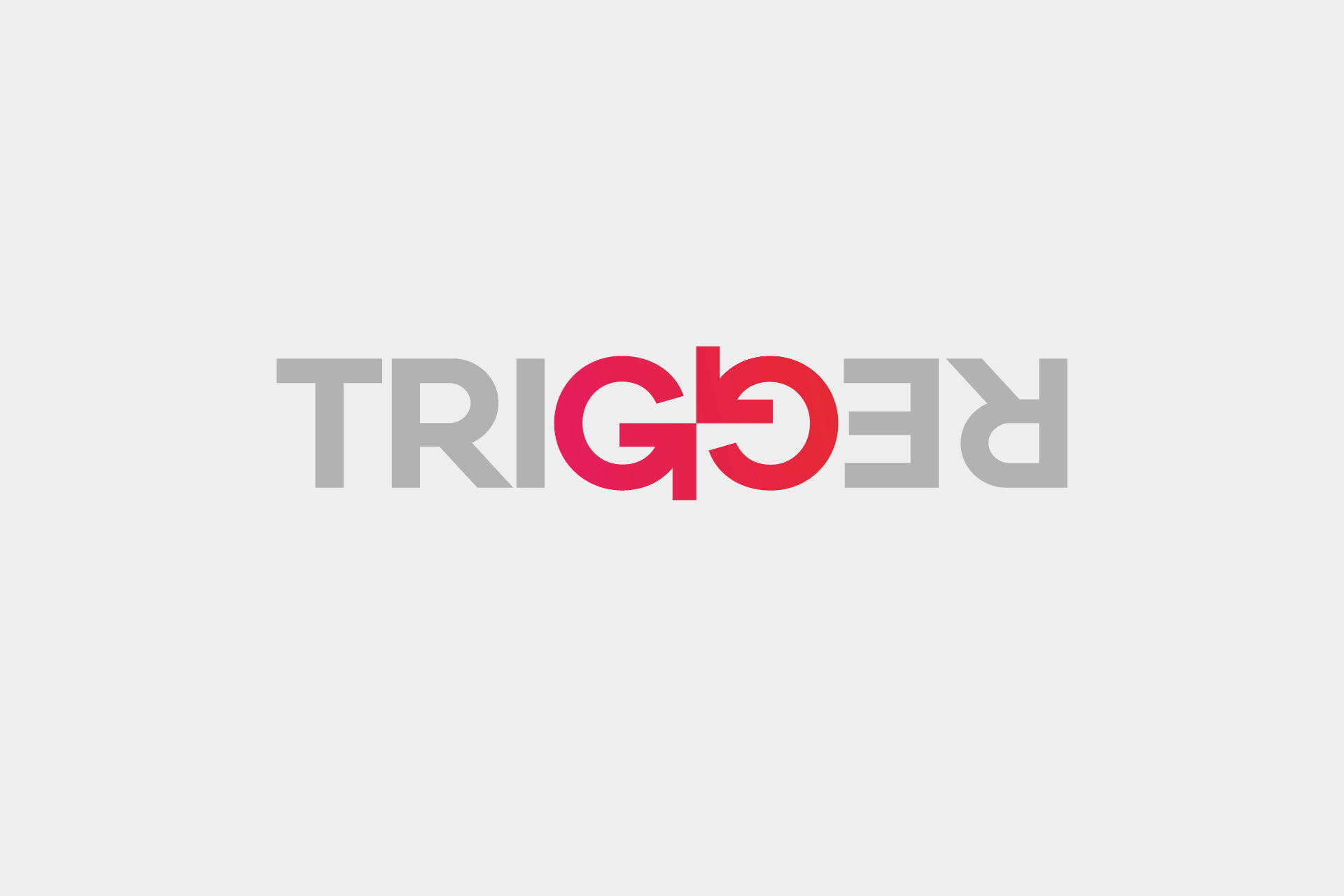
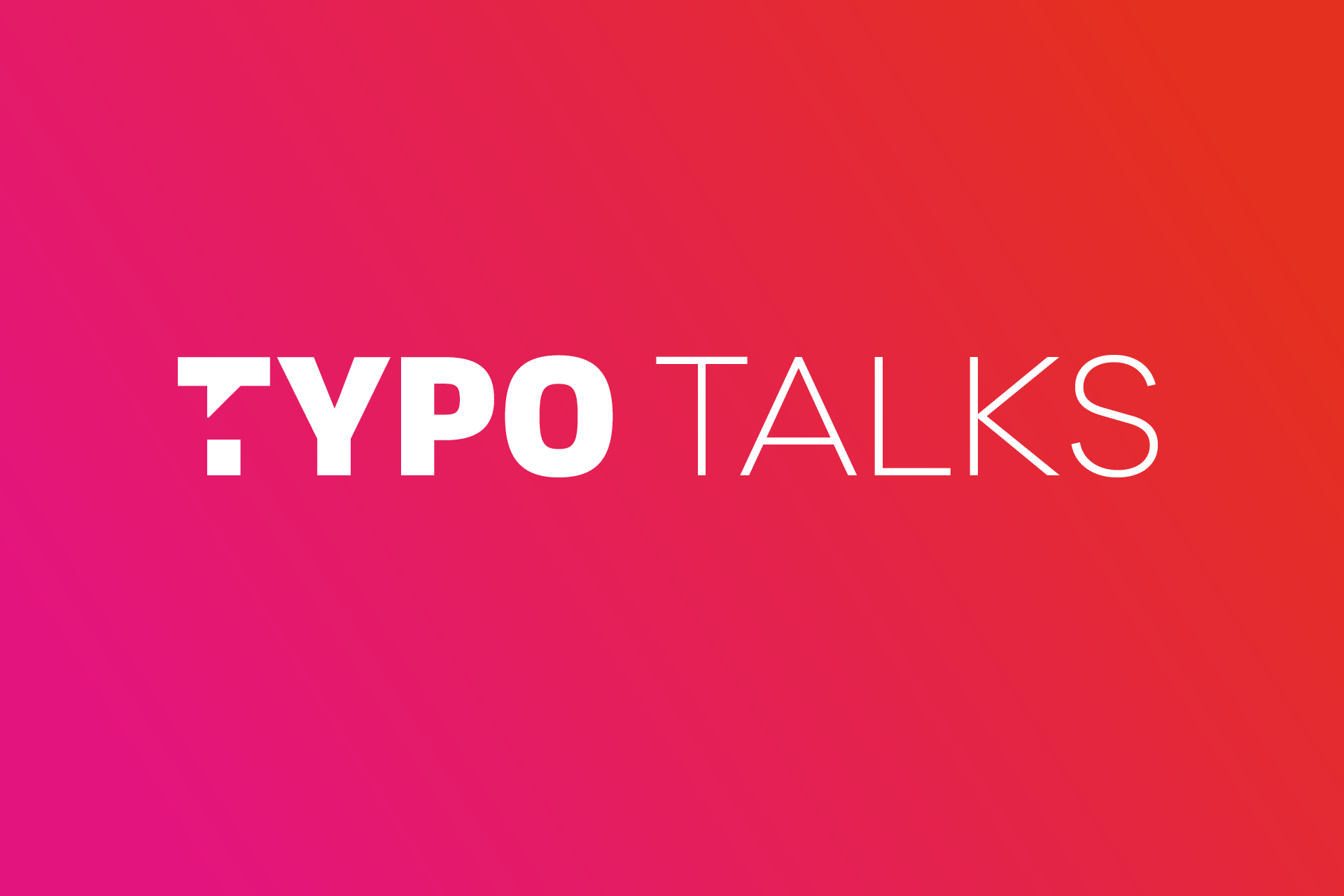
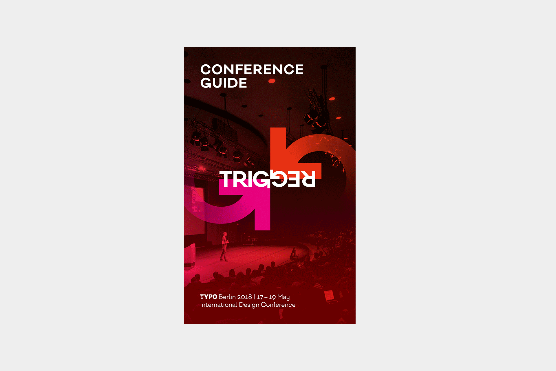
A particular bonus is the appearance of the TRIGGER Logo or TYPO Logo when you type that combination of letters. Read more about the branding on the TYPO Talks Blog
If you want to talk about a project or want to know more about what we can do, please send a mail to contact@renebieder.com.