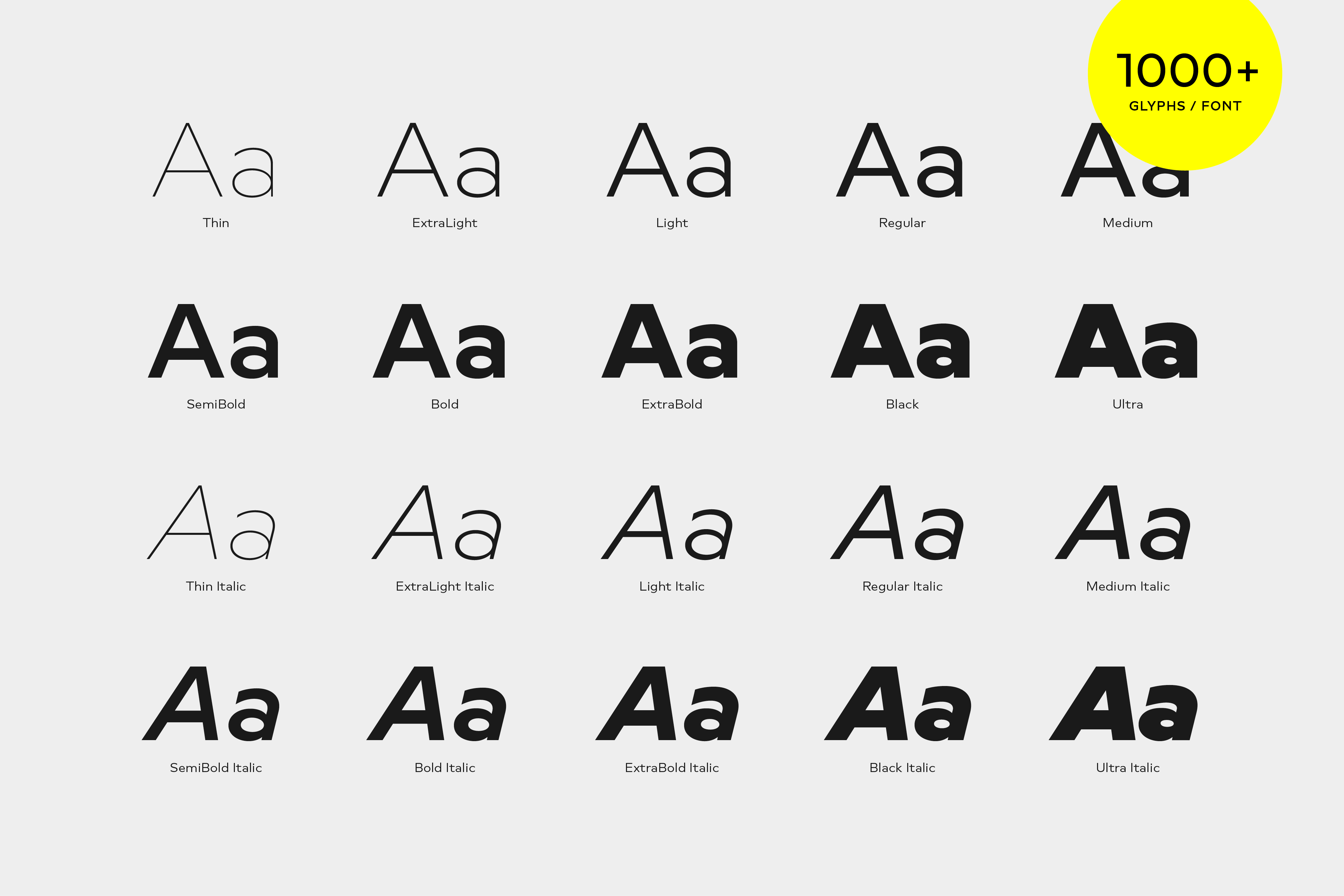
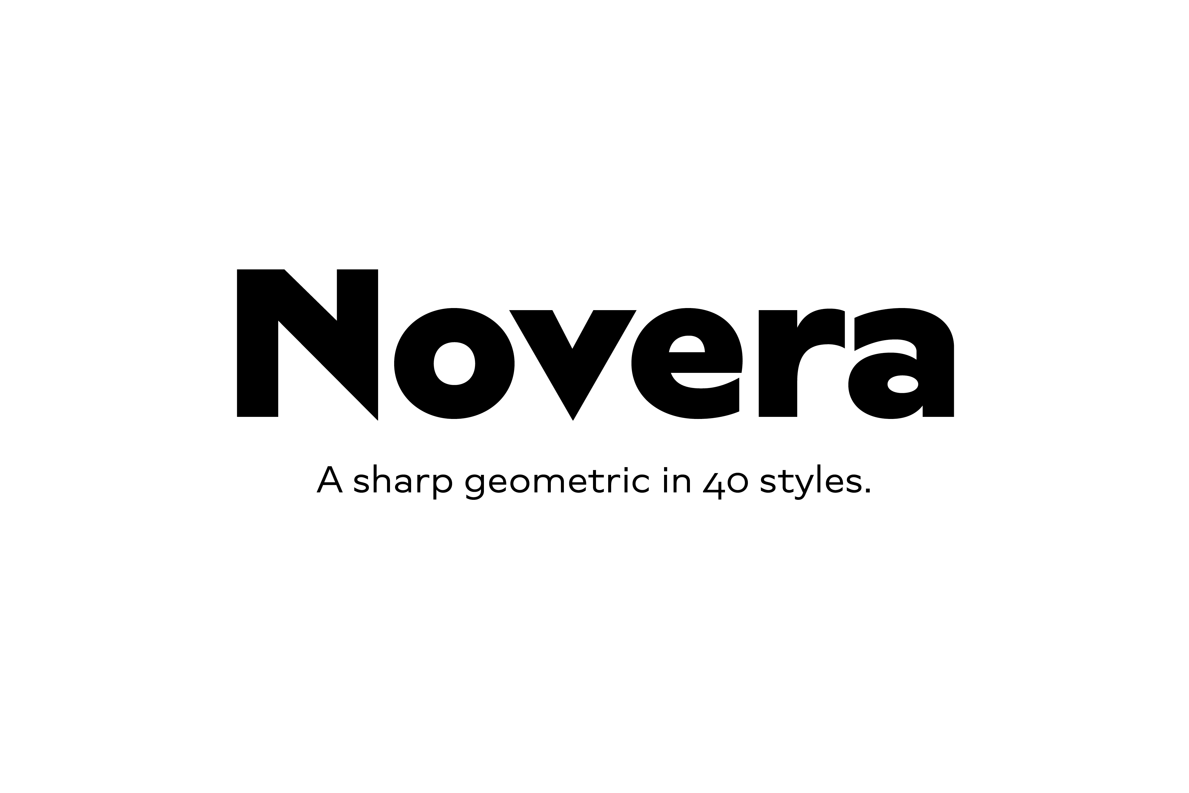
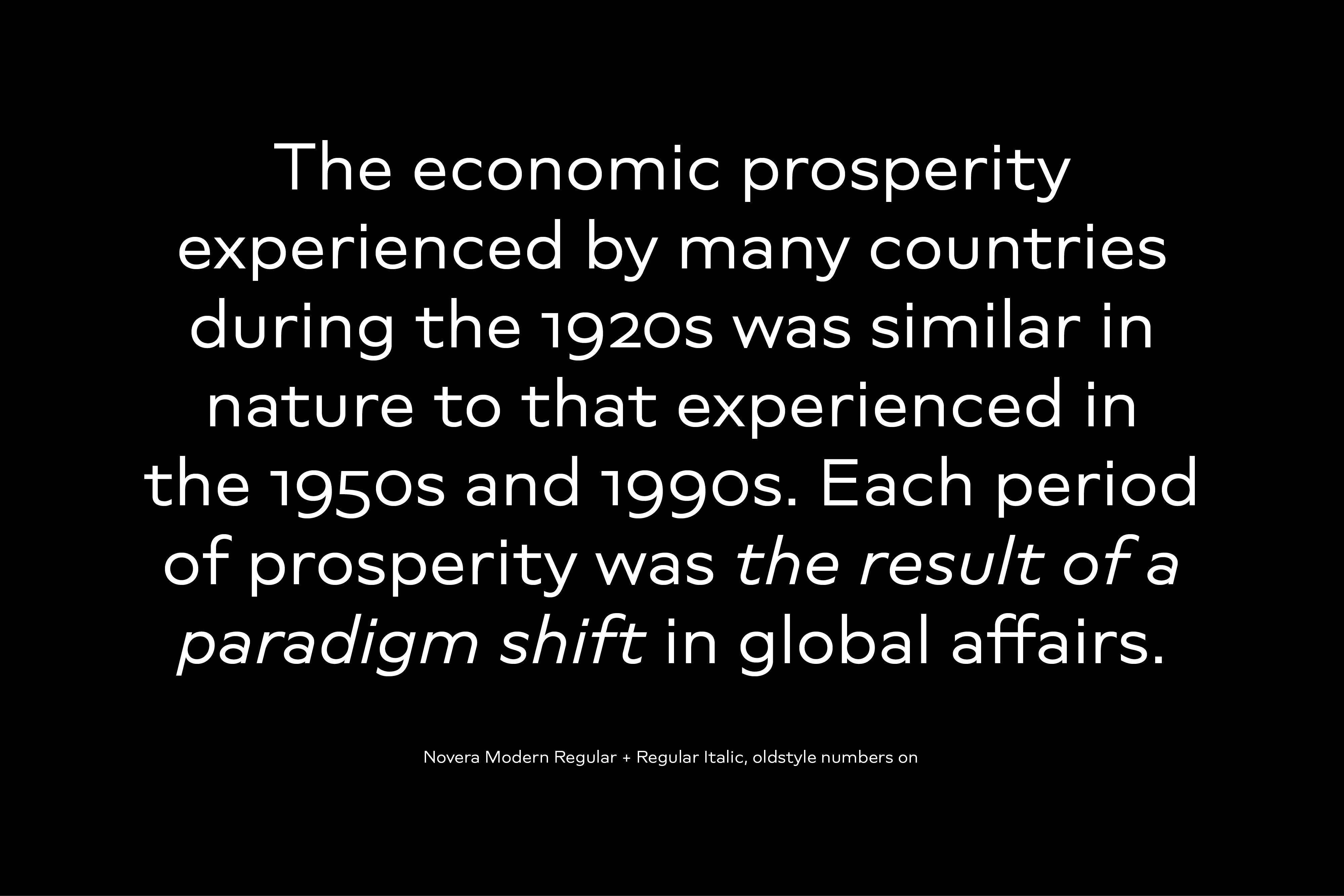
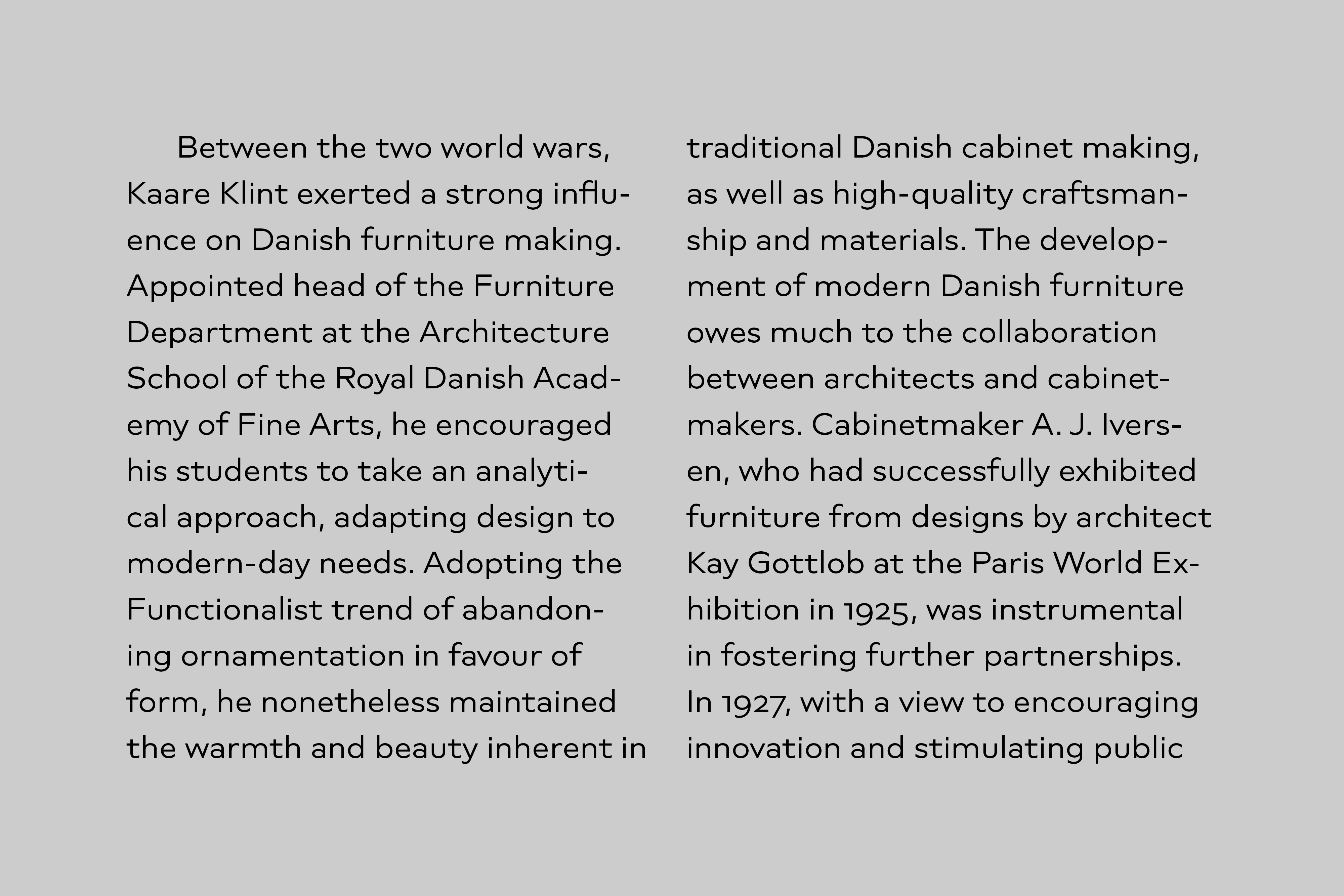
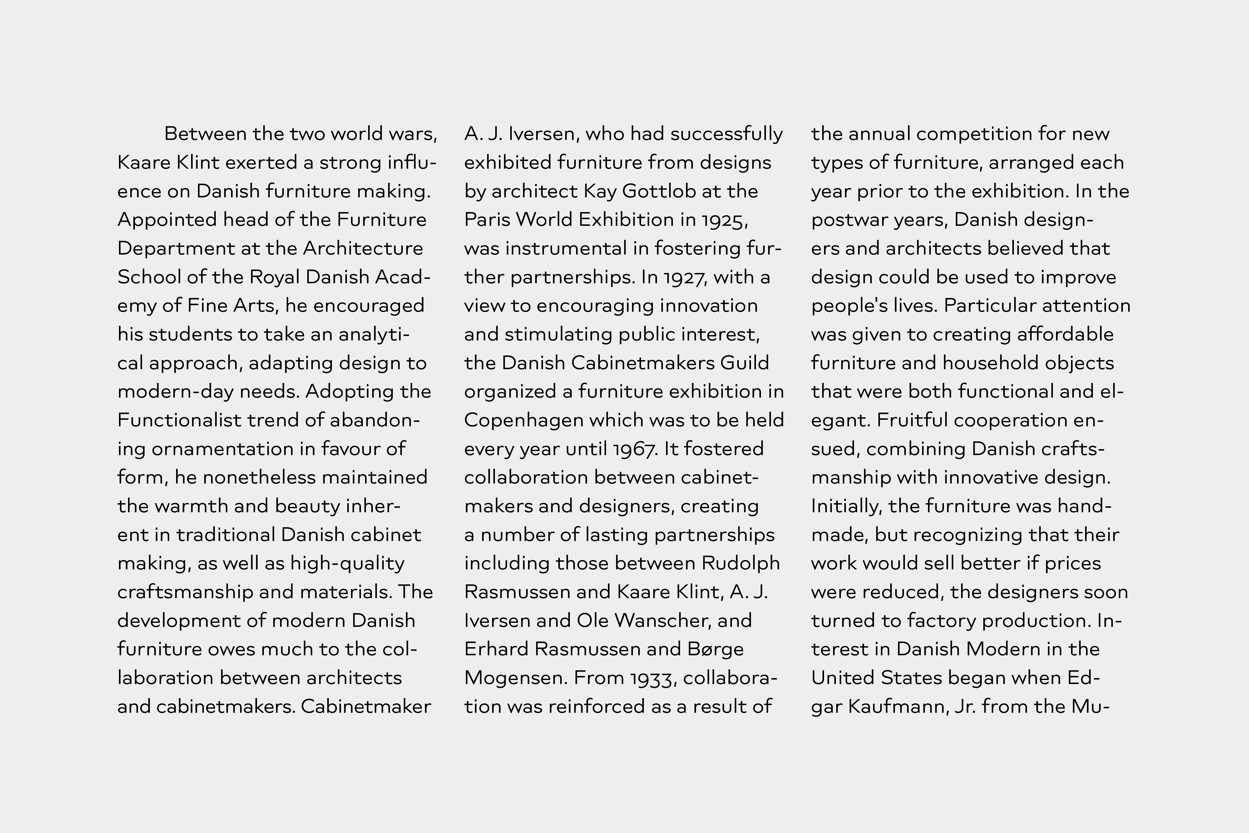
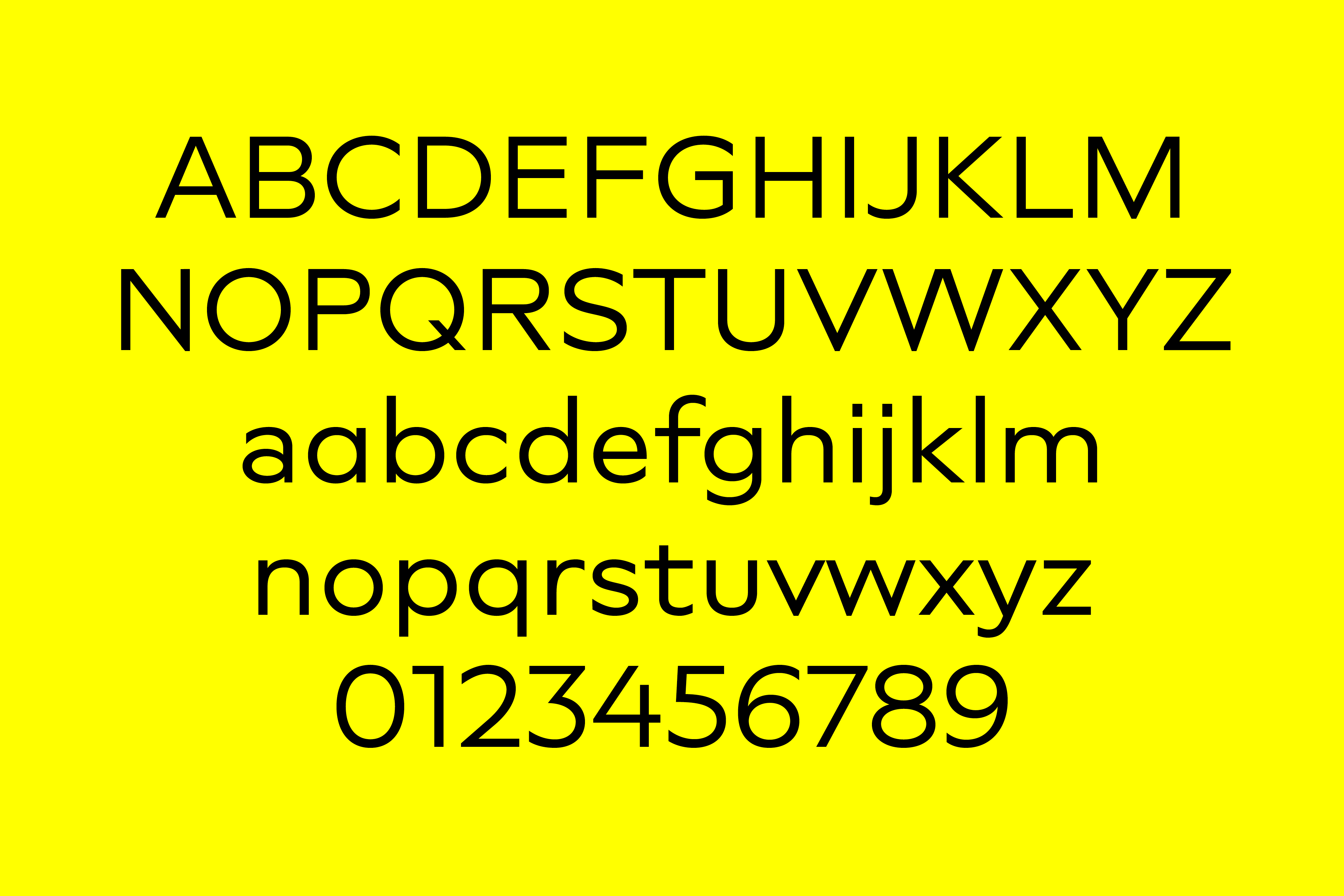
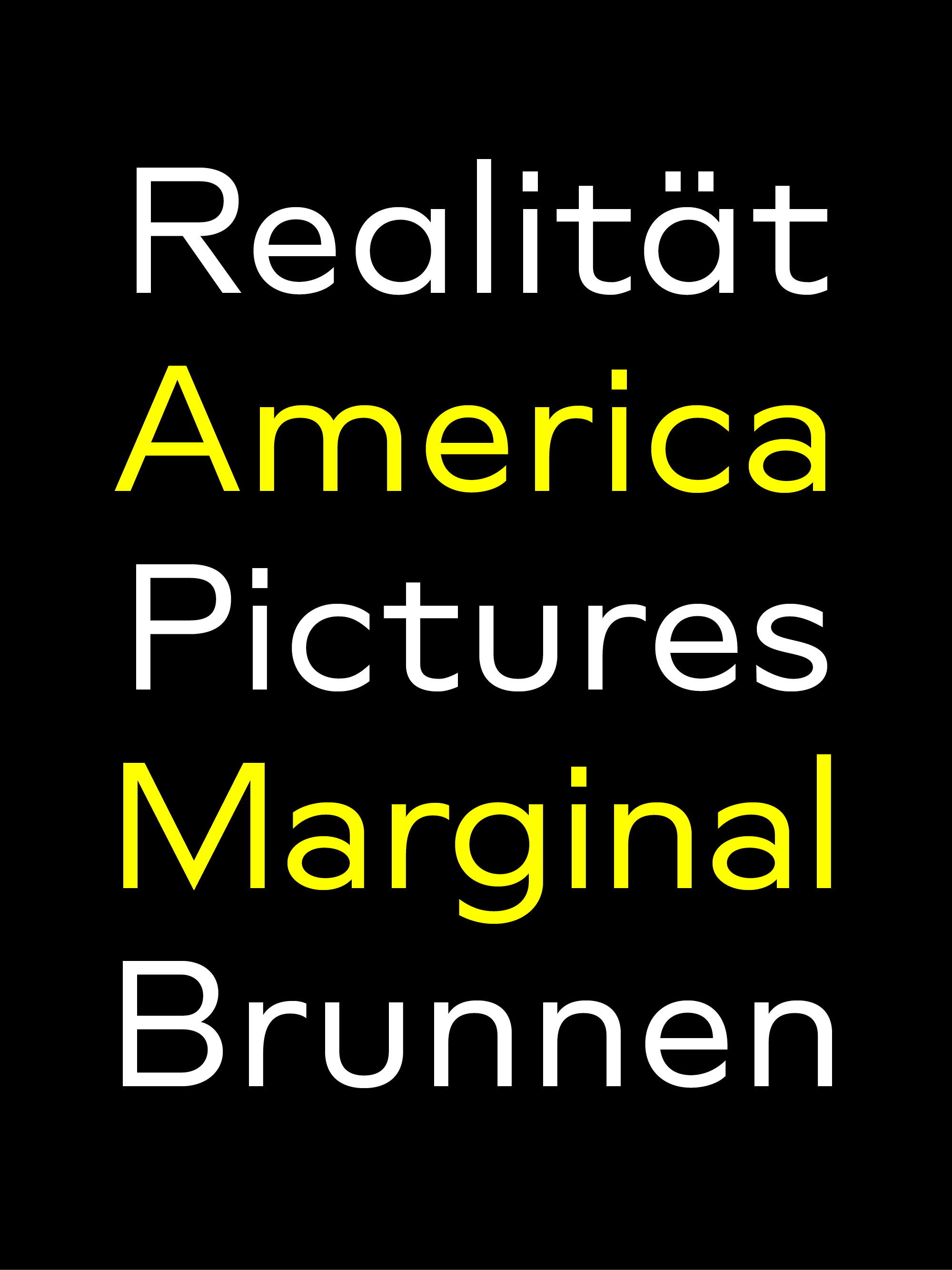
The Novera family is a sharp geometric sans available in 10 weights and 2 versions, plus matching italics. It has a multifunctional yet characteristic design, that comes with an extensive glyphs set of 1000+ glyphs per font.
Buy Novera on Myfonts
Download the Testfonts
Characteristics
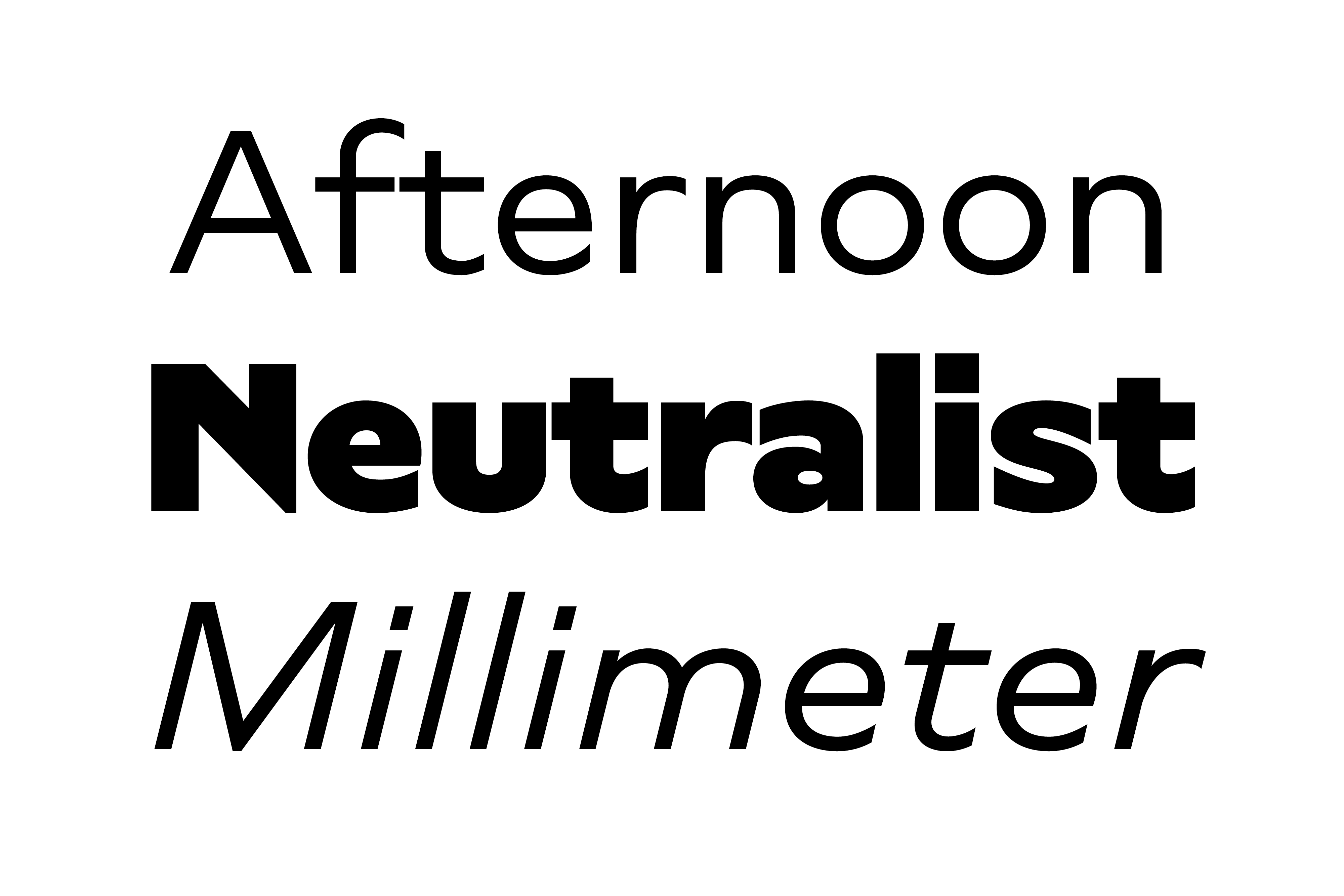
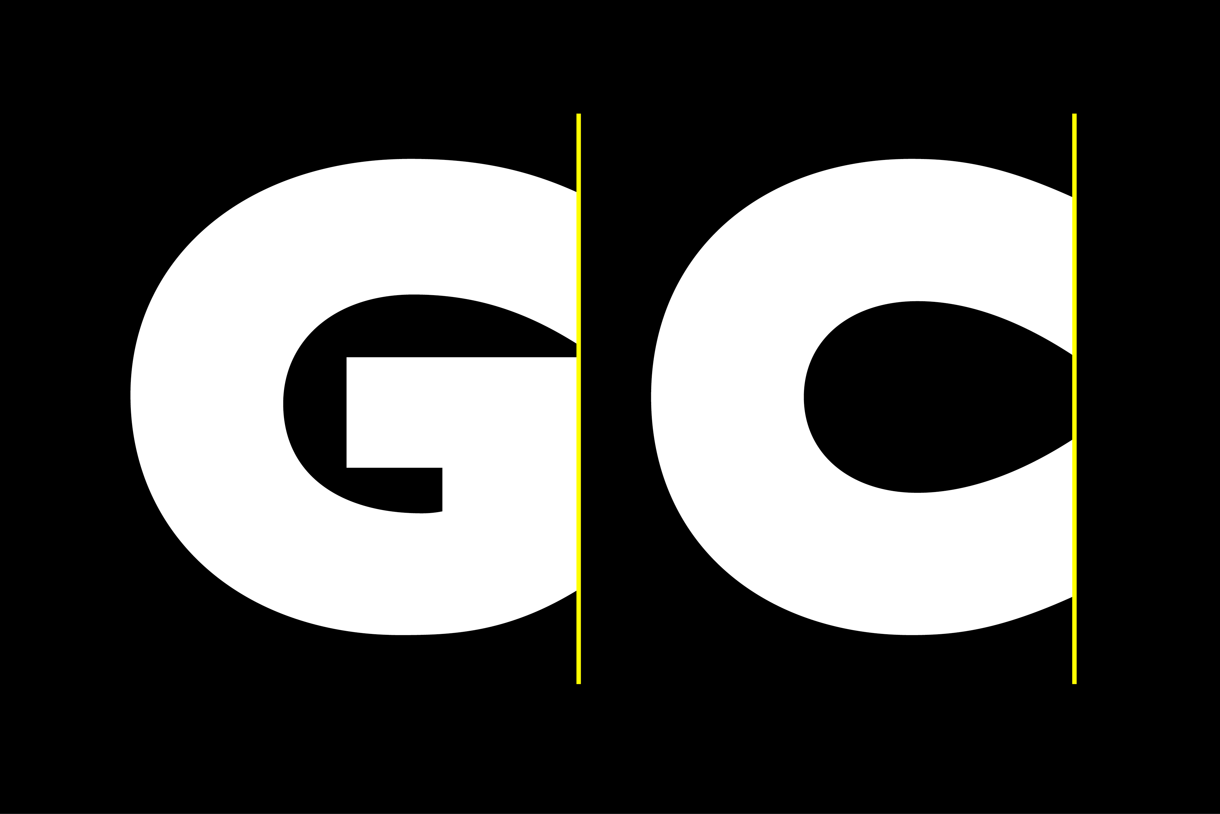
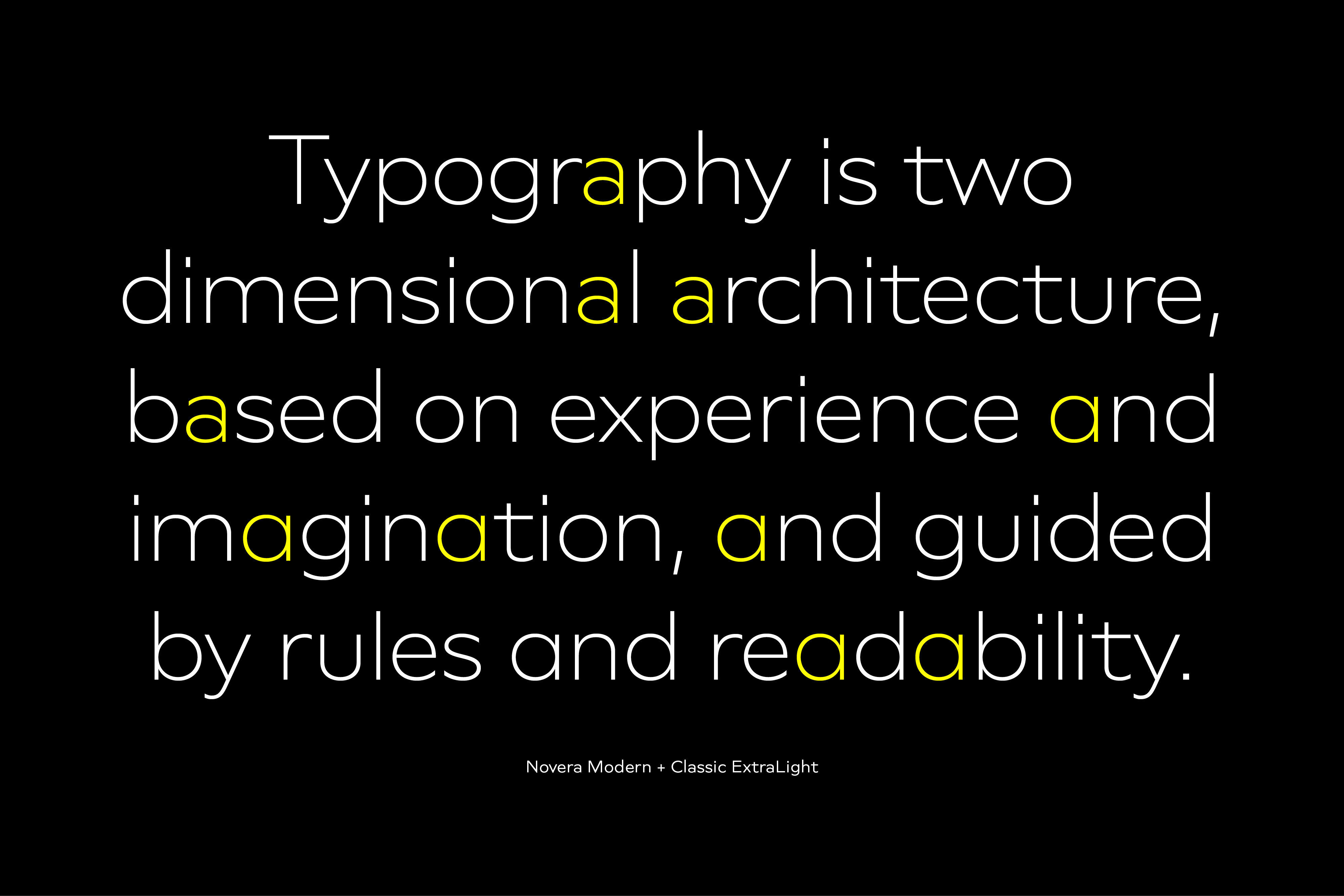
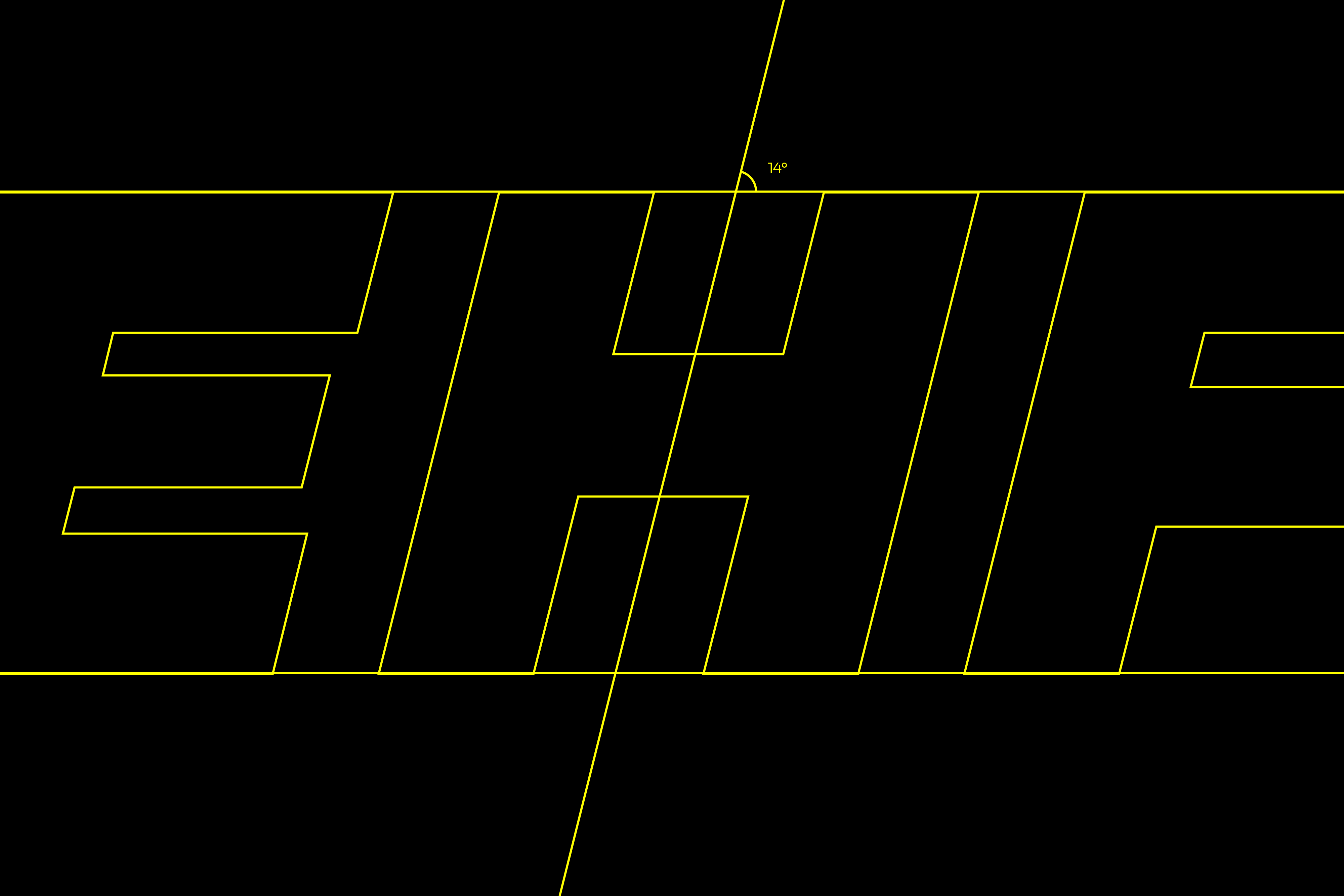
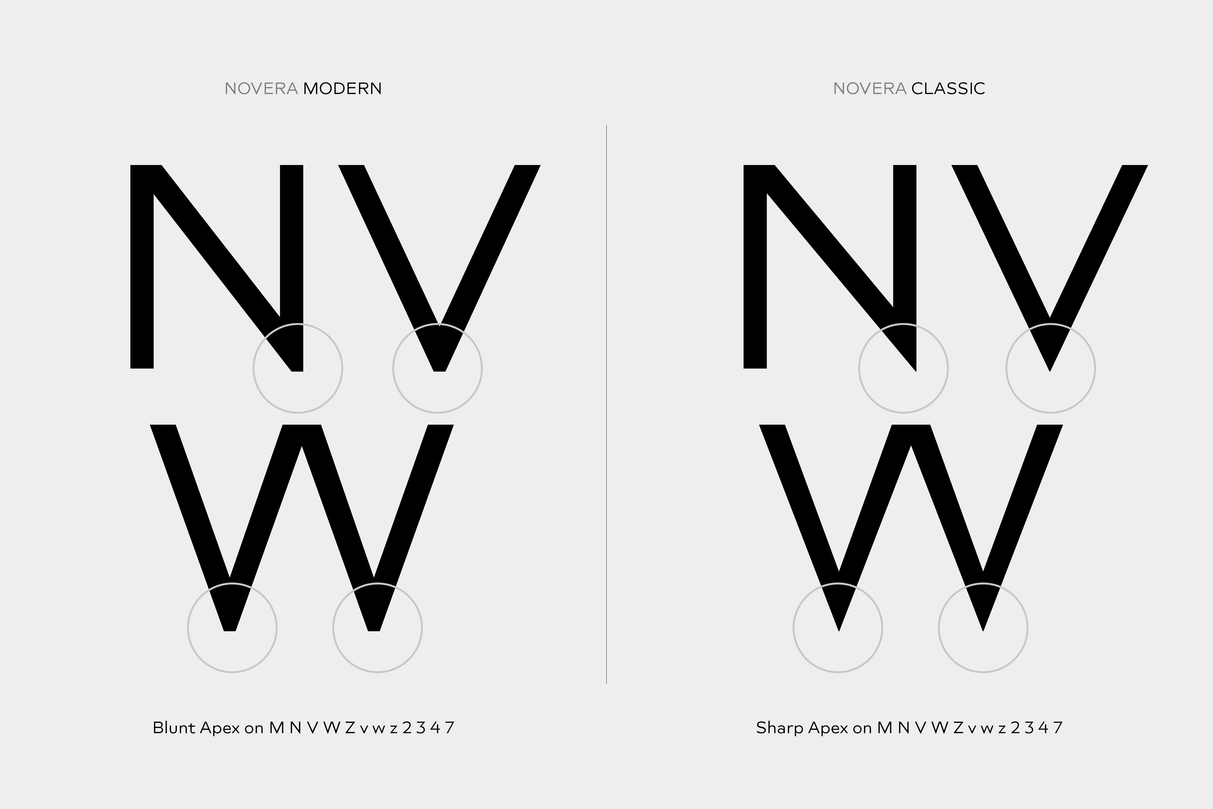
Vertical terminals, circular shapes and angular apexes – Novera truely breathes geometry! But the concept goes beyond the application of rational geometry. The intension was to create a highly legible family suitable for every day usage inspired by the work of Paul Renner, Eric Gill or Jakob Erbar, combining the geometric with the human and the functional with the unconventional.
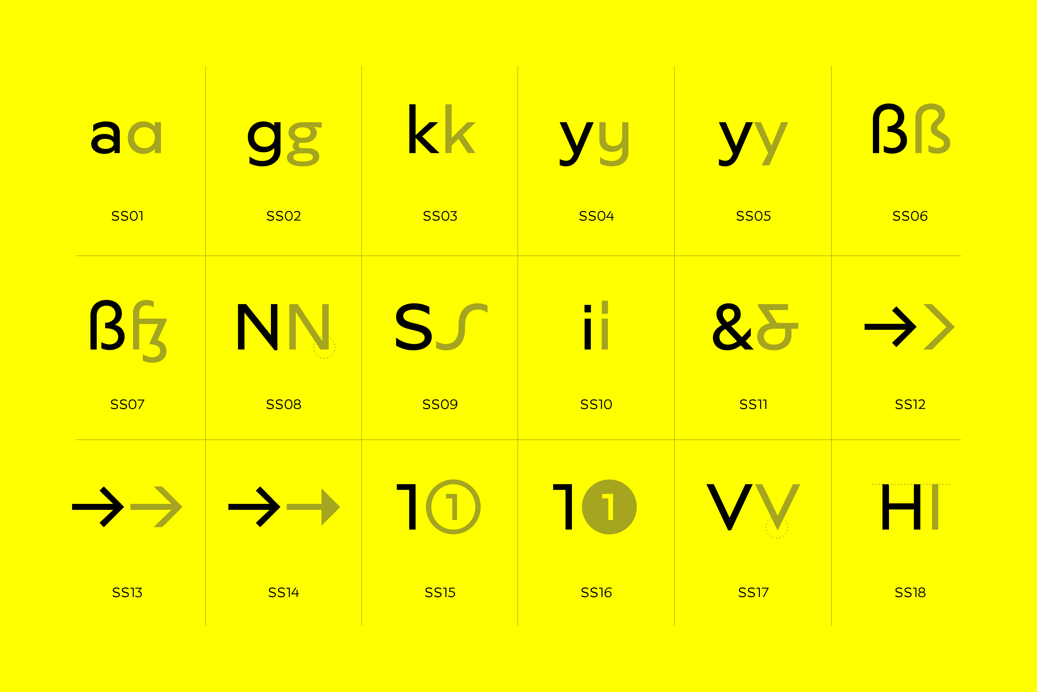
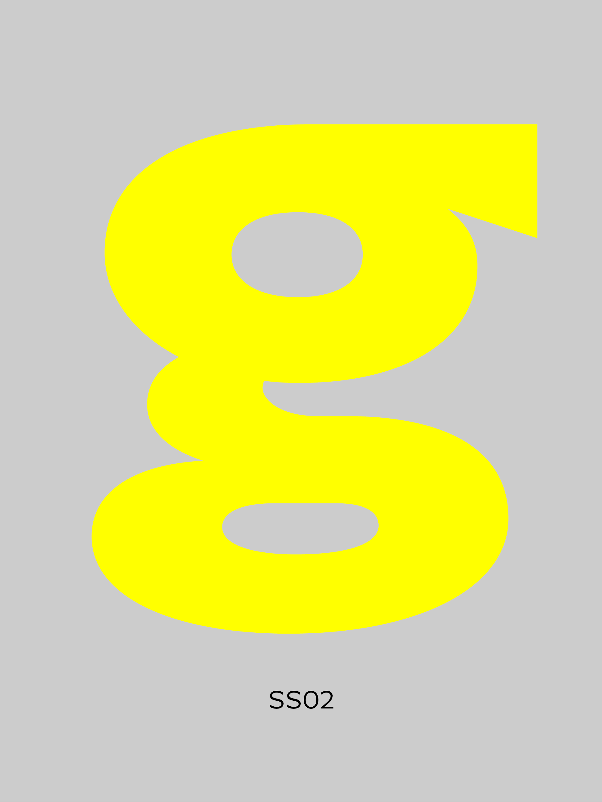
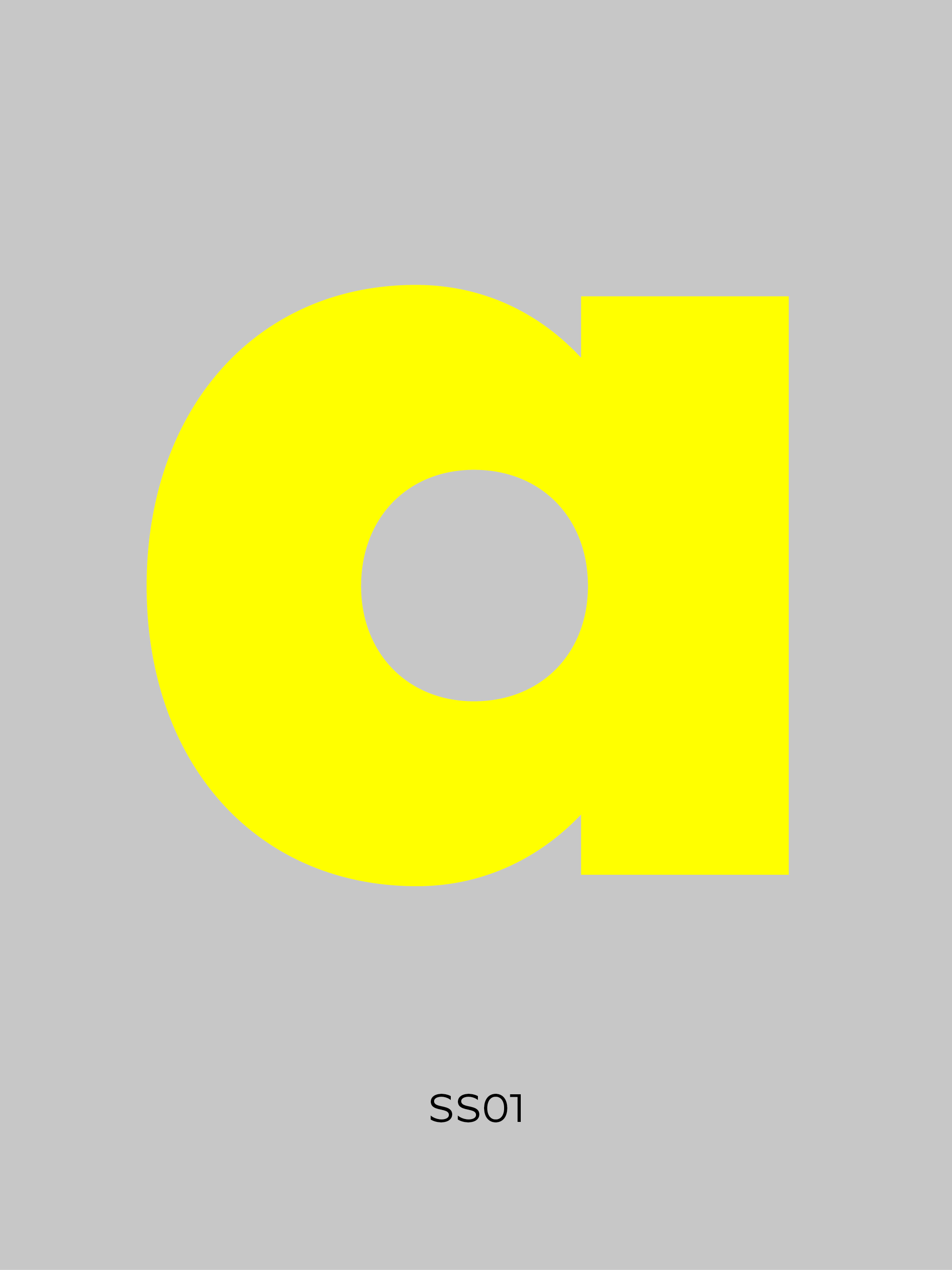
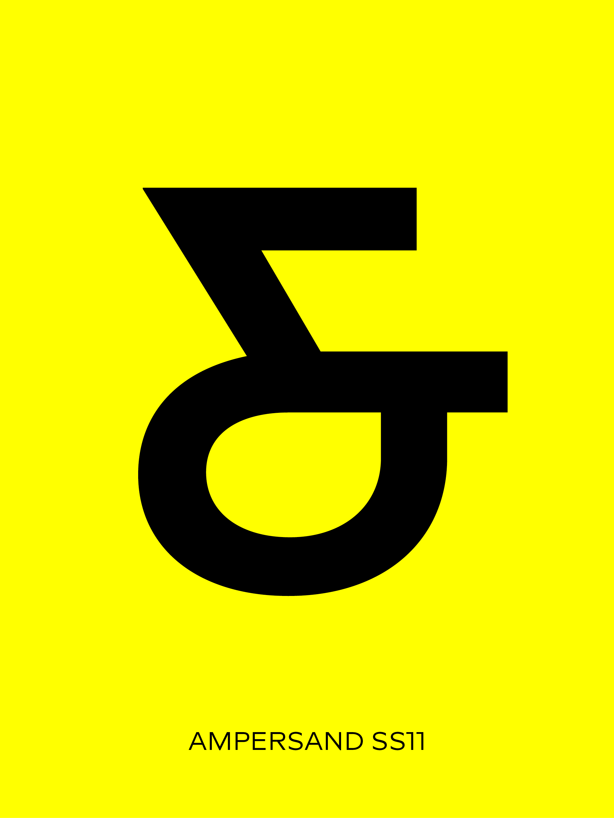
Alternates
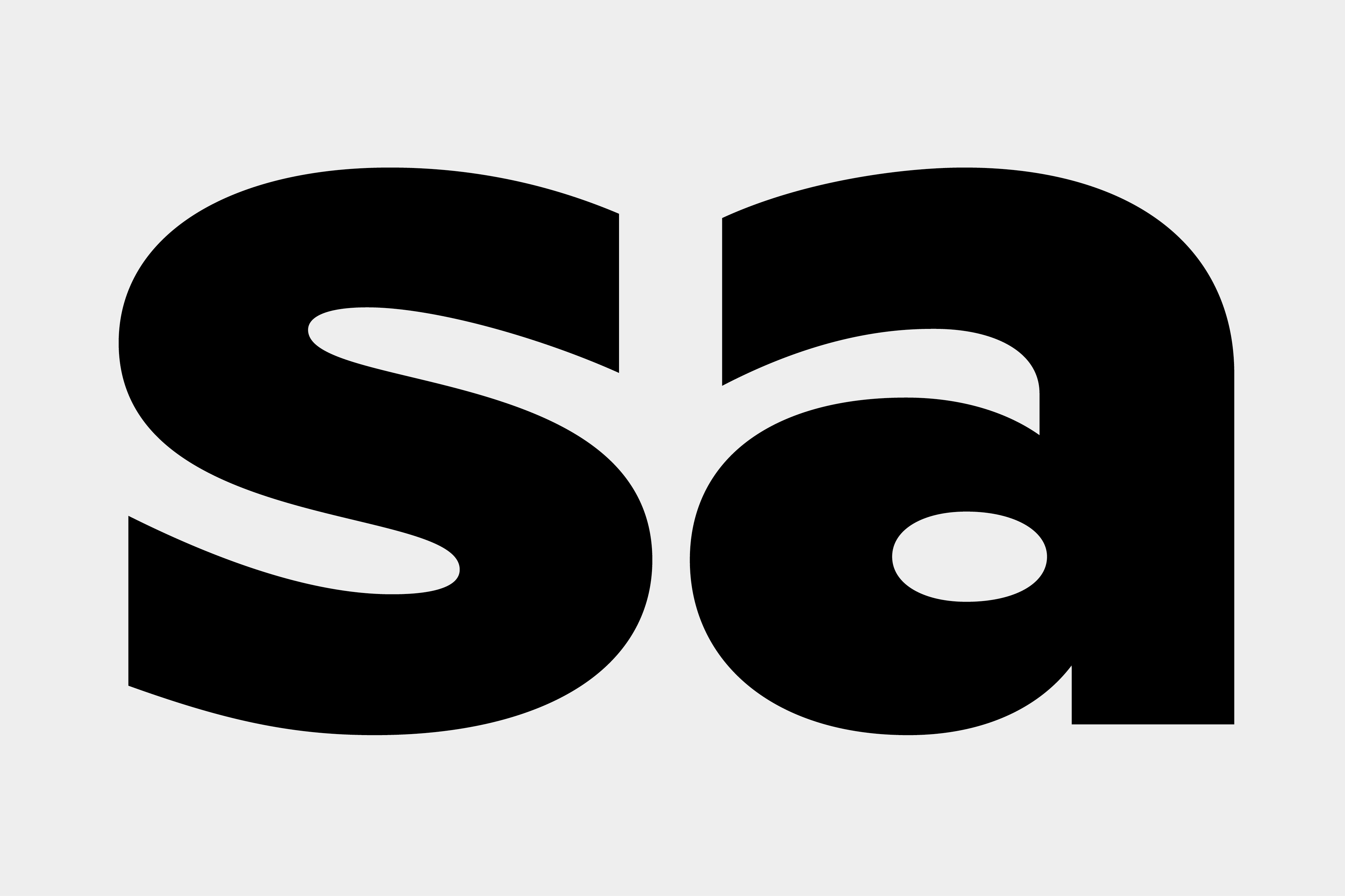
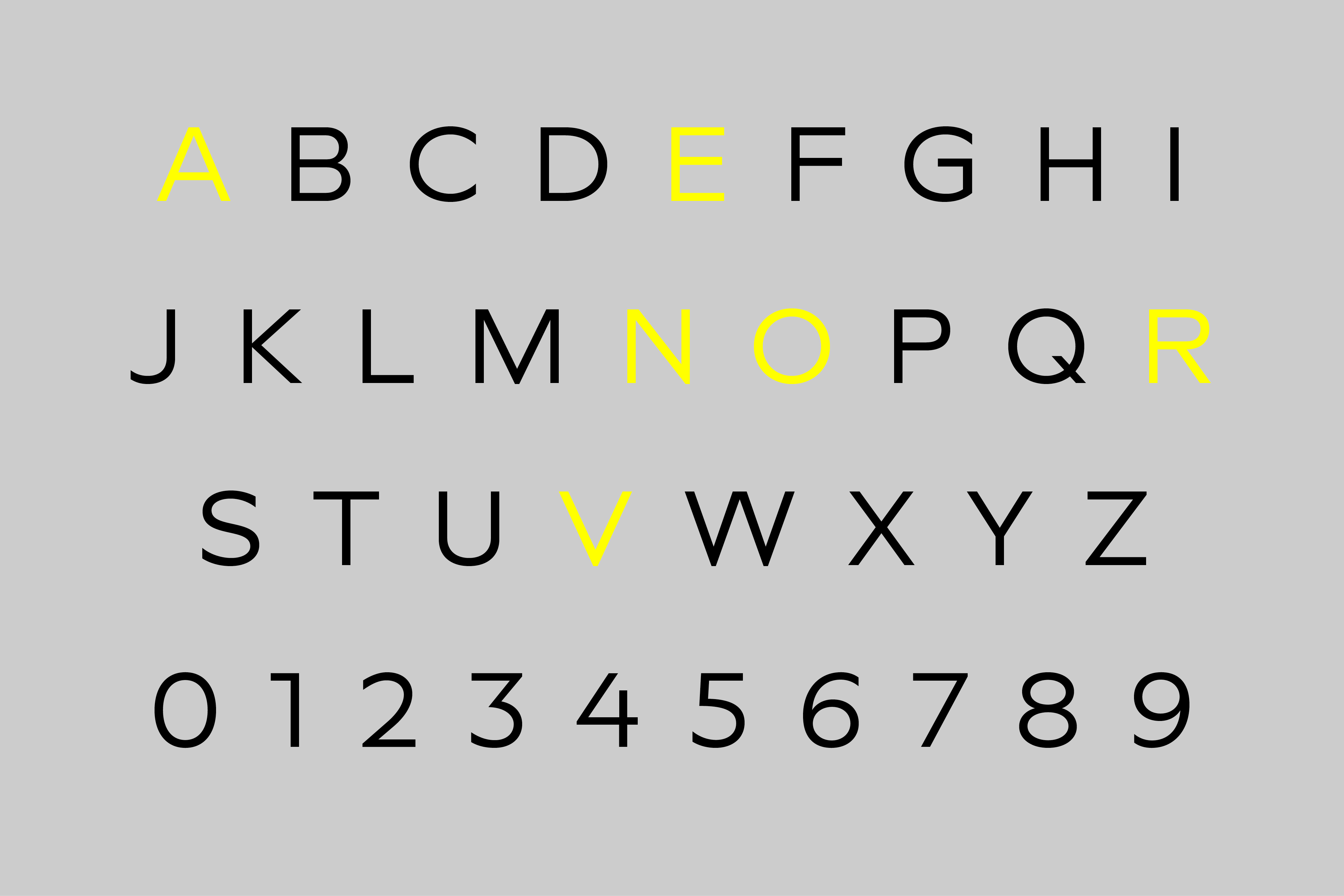
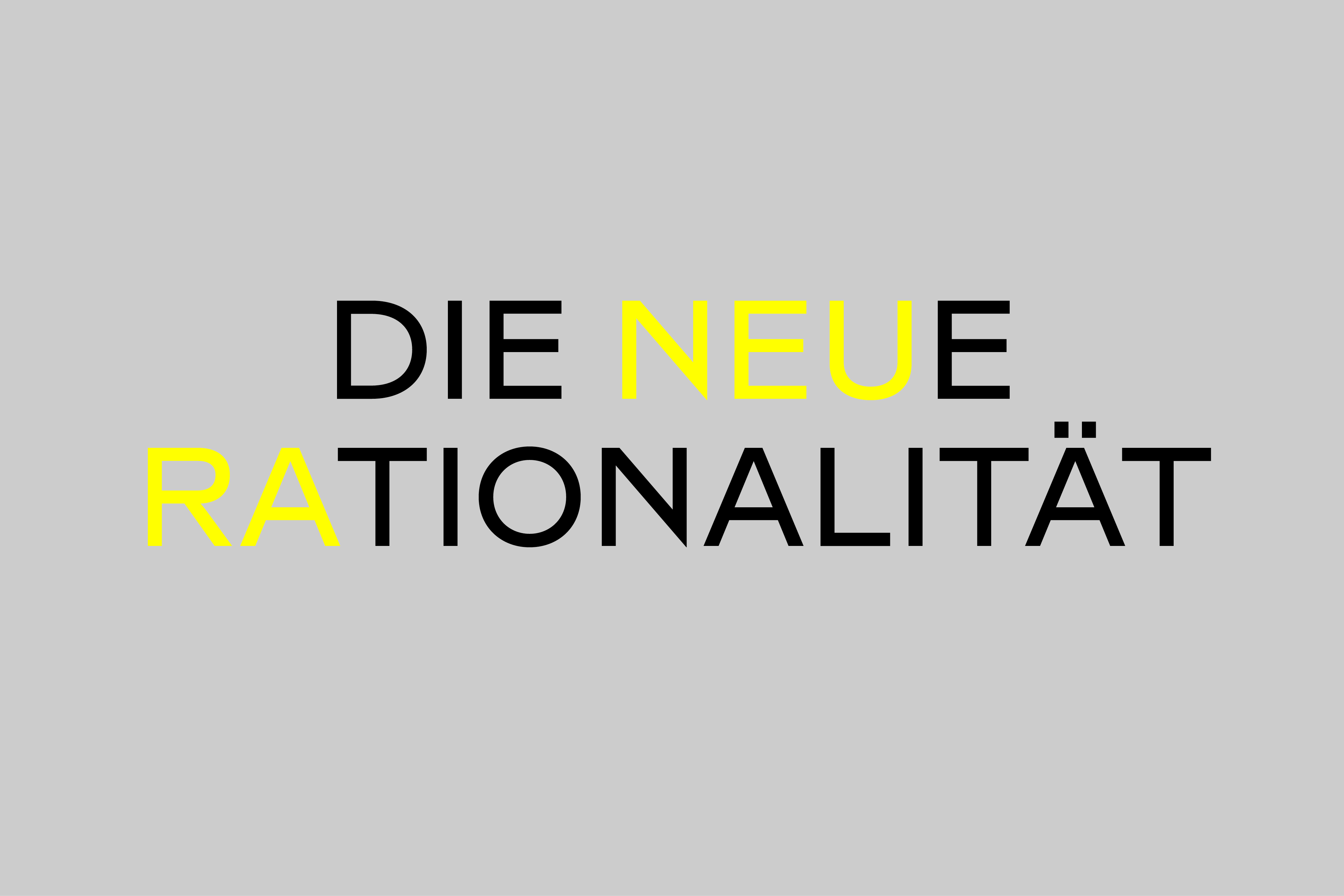
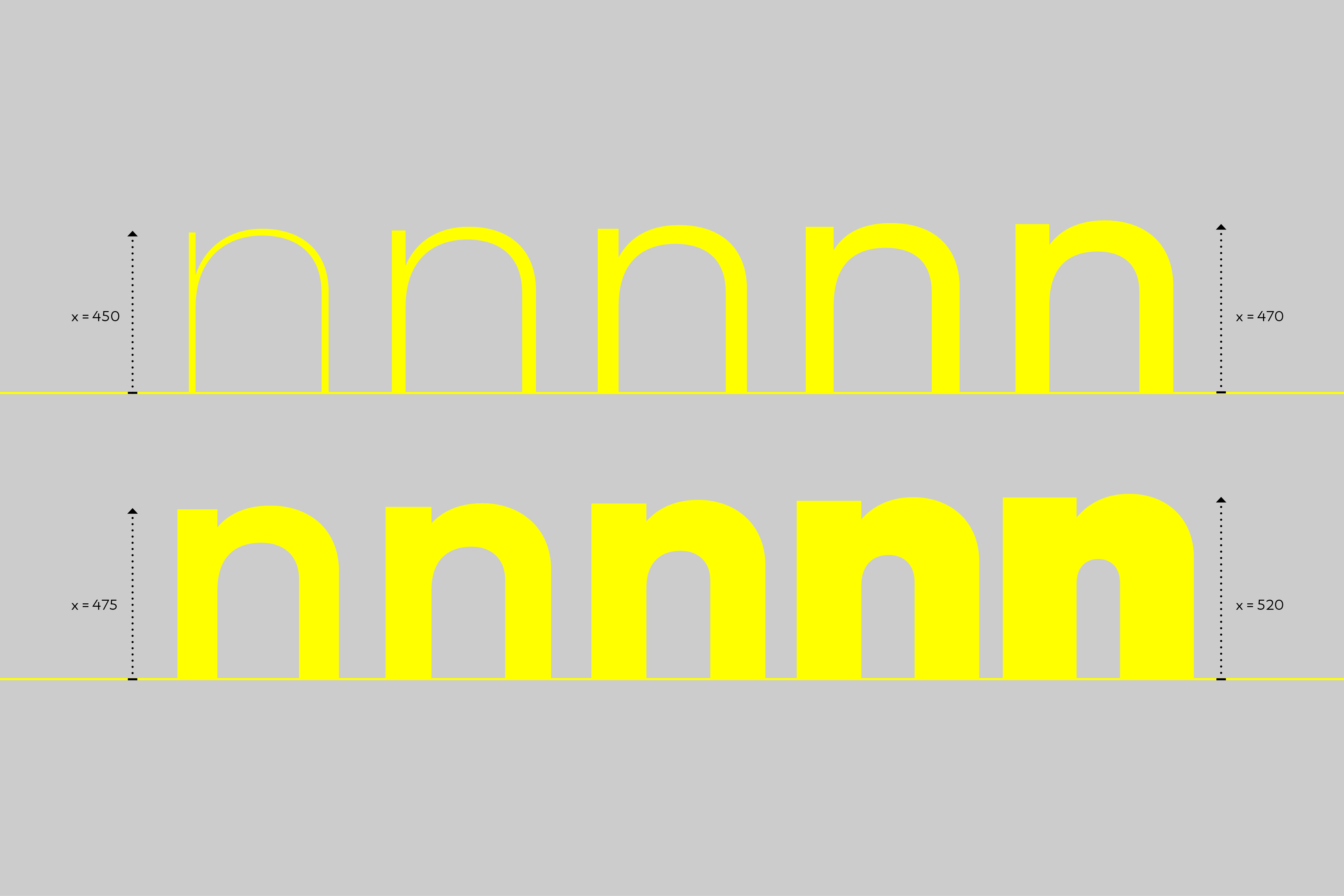
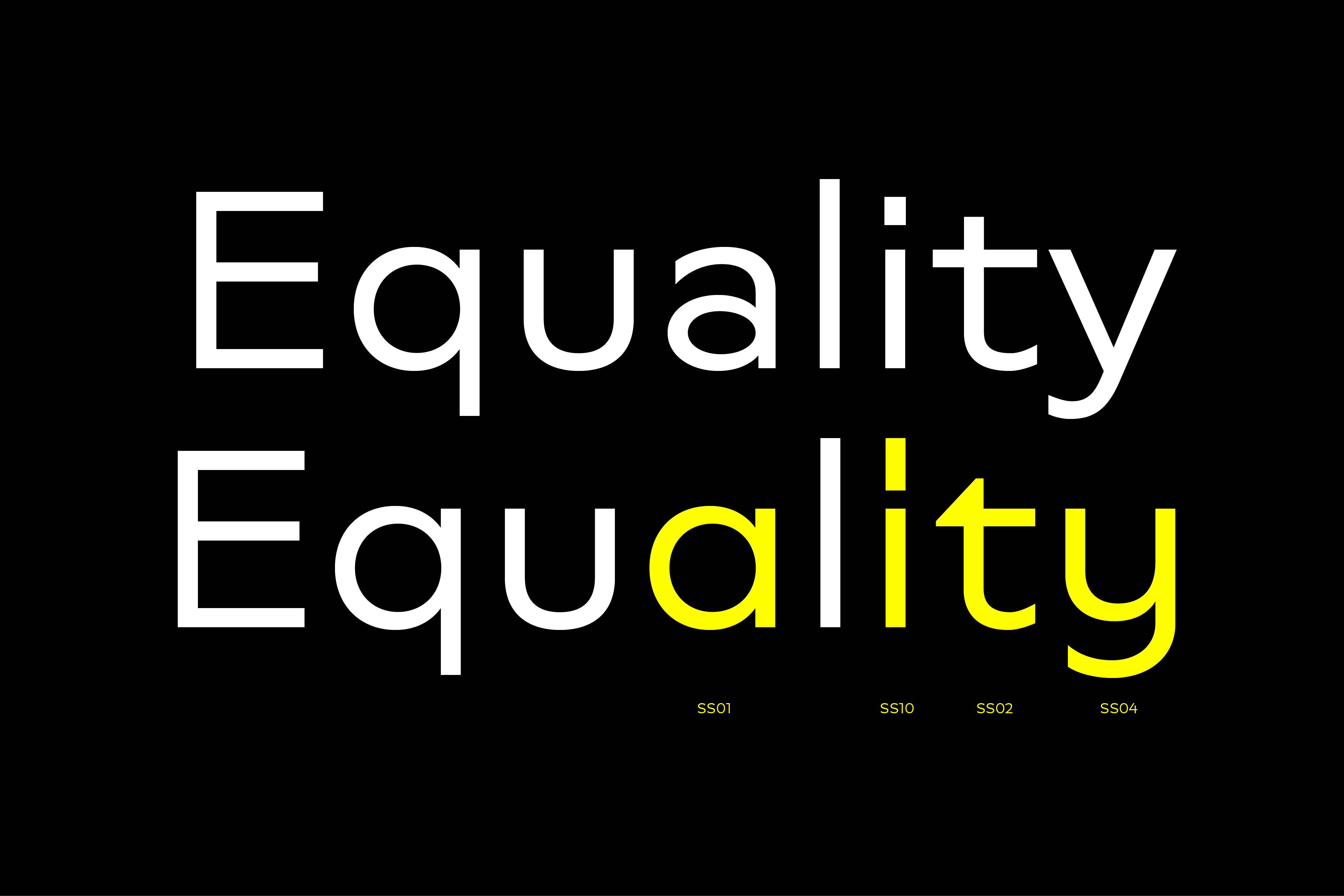
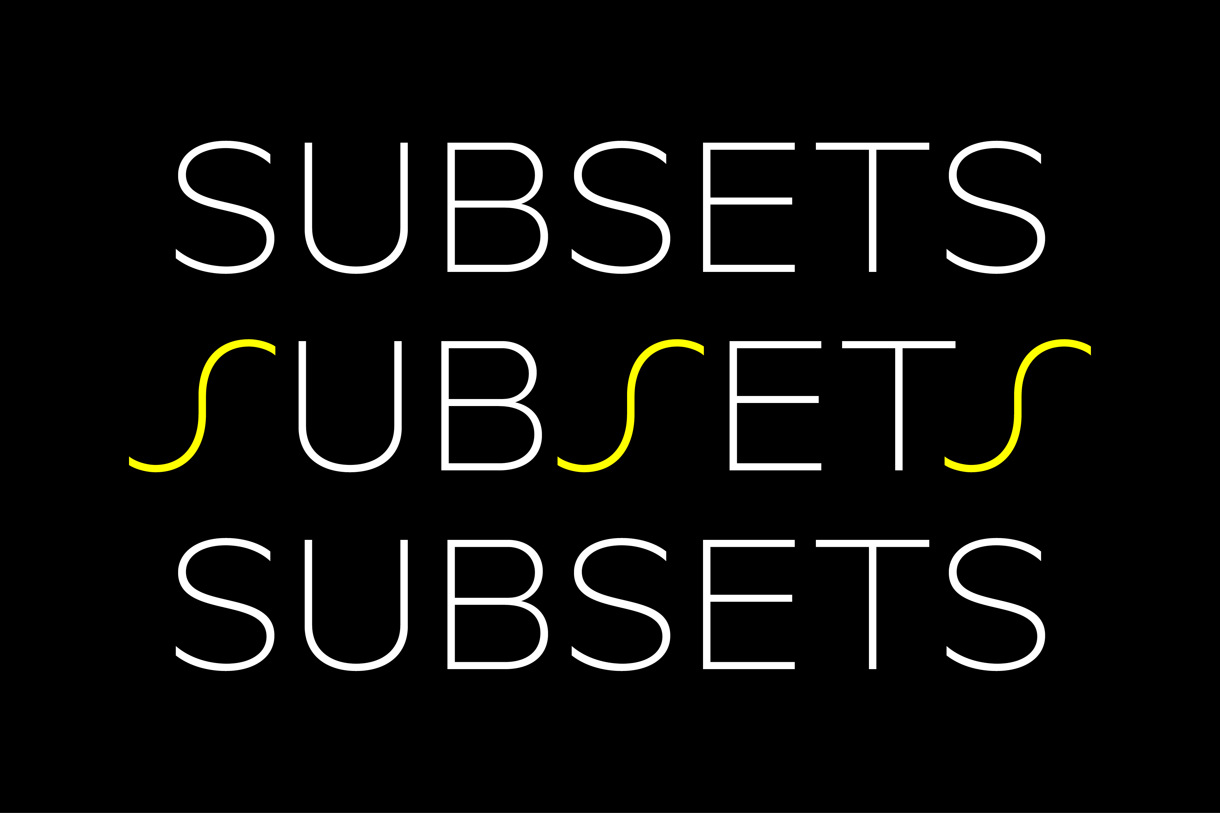
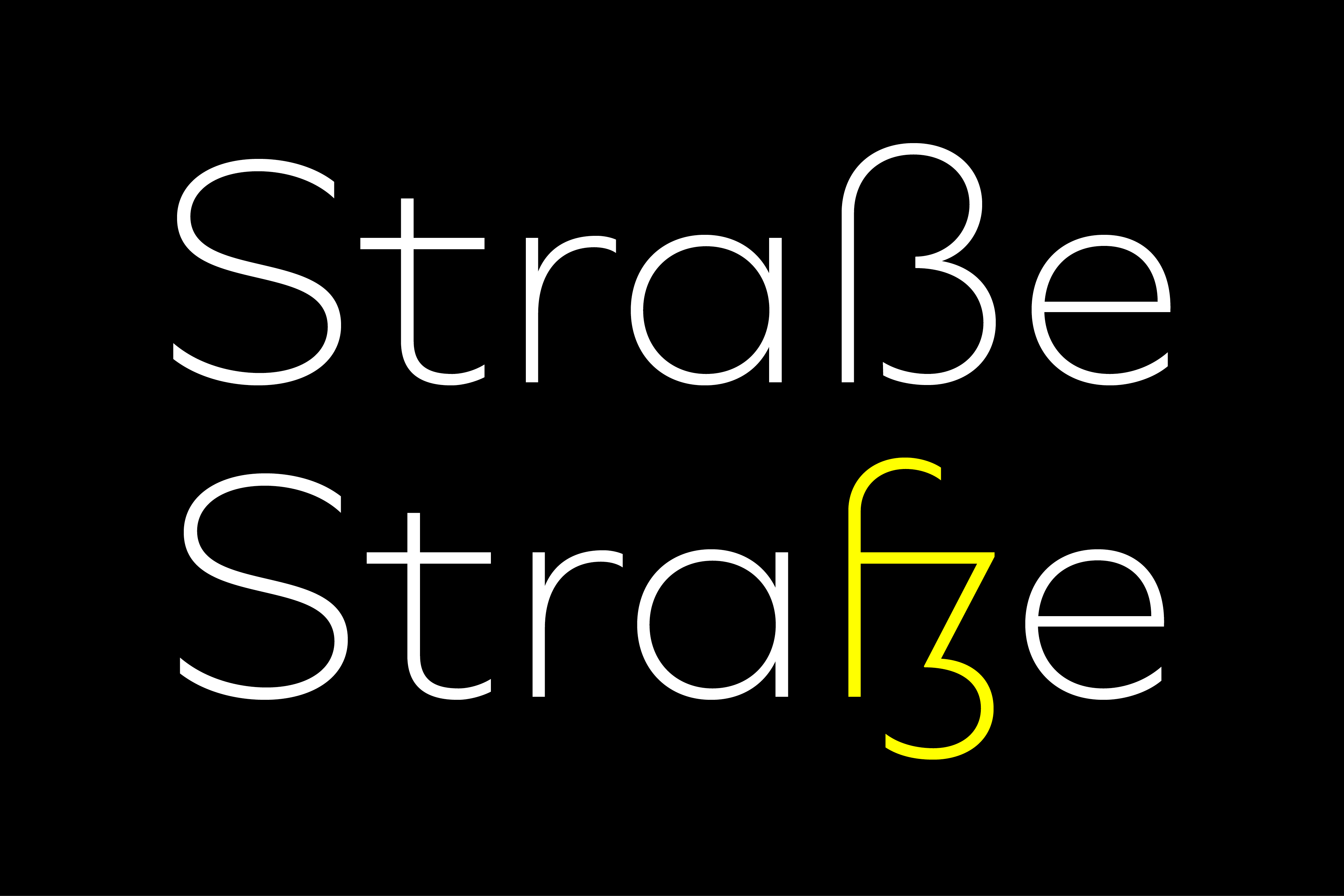
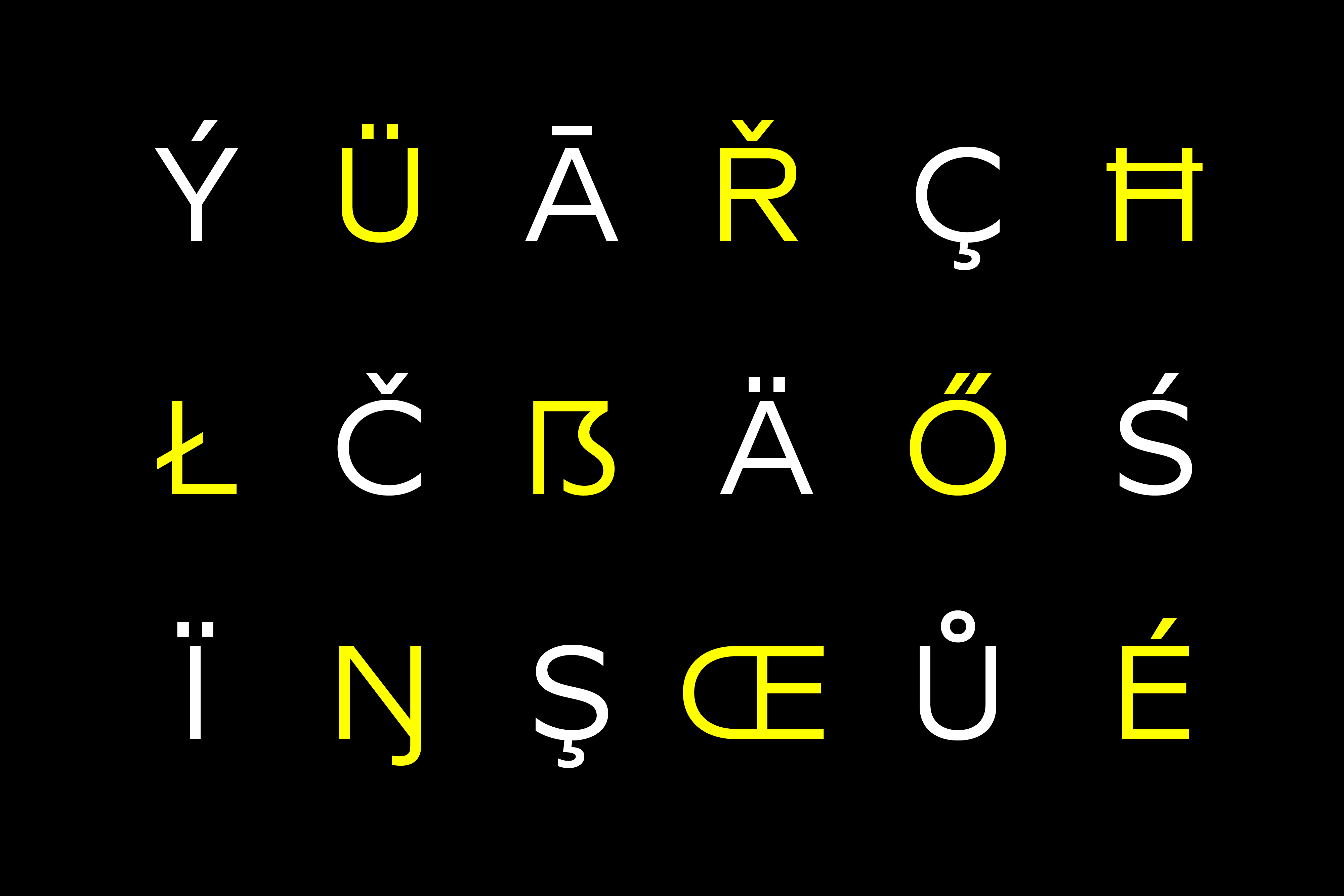
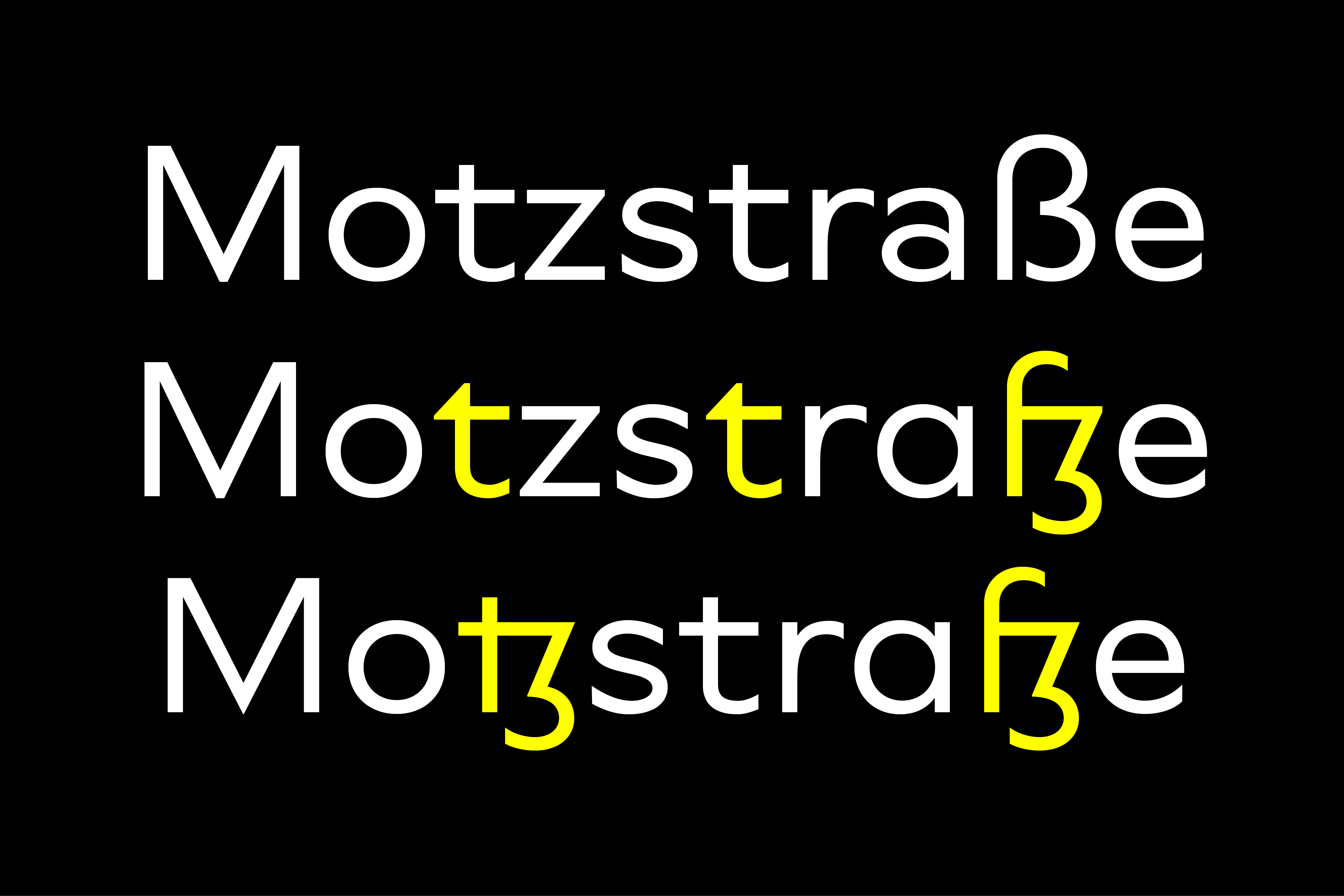
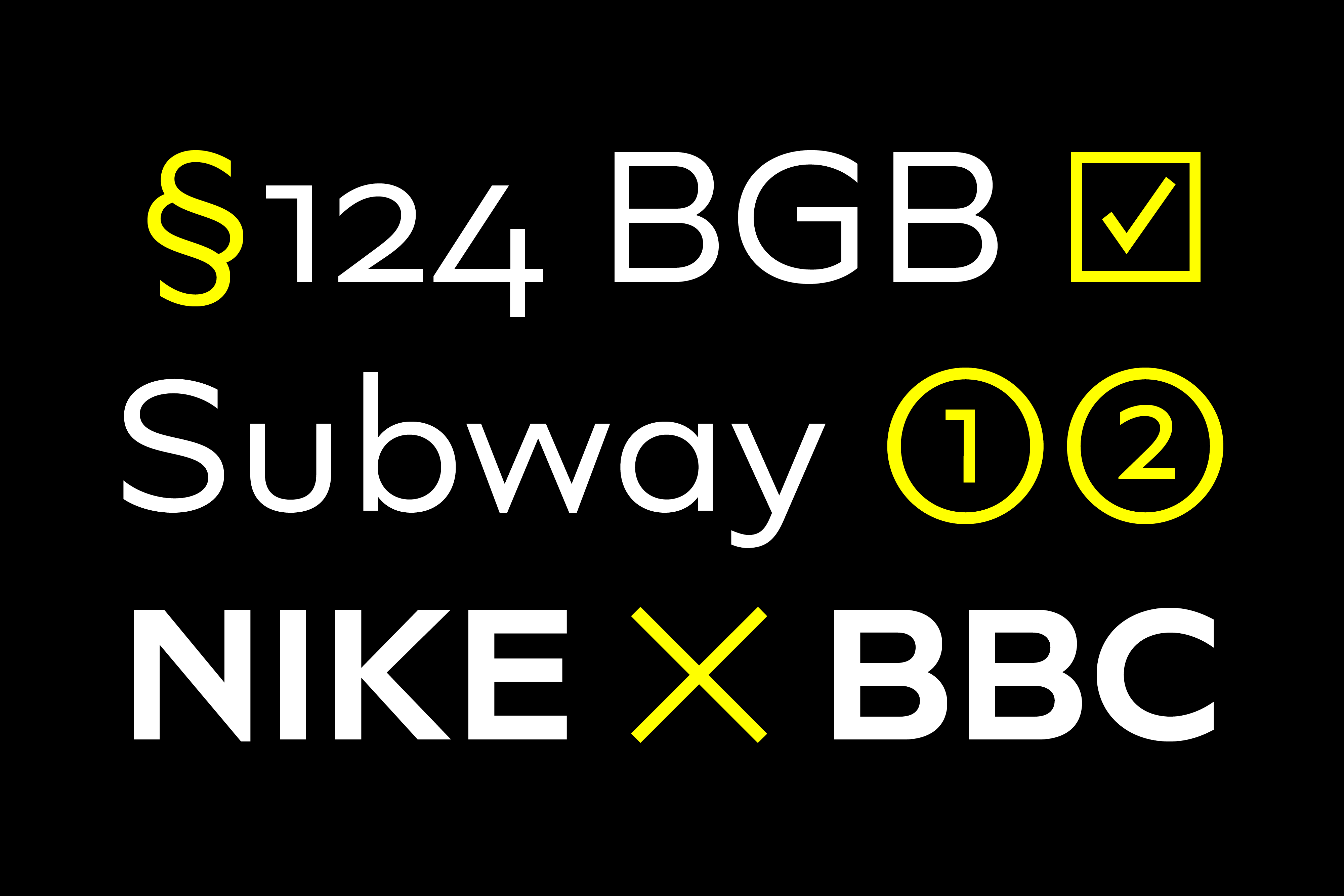
To maintain neutrality and a modern appearance, the standard character set largely dispenses with idiosyncratic forms. This is in contrast to the alternative forms with the Gill-like lowercase letters g and t as well as a traditional shape of S and the German ligature t/z, which traces back to old German spellings. Also inspired by German poster designs from the early 20th century are the elongated i-dots and dieresis-dots that can create a special eye-catcher in headlines or logos.
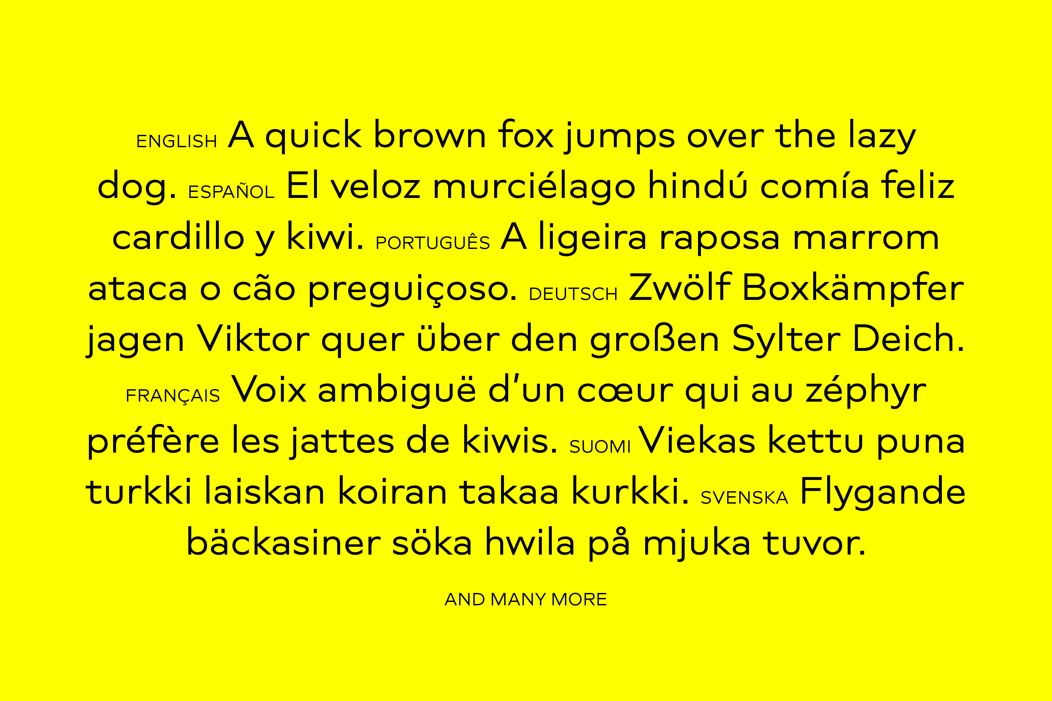
Languages
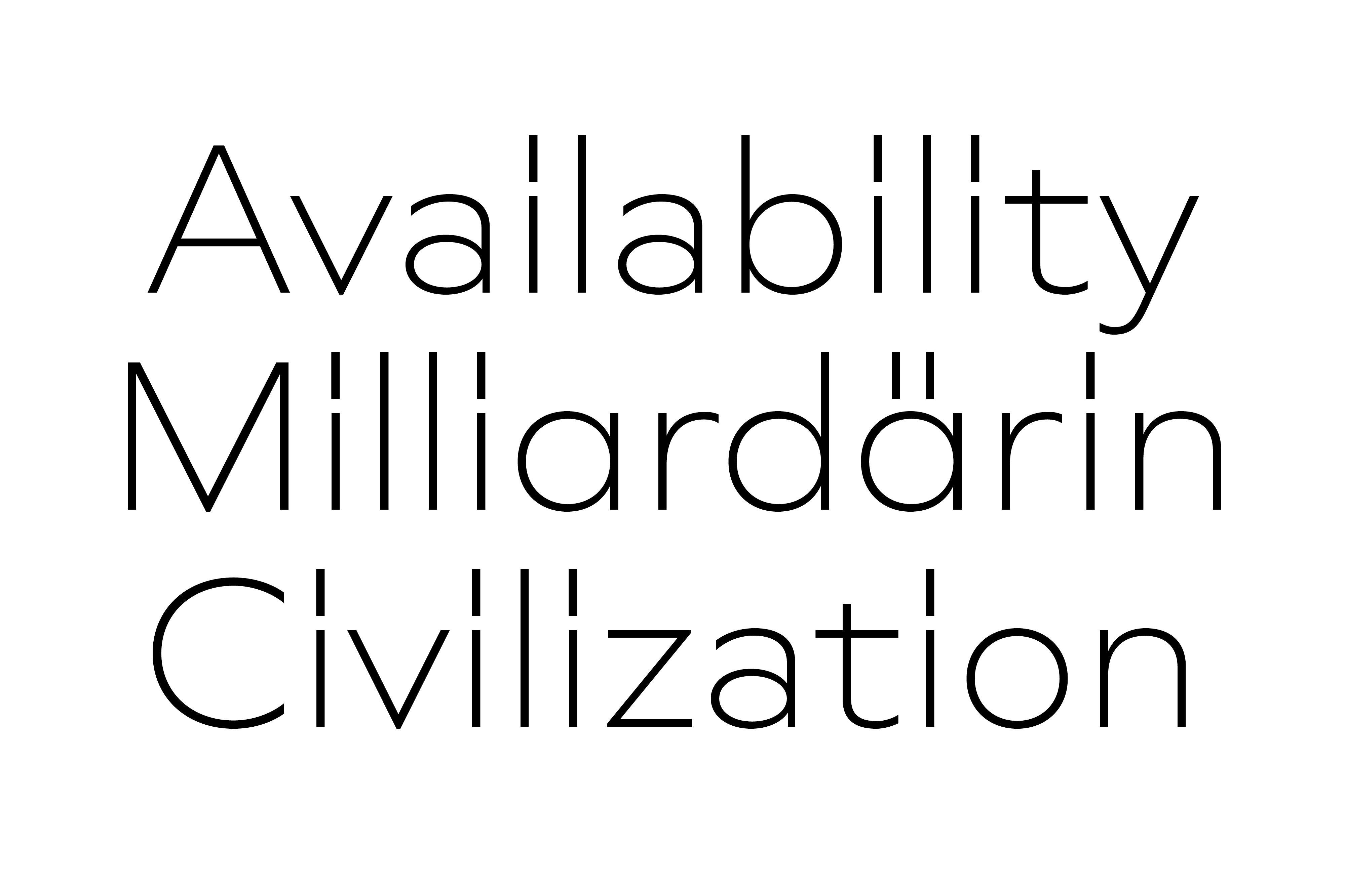
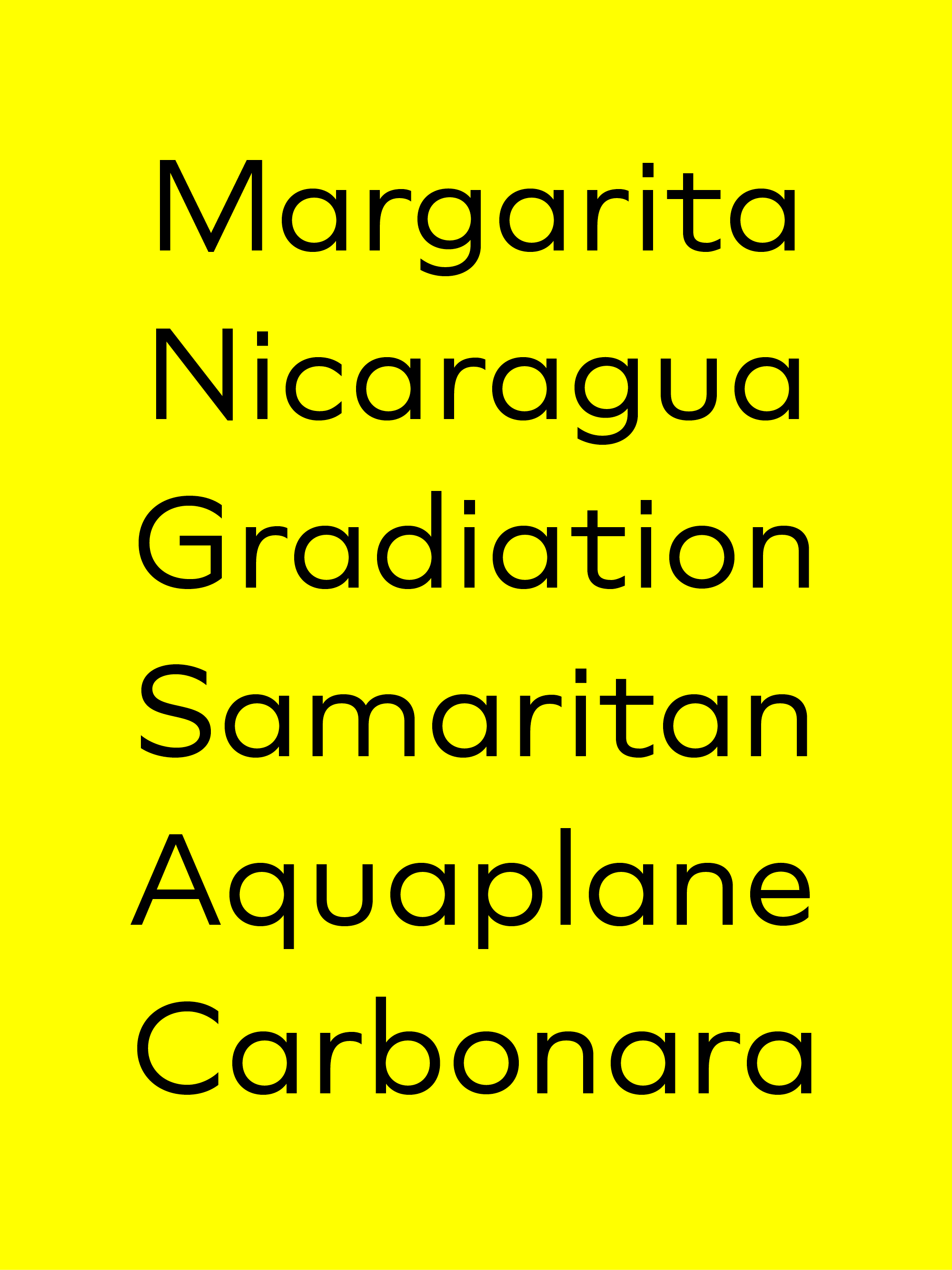
Bonjour, gracias, dank je wel. It’s all there. Plus more than 190 other languages.
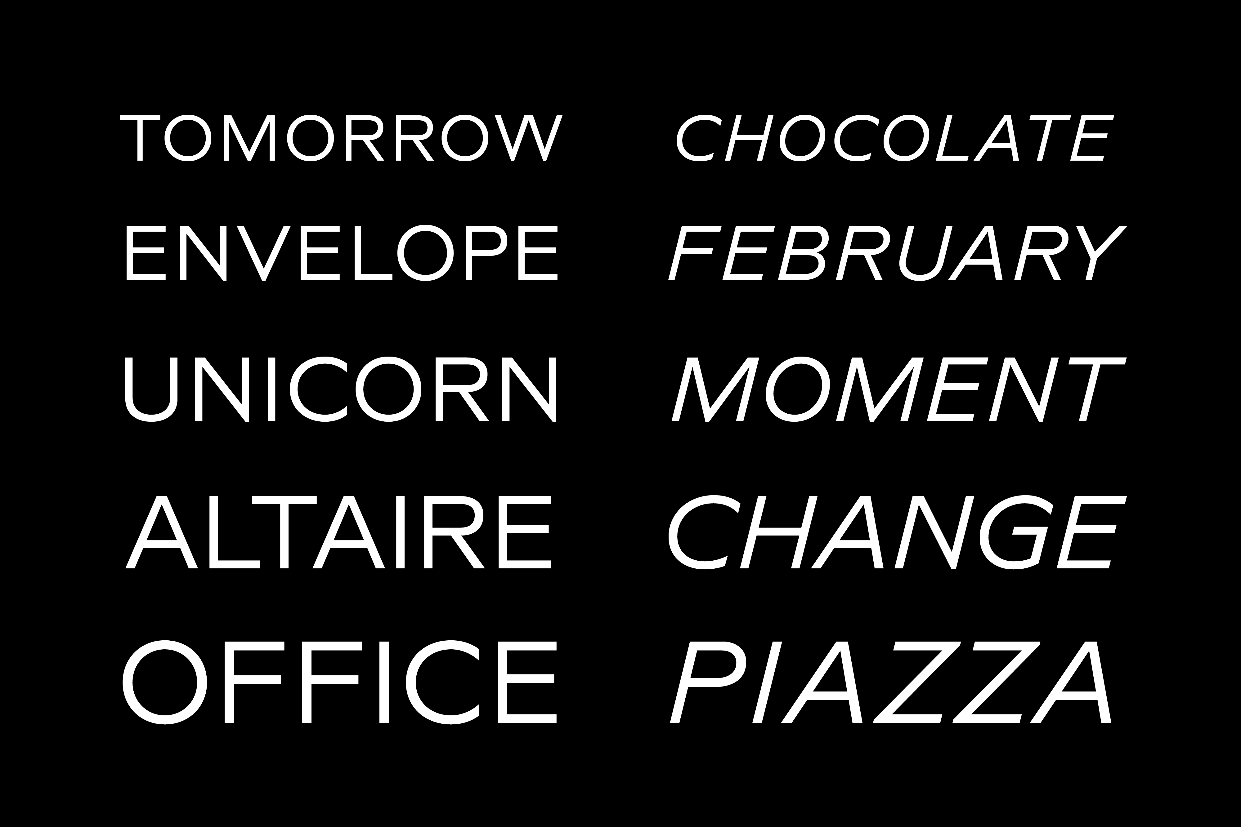
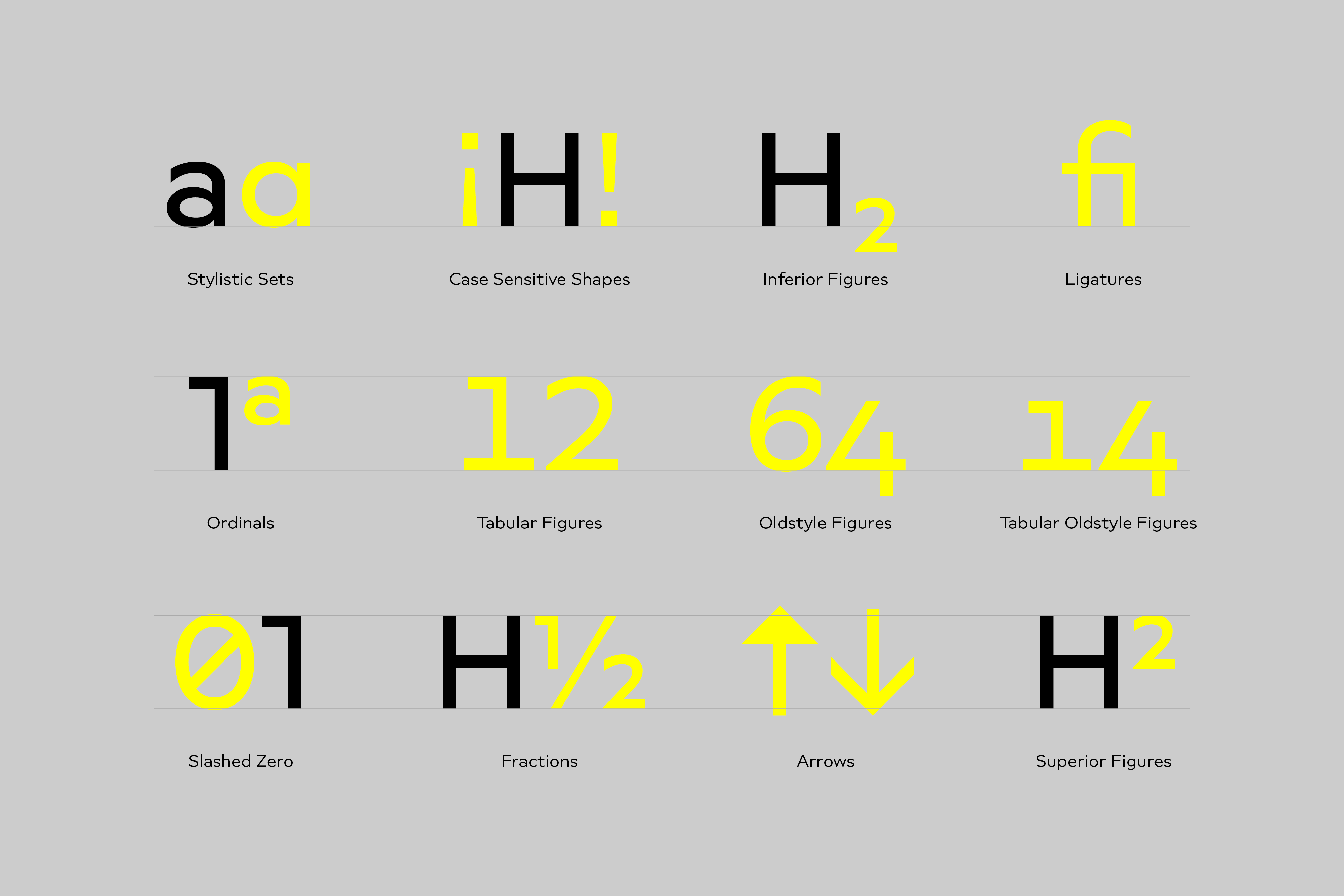
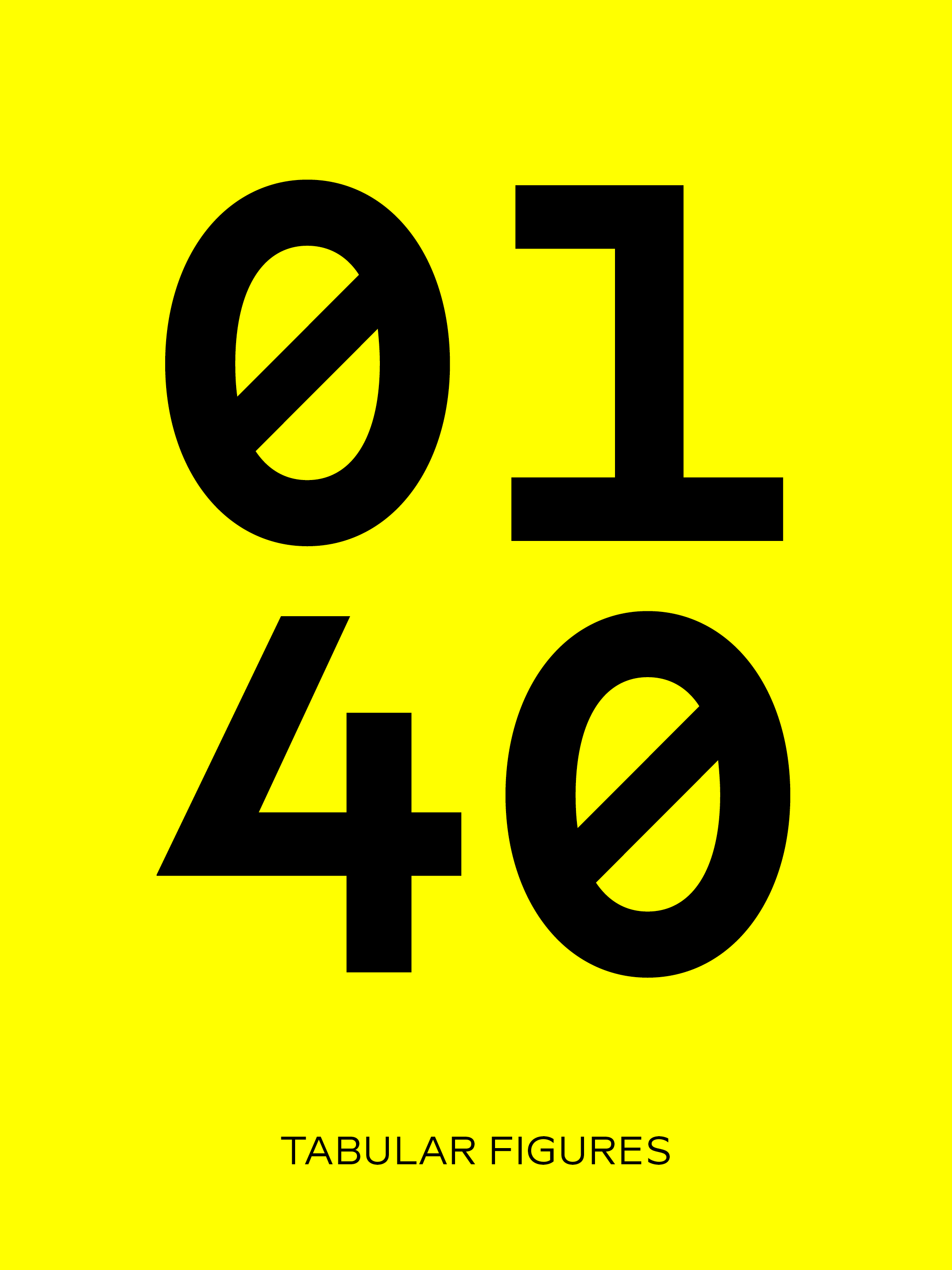
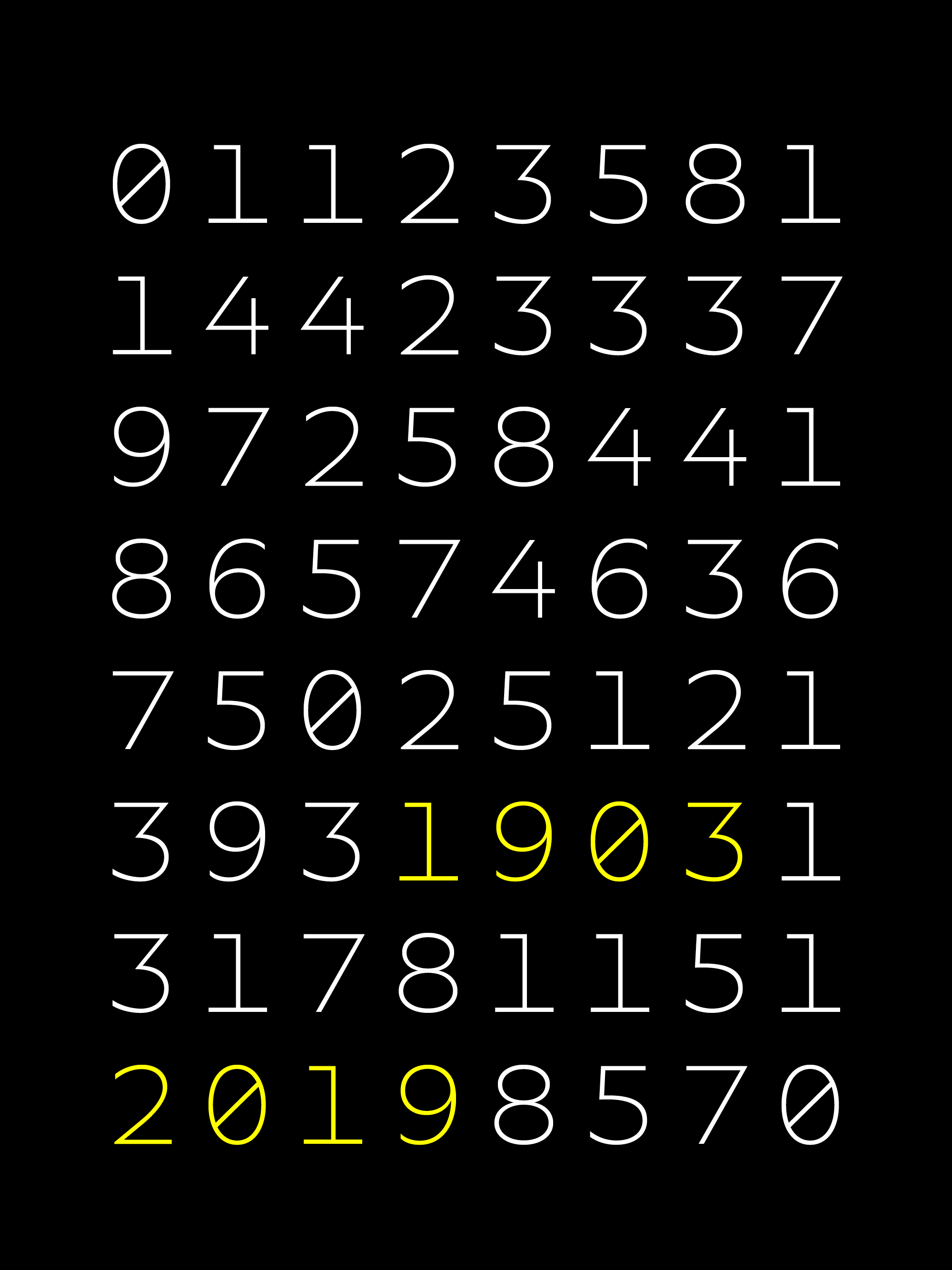
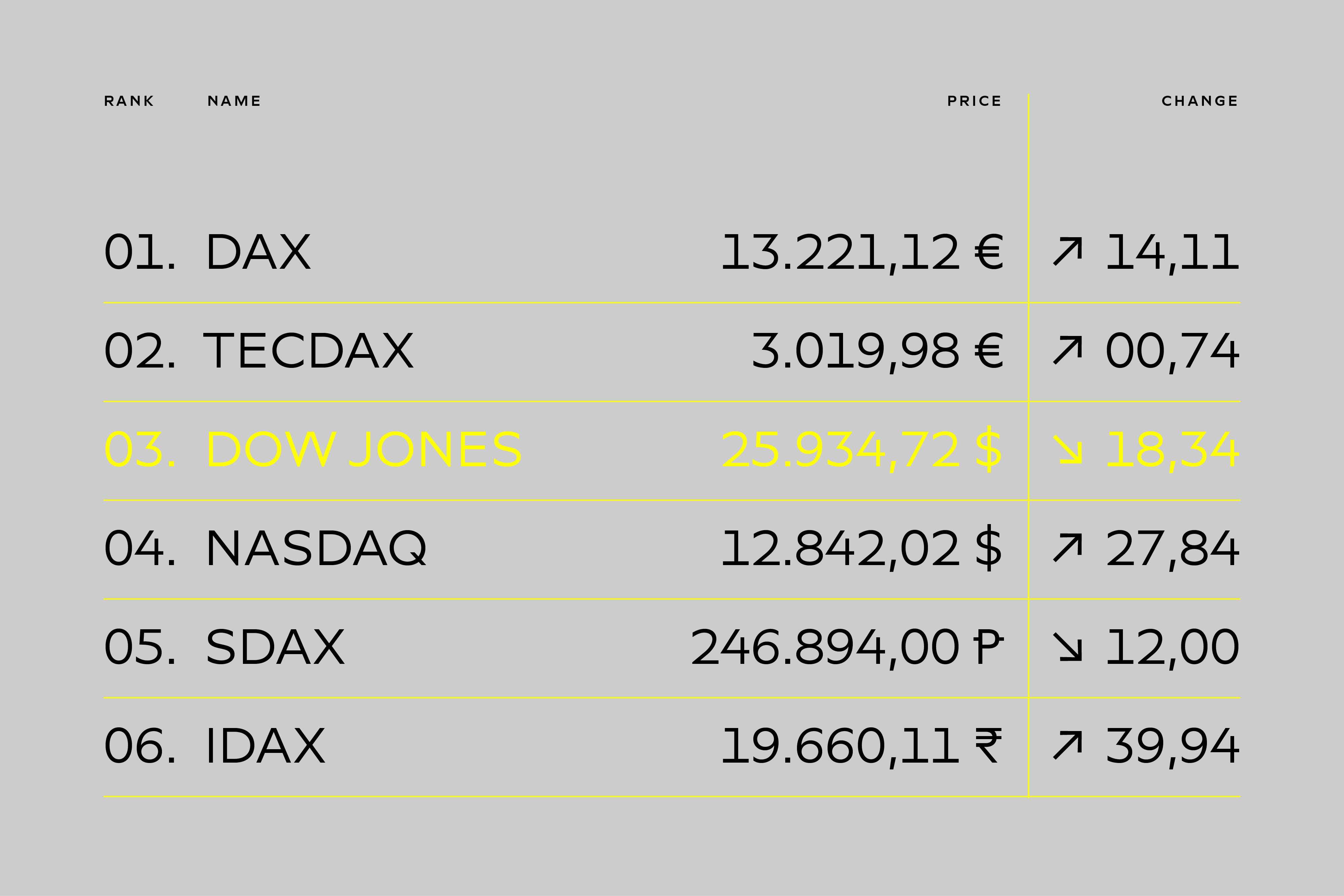
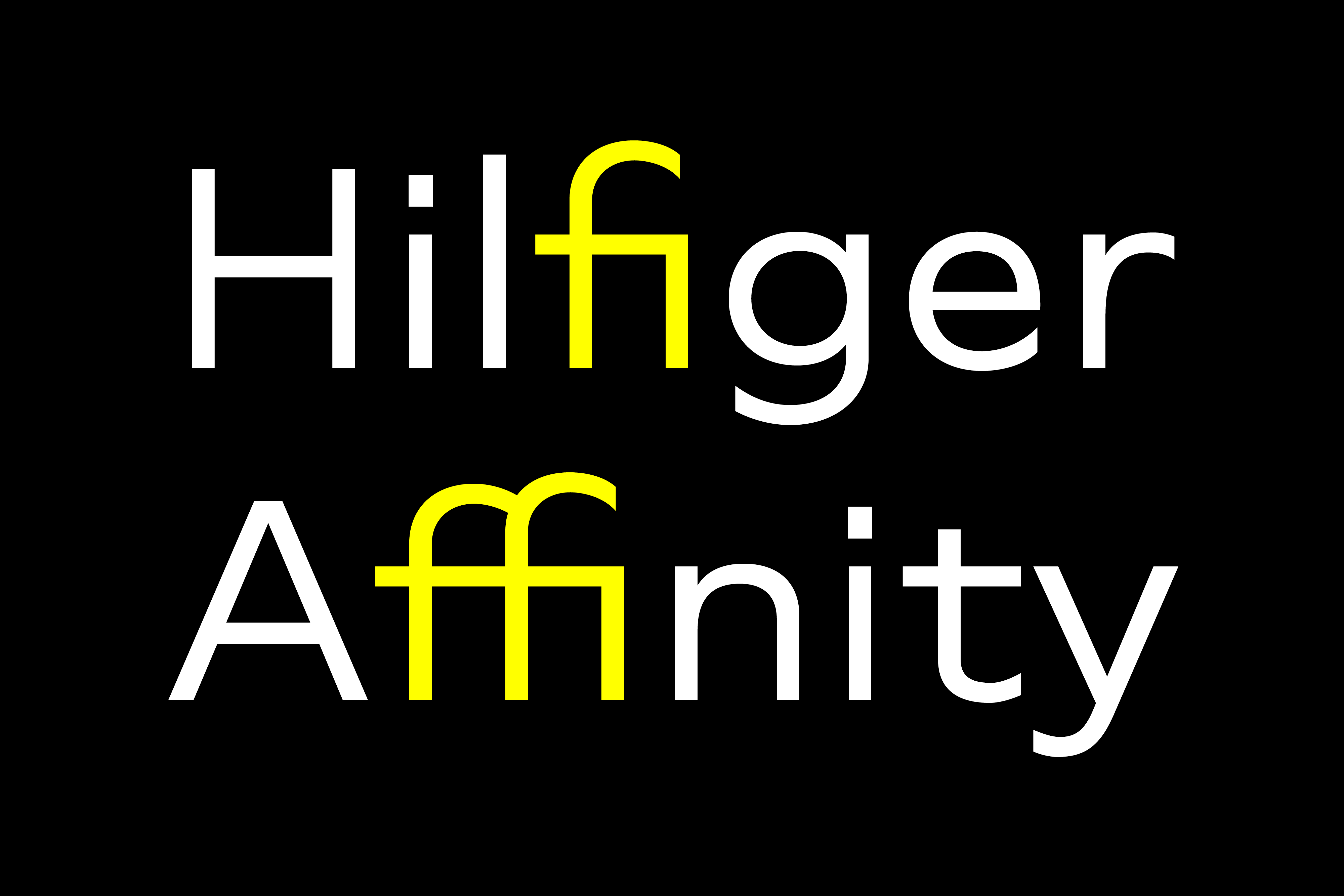
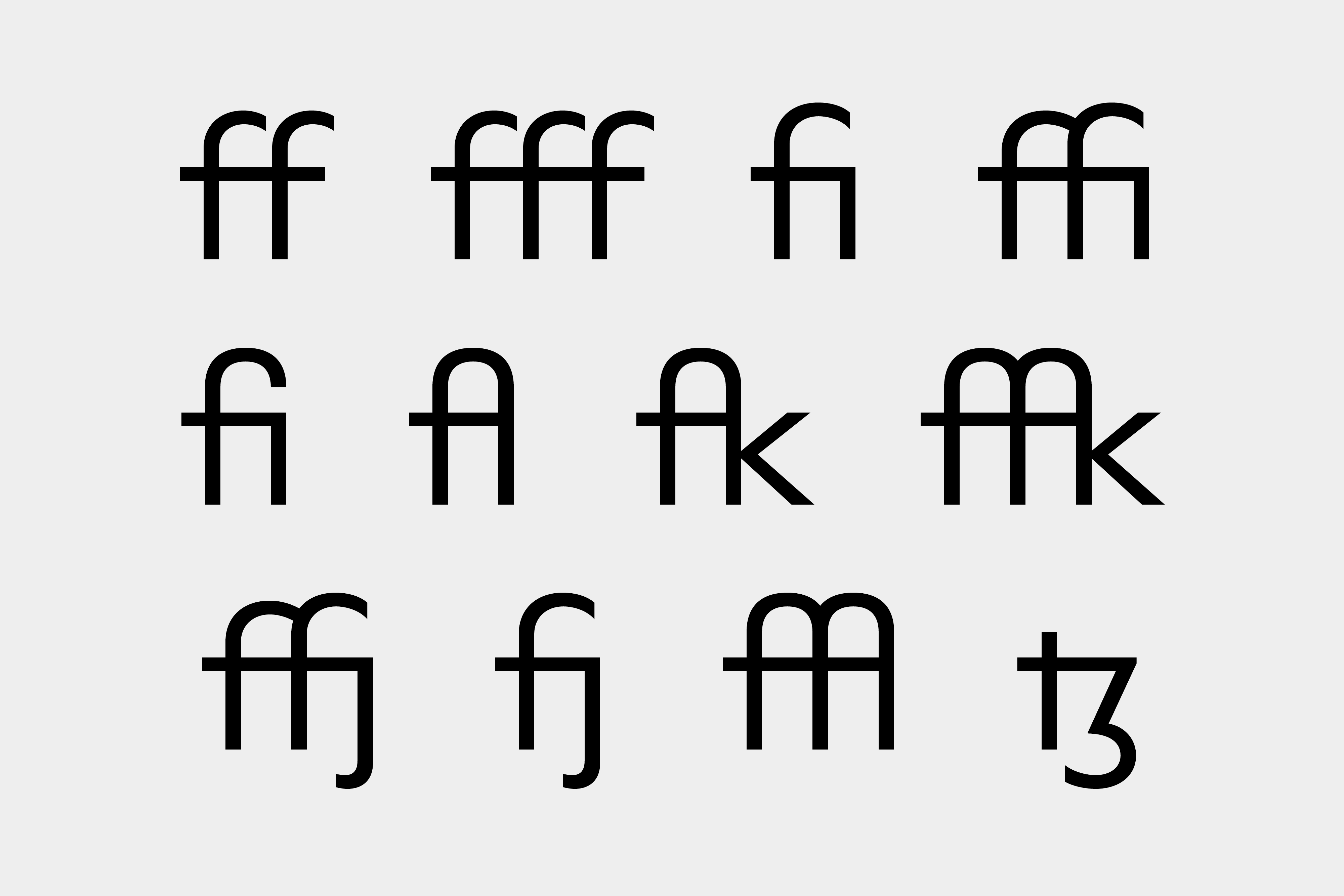
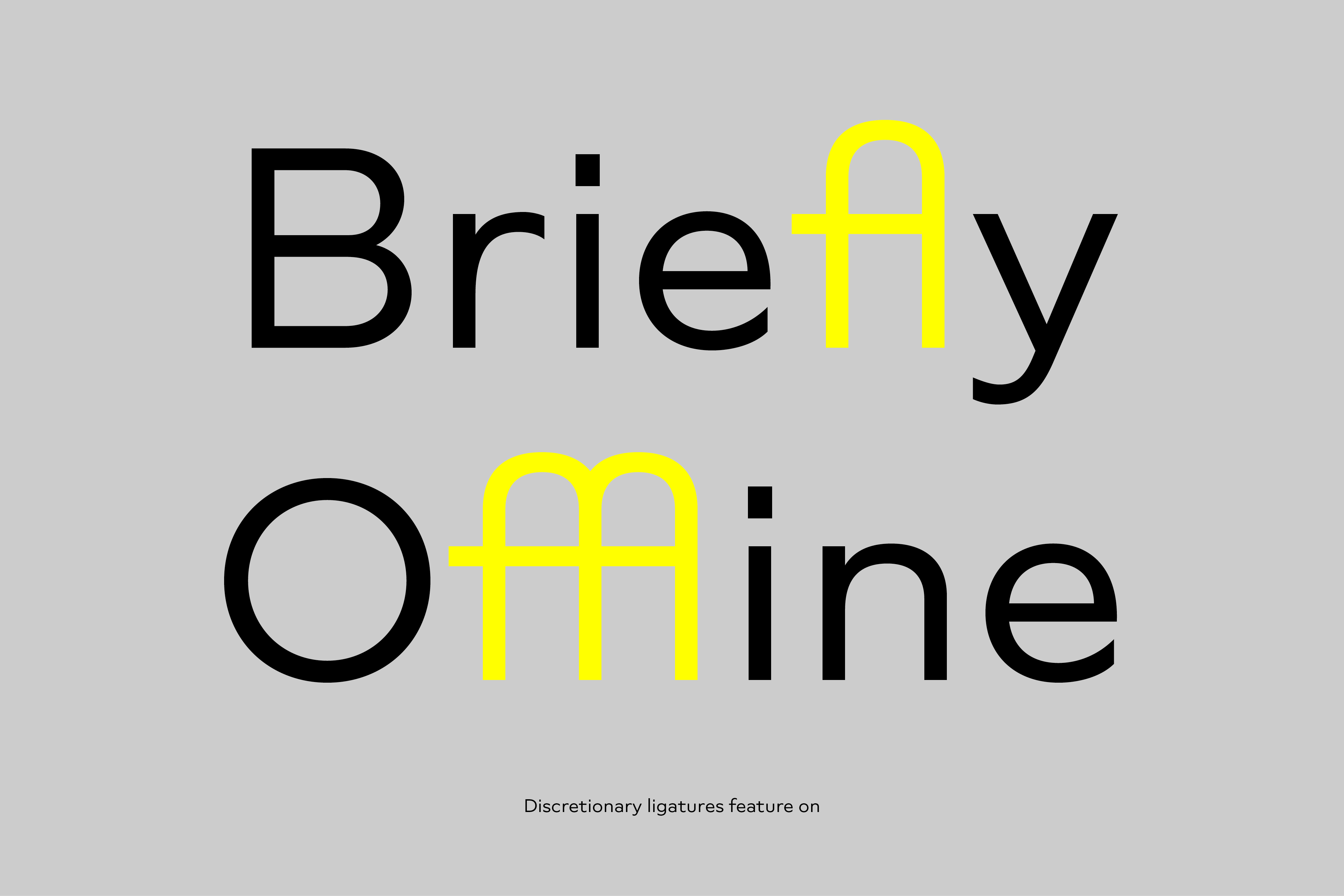
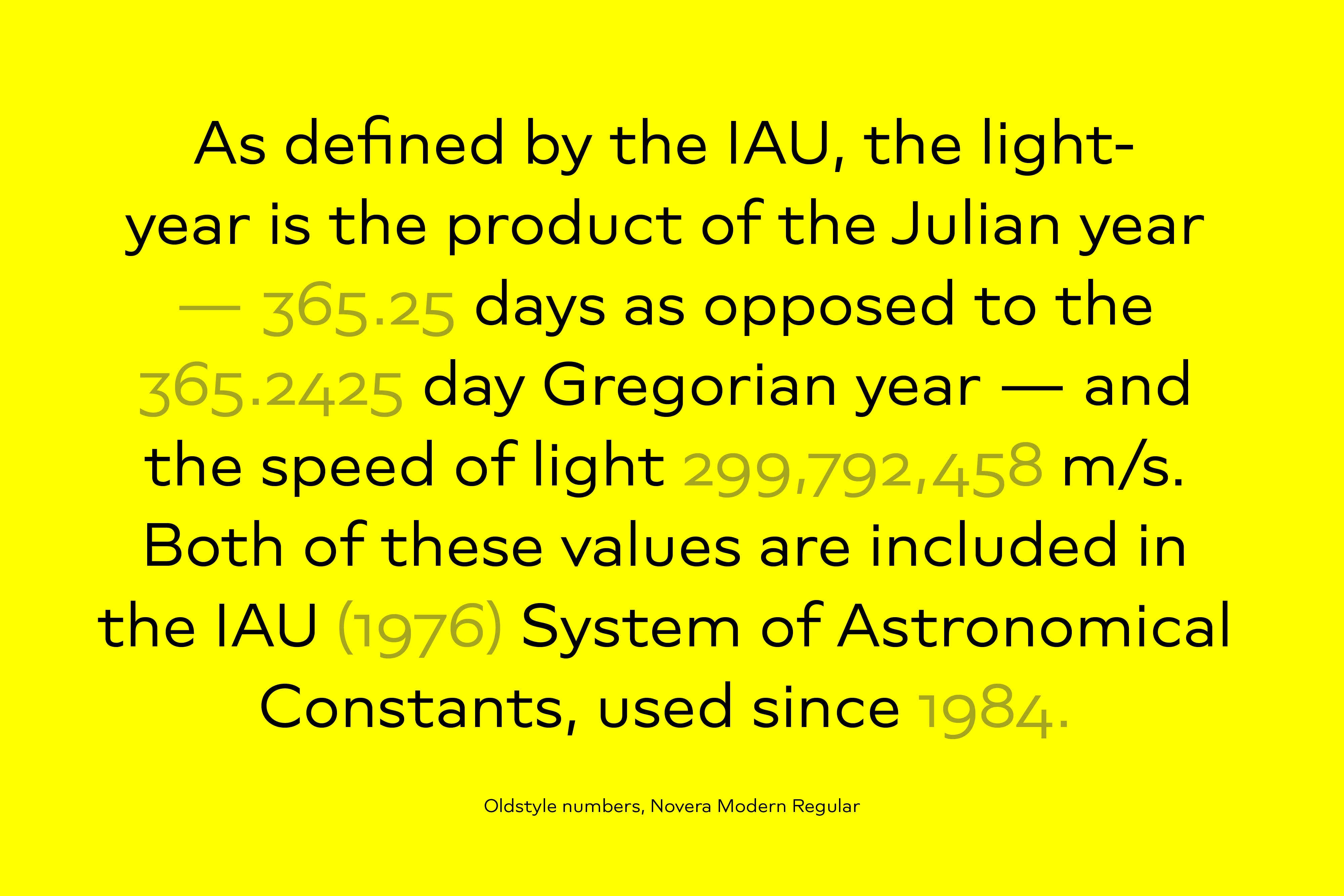
Opentype Features
The family comes with many opentype features to support modern typesetting. This includes ligatures, different number sets or alternative shapes for texts set in all caps.
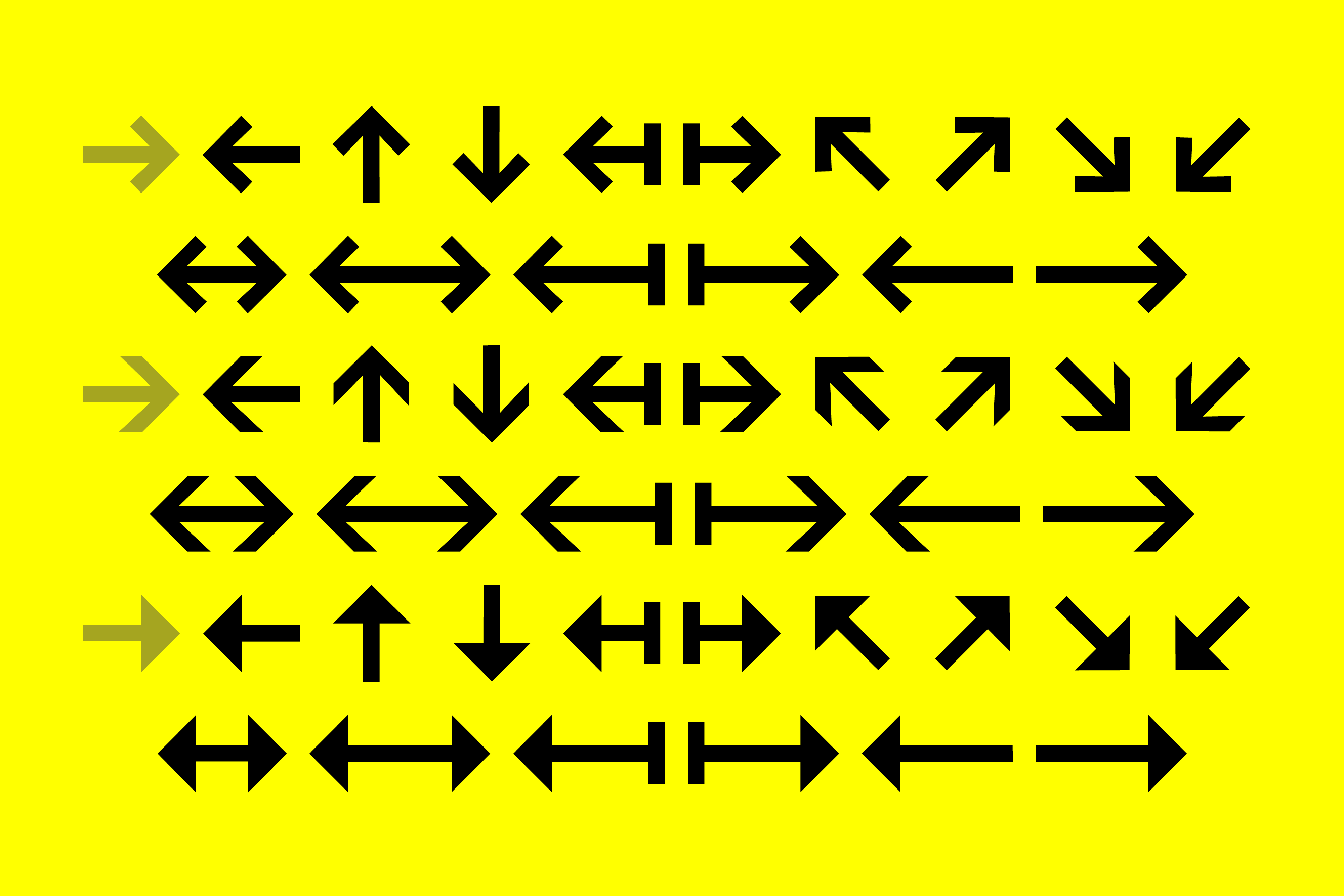
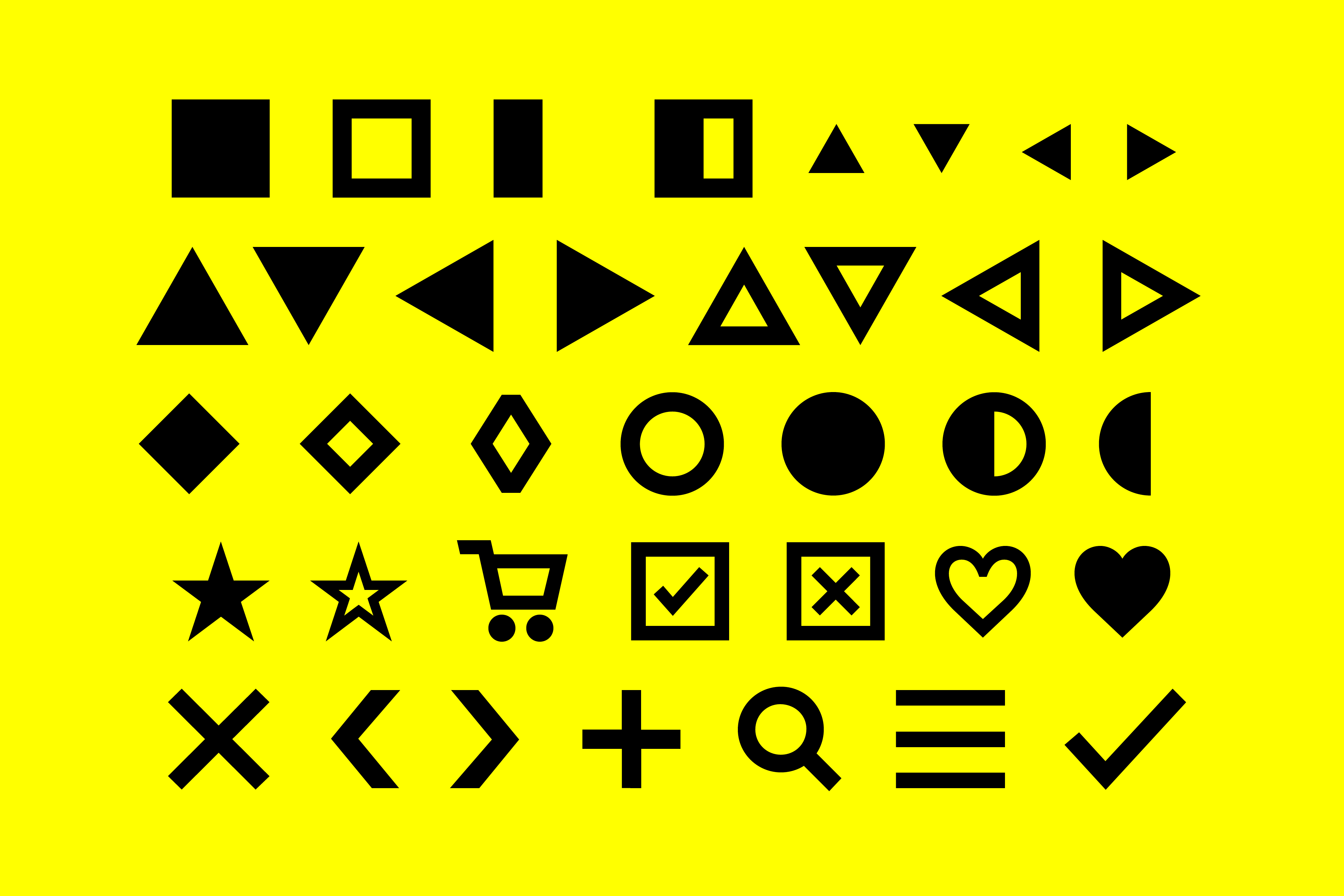
Arrows and Symbols
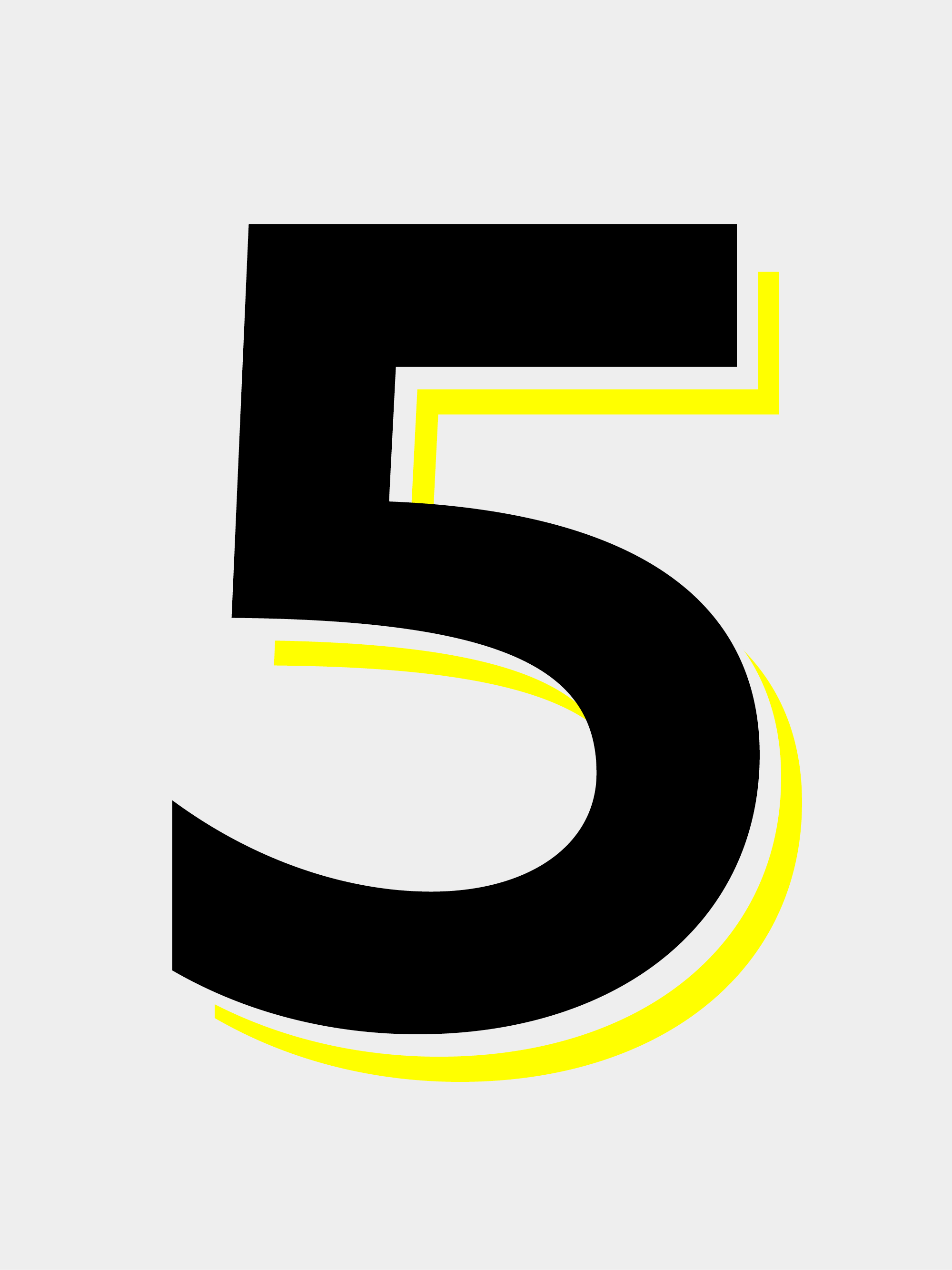
If you like arrows and other shapes, you will love Novera! The family has a built-in extensive symbols-set including 48 different arrows and various geometric shapes or icons.
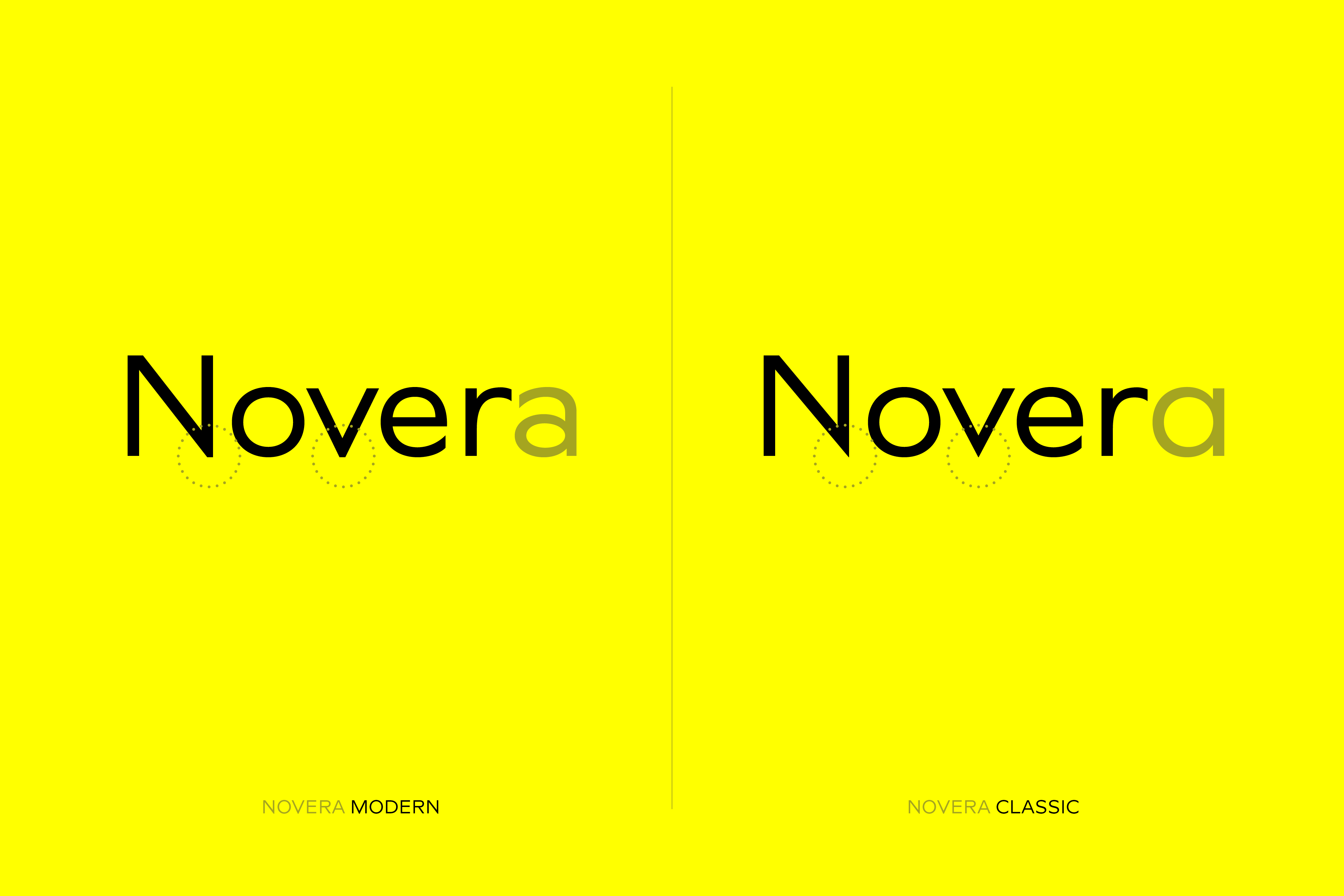
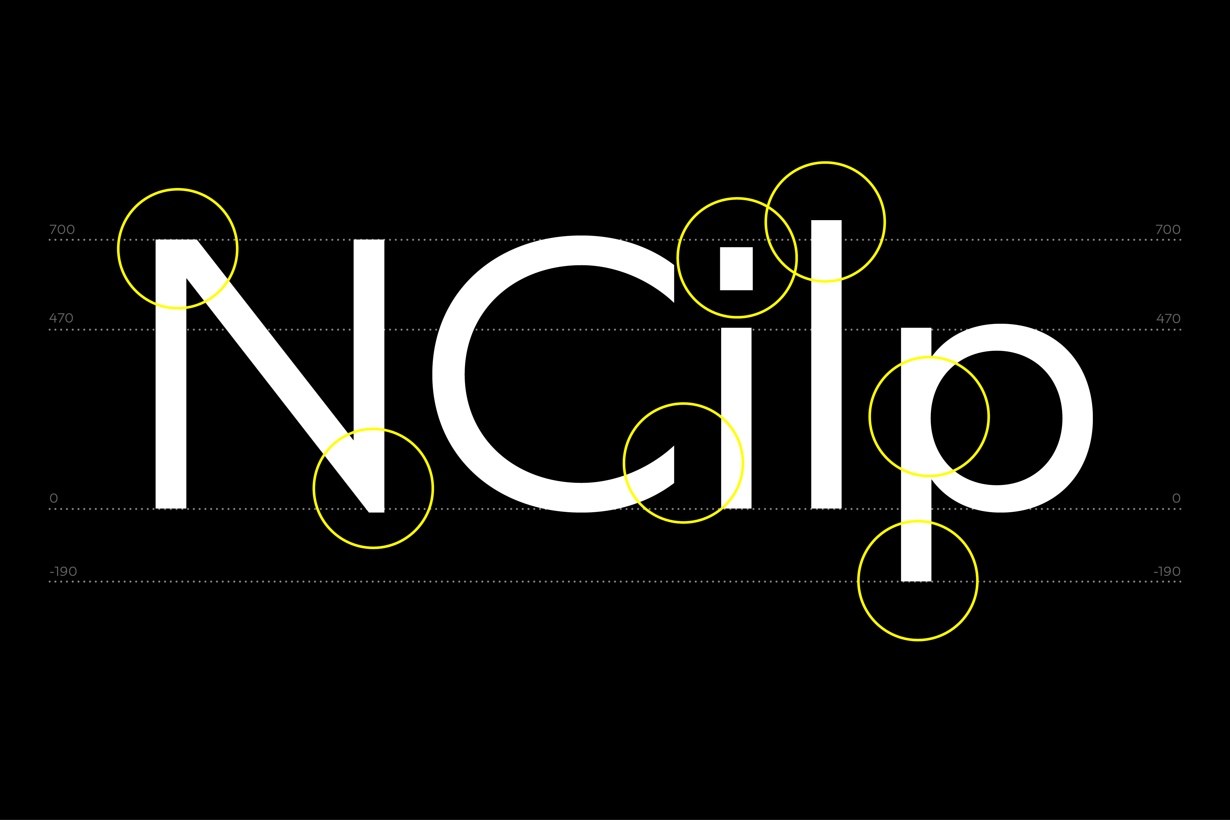
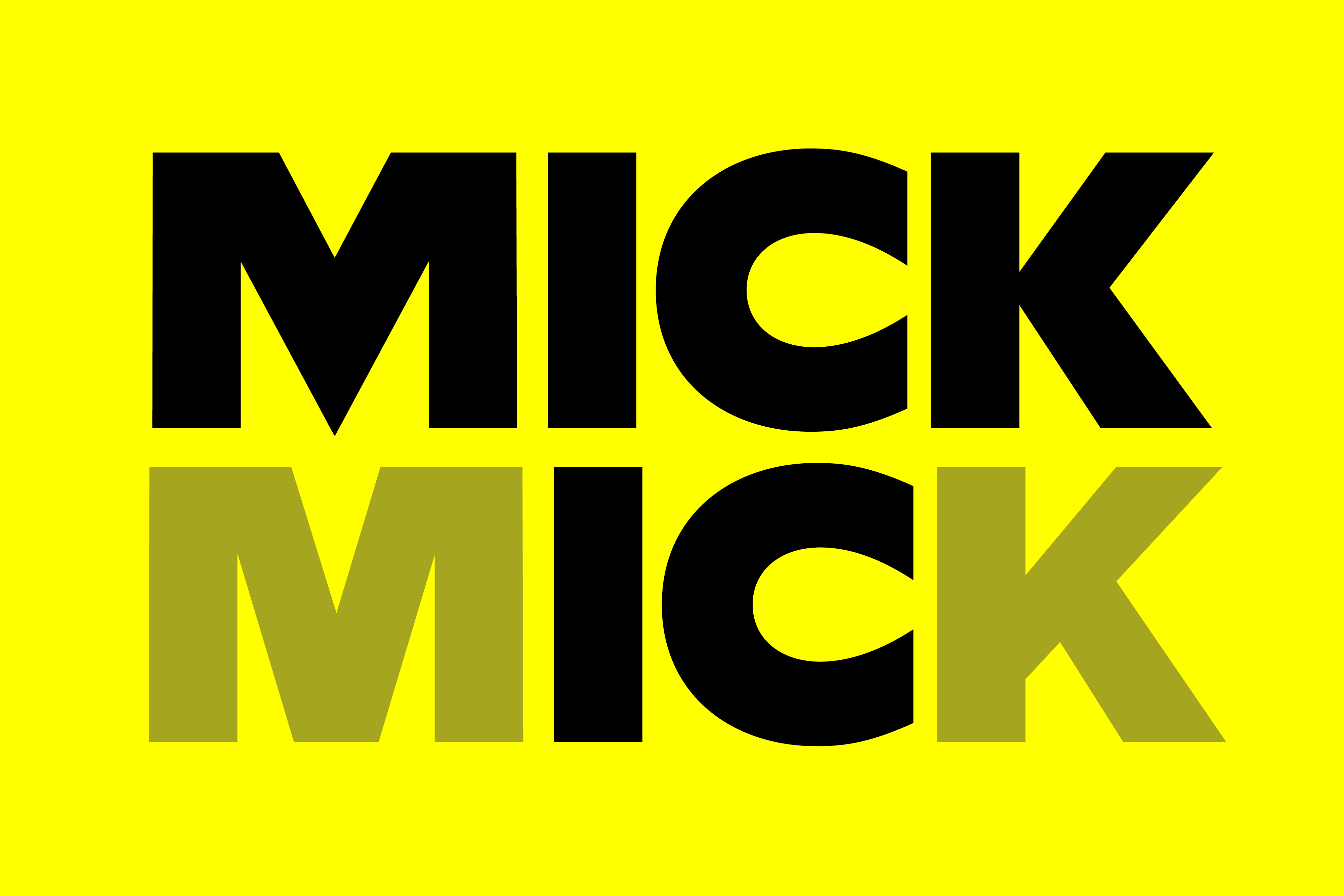
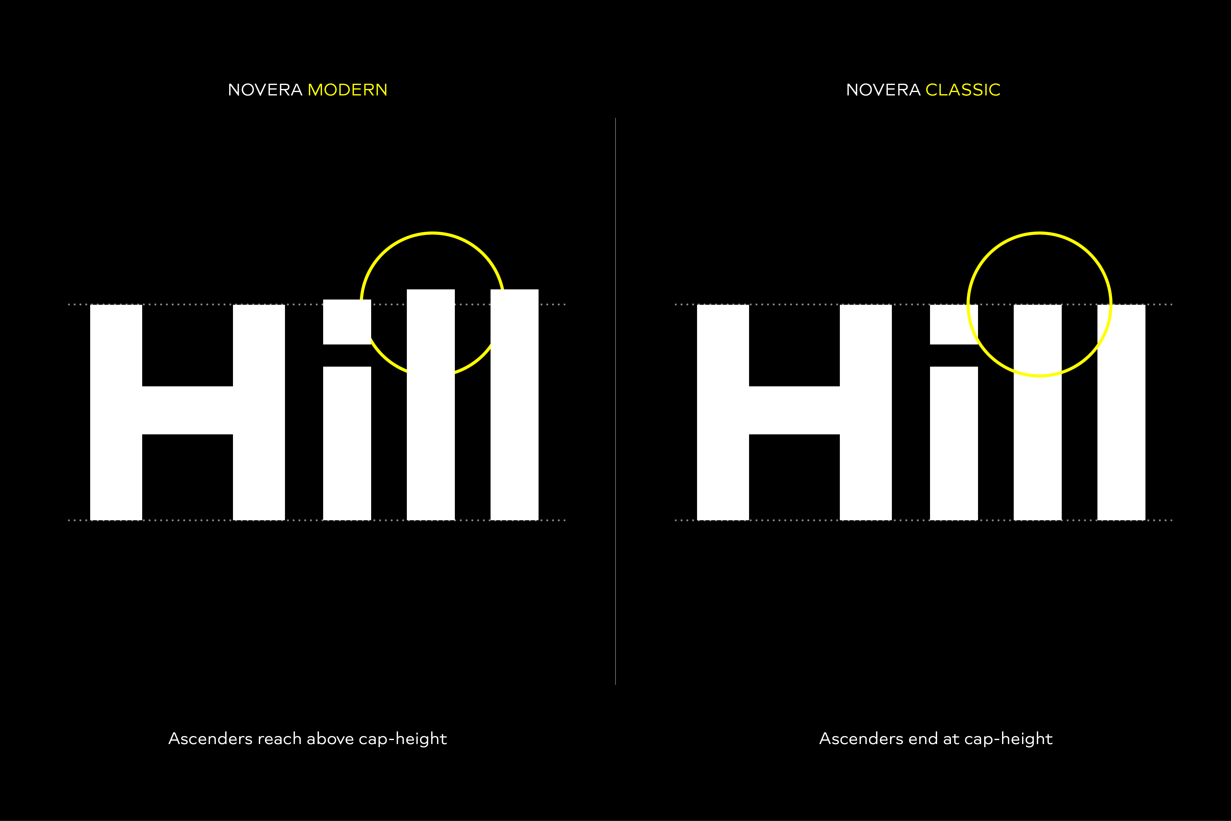
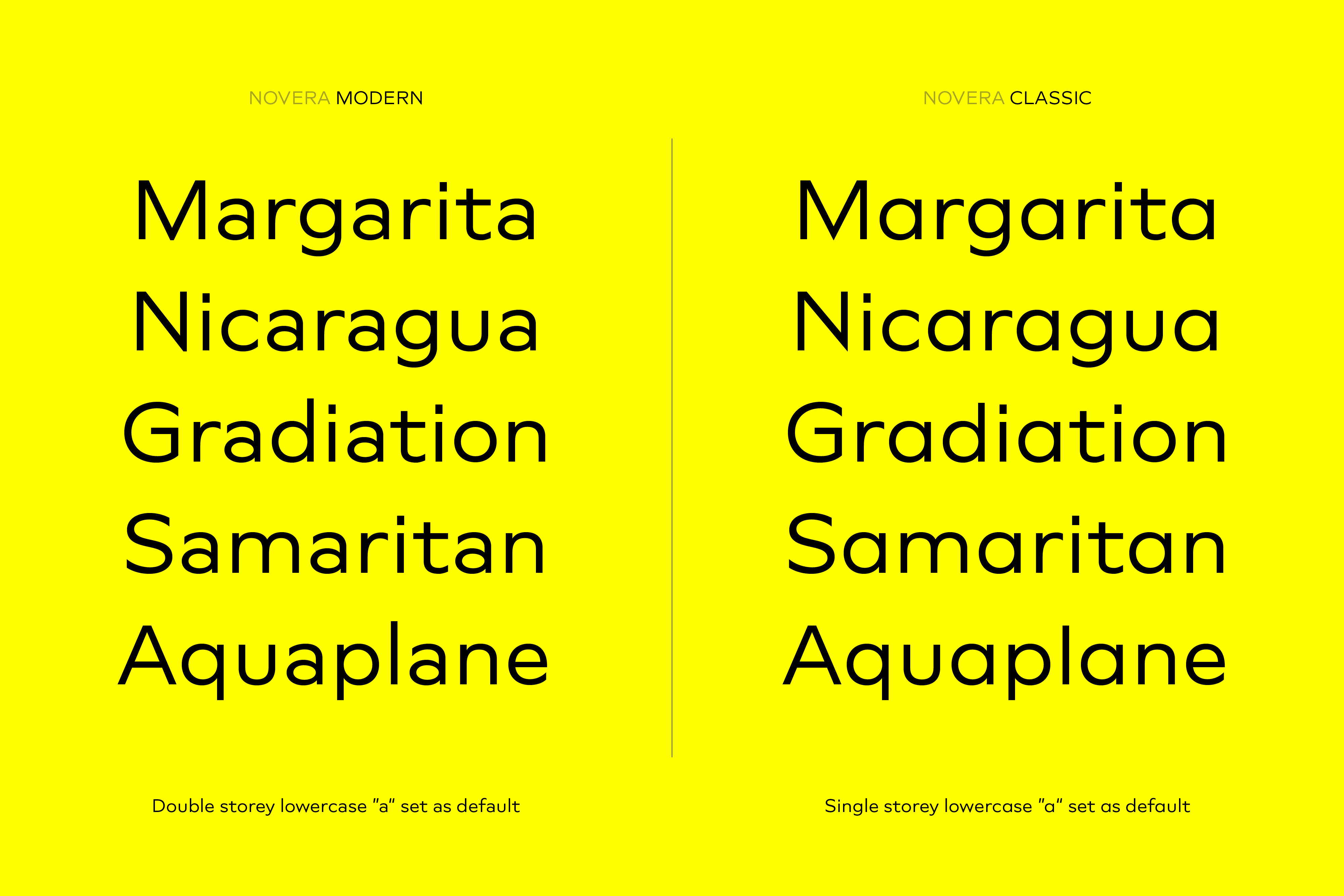
Modern vs Classic
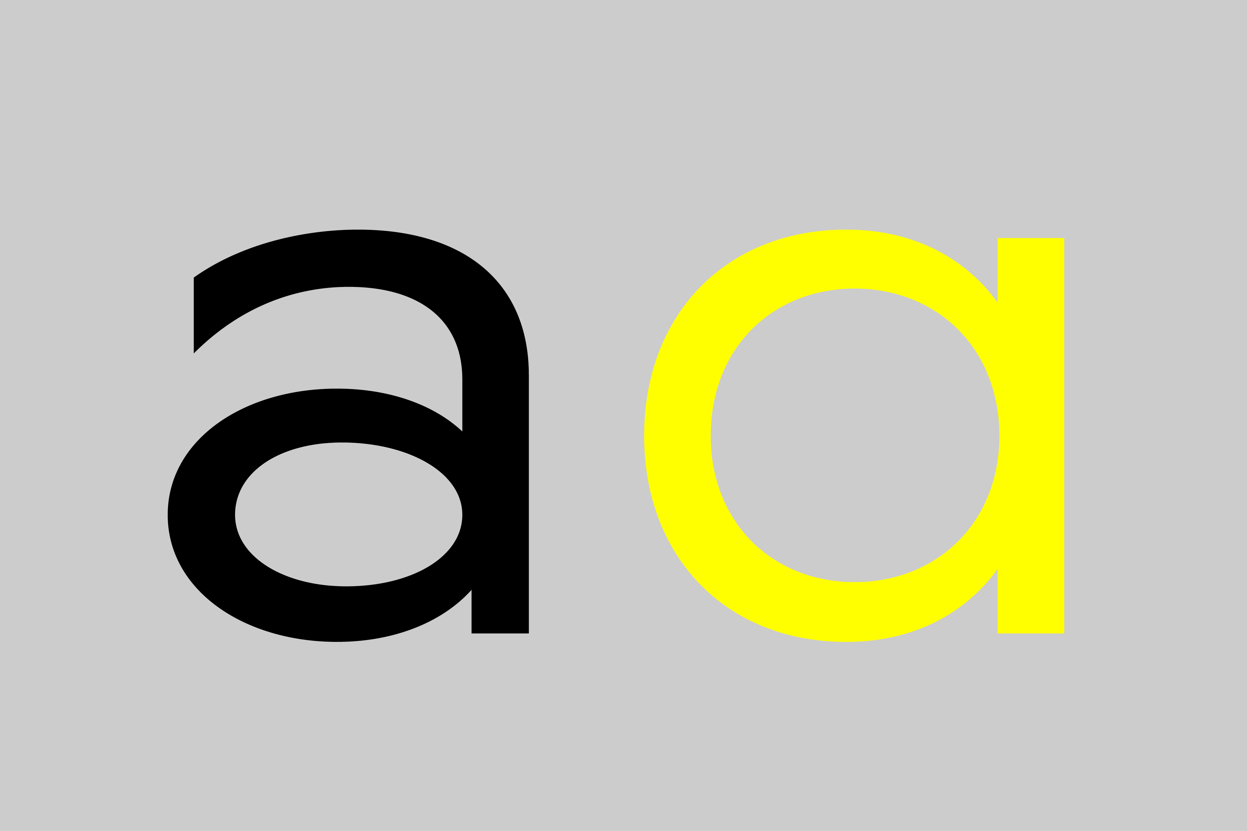
Novera is available in two versions, both with the same original source file but different characters set as default. This includes among other features the double-storey a (Novera Modern) which is optimized for legibility in longer text paragraphs, or ascenders ending at the cap height (Novera Classic) for a helvetica-flavored look.
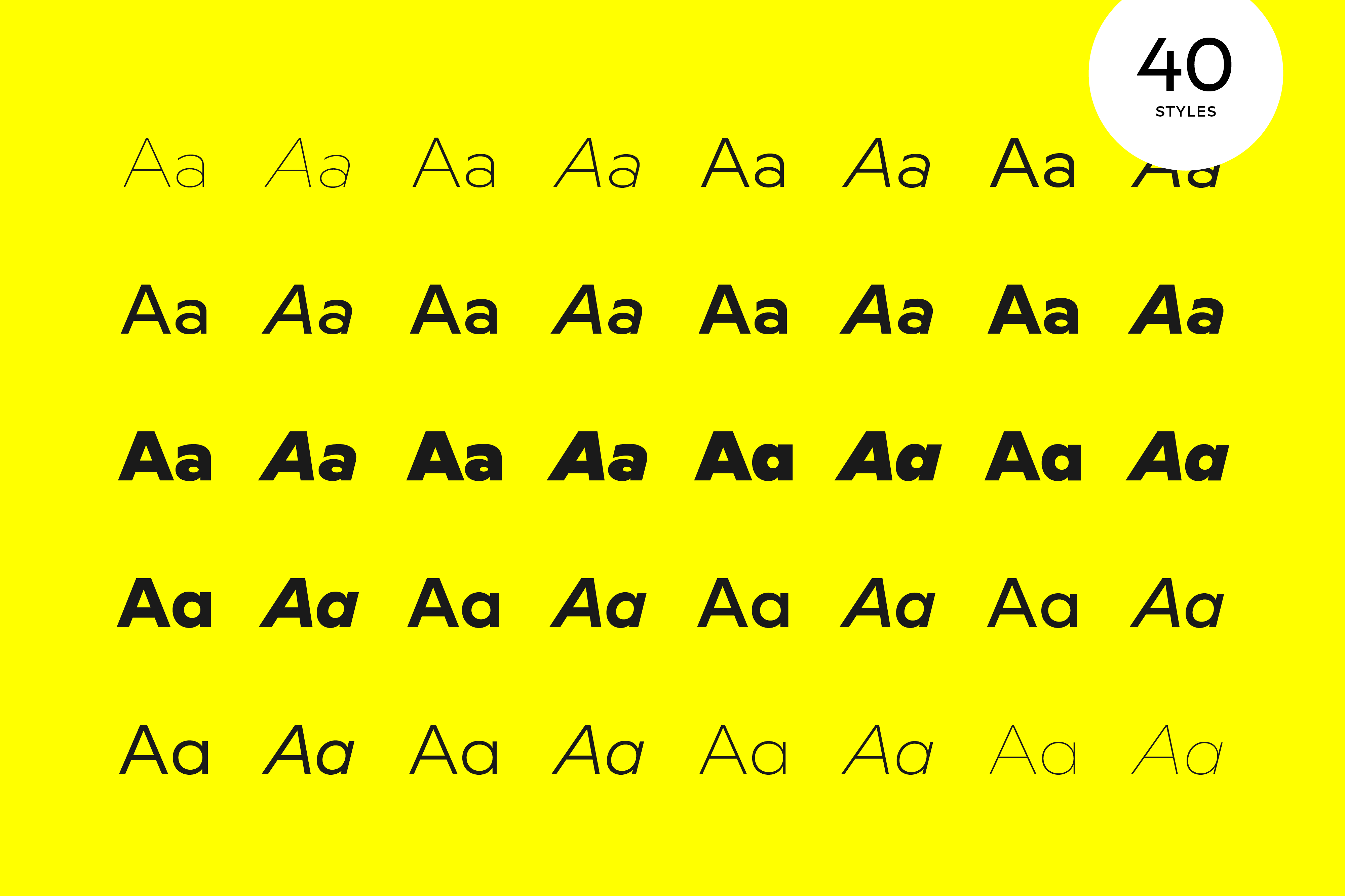
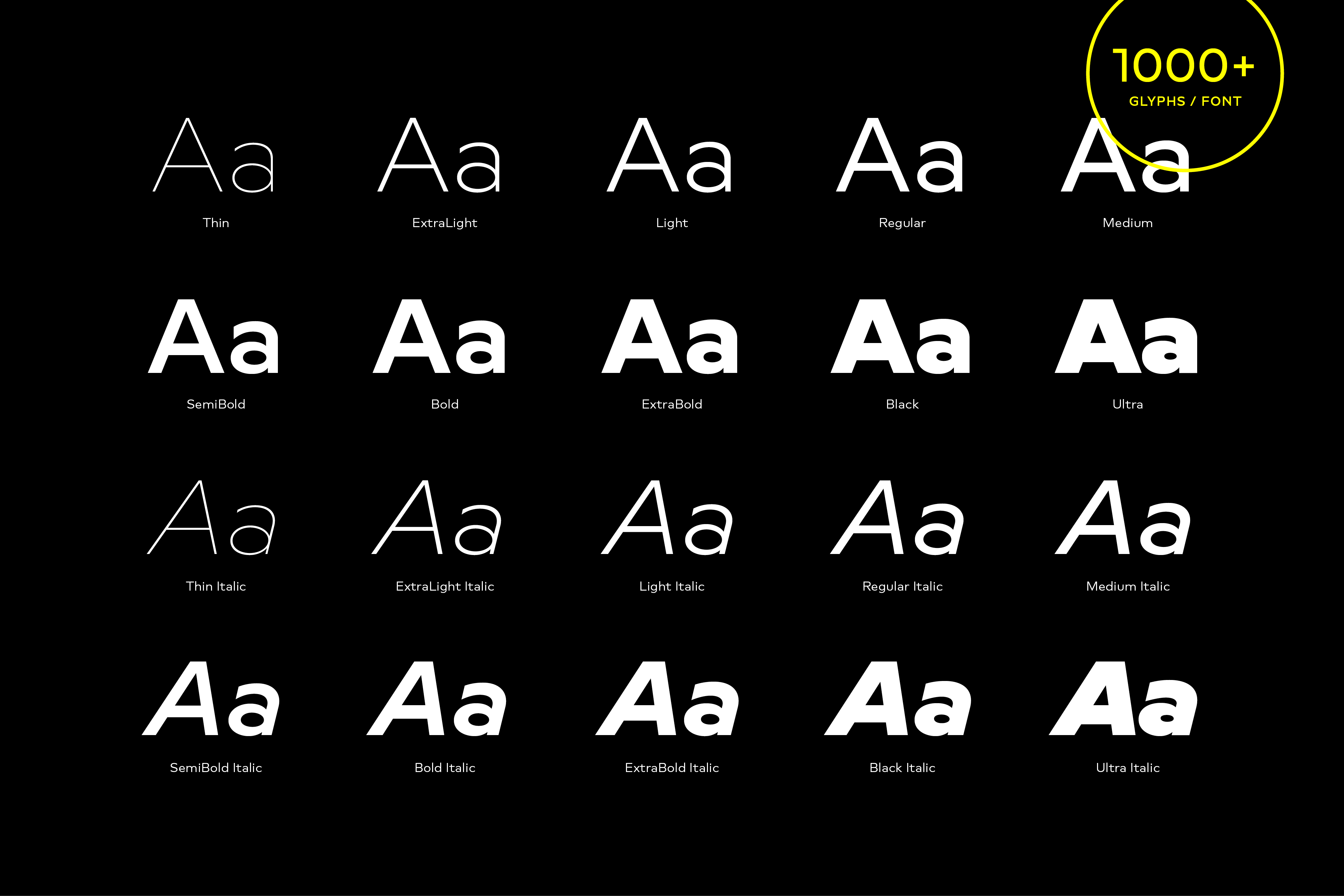
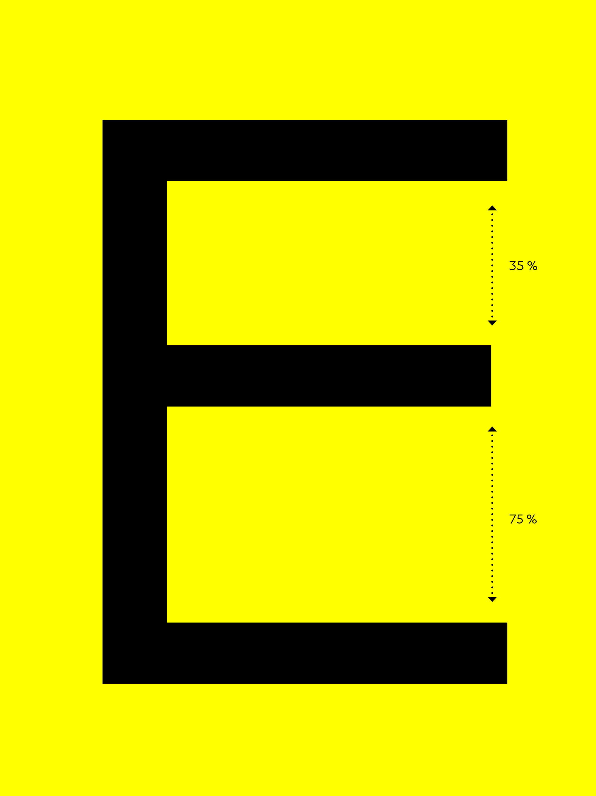
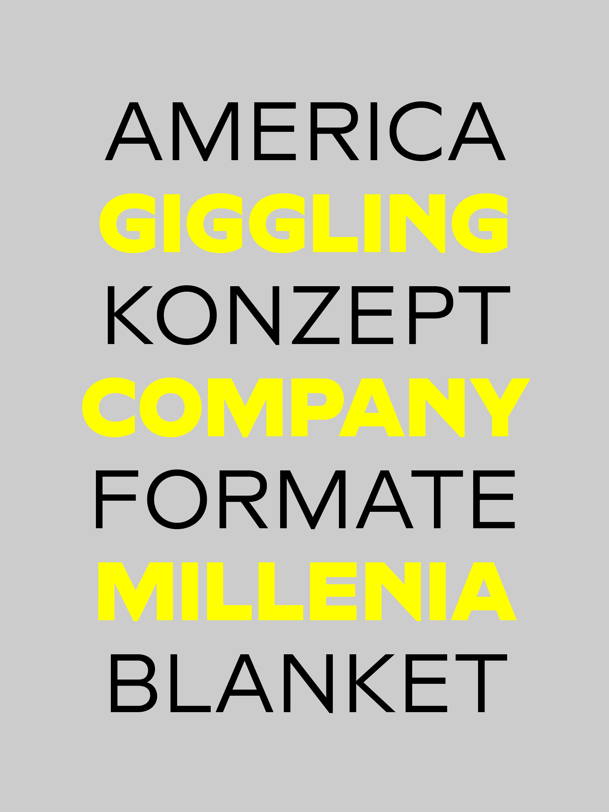
Weights
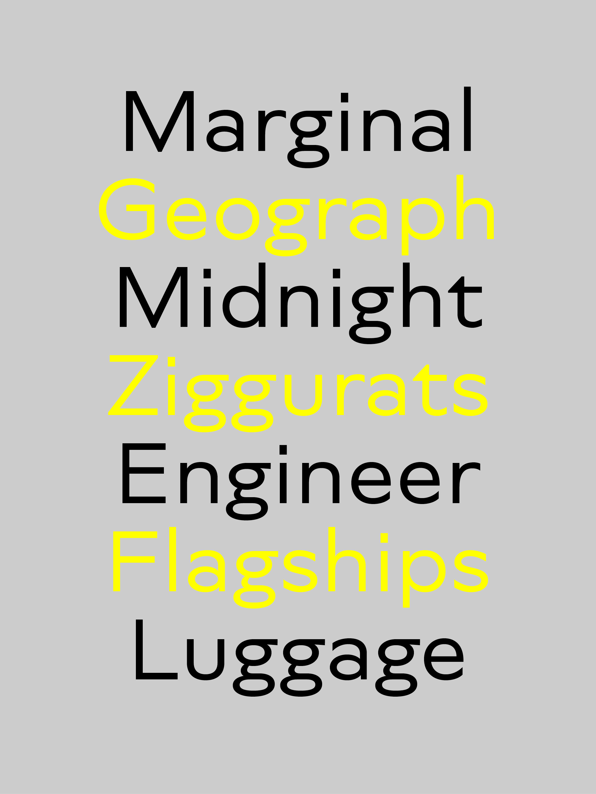
With its 40 styles and 1000+ glyphs per font, the Novera family covers all thinkable design scenarios from branding to web, app or editorial usage. It blends in perfectly in text heavy paragraphs with its mid-weights like Light, Regular, Medium or Bold or stands out like a monument in headlines and posters with its extreme weights like Black and Ultra or Thin and ExtraLight.